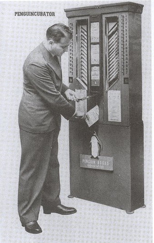
Penguincubator. Click for more.
This made the rounds recently, I believe originating with this piece on Publishing Perspectives, about Allen Lane, best known for devising the first breakout success cheap-but-quality paperback, for Penguin. Evidently Lane also dreamed up the device above: The Penguincubator, a book vending machine from the mid 1930s.
First installed outside Henderson’s (the “Bomb Shop”) at 66 Charing Cross Road, [it] signaled [Lane’s] intention to take the book beyond the library and the traditional bookstore, into railway stations, chain stores and onto the streets. It is worth noting, given publishers’ frequent timidity in this area, that this really annoyed booksellers. (Lane’s lack of trepidation is an important part of this story; worth noting, too, that he was the first English publisher of James Joyce’s Ulysses, at the Bodley Head, despite the widespread contemporary fear of prosecution for obscenity.)
In the Penguincubator we see several desires converge: affordable books, non-traditional distribution, awareness of context, and a quiet radicalism. And it’s not a huge leap of the imagination to see how these apply now. I see the same bored gaze on the bus and tube today, as people reflexively flip open their phones and start poking at email or casual games, as Allen Lane saw on the platform at Exeter in 1933. And slowly — oh, so slowly — publishers are seeing that what we are presented with is not the death of everything we trust, value and hold dear, but a similar widening vista of opportunity to that which arrived with the mass-market paperback.
I couldn’t find out much more — like the fate of this fascinating object — but there was another picture of it on Flickr, situated next to a “Bikini Automat.”
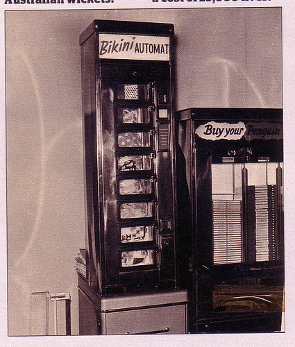
From Flickr user Mags. Click for more.
Given my interest in Things That Look Like Other Things, it’s inevitable that some would pop up in this series.
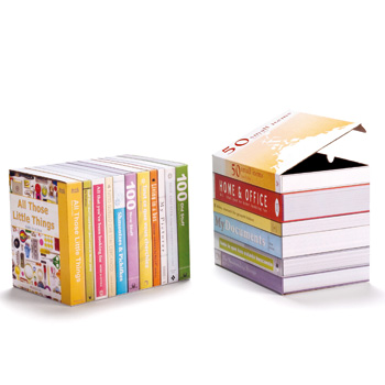
Boxes That Look Like Books. Click for more.
Bookshelf blog reports: “Designed by Peleg Design. Printed cardboard boxes for elegant storage on book shelves.”
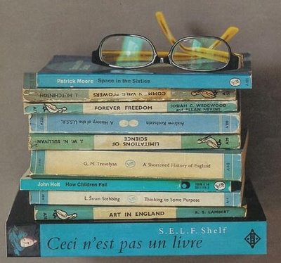
Shelf That Looks Like A Book. Click for more.
Note the title of the bottom “volume.” Bookshelf blog notes that it is actually “a small shelf with the appearance of a book.”
Posted Under:
Products,
The Designed Life
This post was written by Rob Walker on April 28, 2010
Comments Off on Books, the idea, cont’d: This is not a book.
I’m still poring over the delightful Bookshelf blog, but here’s a little bit to add to this occasional series of posts.
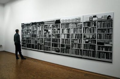
By Hans Feldman
Bookshelf says: “‘Bookshelves’ is a 5-panel, life-size photograph of Feldmann’s own bookshelves at his home in Düsseldorf.”
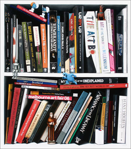
"Alasdair Macintyre," by Victoria Reichelt; click for more.
Apparently this is an oil on canvas piece, one several made by Victoria Reichelt. Bookshelf quotes her:
While some of these bookshelf paintings are of random books, I’ve recently done a series that are portraits of people. So I’d go to their houses and photograph their bookshelves and then make paintings from the photos as a way of telling the viewer about the person.
She also made this series of color-grouped books, which I think are pretty stunning:
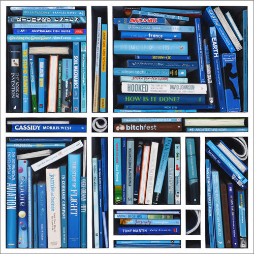
"Blue Ocean," by Victoria Reichelt, click for more.
Posted Under:
Artists
This post was written by Rob Walker on April 27, 2010
Comments Off on Books, the idea, cont’d: Spines as art
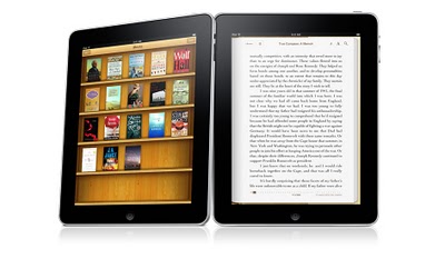
Via Bookshelf Blog, click for more.
Here via the Bookshelf blog are two items of note. Above, the iBookshelf app, available for iPhone or iPad, as I understand it. Below, an iPhone bookshelf skin.
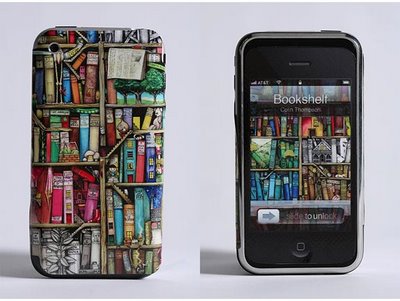
Via Bookshelf Blog. Click for more.
I assume — if you’re at all interested in this series of posts — you’ve already heard about, read, critiqued, etc the Ken Auletta iPad piece in The New Yorker. Can I possibly add anything? Not really, but in relation to this series, I did ponder this aside:
There are now an estimated three million Kindles in use, and Amazon lists more than four hundred and fifty thousand e-books. If the same book is available in paper and paperless form, Amazon says, forty per cent of its customers order the electronic version. Russ Grandinetti, the Amazon vice-president, says the Kindle has boosted book sales over all. “On average,” he says, Kindle users “buy 3.1 times as many books as they did twelve months ago.”
Obviously buying books isn’t the same thing as reading books. It’s quite plausible to me that e-books, being rather easy to buy, will set a new standard for the distribution of paid-for and unread words. Does it matter? My mixed feelings are too obvious to bother expressing.
But as it happens, I was sorting out the physical books in my office the other day, and trying to estimate the percentage of books I own but haven’t read. There are many reasons for this. Let’s just set aside the stuff that I have no intention of reading but was sent to me be a publicist, or don’t want to read but might have to at some point for professional reasons. There are plenty of the books I own that I really do intend to read — but I “haven’t found time.” How many? What percentage? And would such titles pile up more quickly on ebook “shelves”? I think for me they would.

Mr. Portigal (thanks!) points out this Metafilter post that I’d missed:
In the capital of Turkmenistan stands an enormous statue of a book. Every evening at 8PM, the statue swings open and a recently deceased dictator’s magnum opus, the Ruhnama, is broadcast throughout the square while a video from within the statue shows his image.
The post links to a documentary maybe by Finnish filmmakers and available on YouTube in 10 parts. I did not watch the whole thing. In this part, however, at about the 4:35 mark, there’s some twilight / nighttime footage of the book swinging open. I know precisely zero about the rather dodgy-sounding politics here, but an immense book that swings open, onto which video images are projected, is fascinating.

Click to see YouTube video; I’ve punched up this image a little.
This post is part of a series.
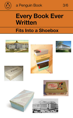
Douglas Coupland:
Last month I installed new bookshelves in a room in my house. They’re black, and my painter offered the unsolicited opinion that they might look depressing when completed. I knew he was wrong because, at the very least, the paperback shelf couldn’t help but have a cheerful orange zing a zing that comes from the Penguin spine, the most wonderfully insidious default interior design statement in our culture.
Of course he’s not simply expressing this opinion in public; it’s part of “A Penguin 75th Anniversary Project By Douglas Coupland.” (Is it just me or has “project” become the trendy word of the moment? Everybody is working a “project” now. Or several “projects.”) This is essentially an appreciation of Penguin cover design, which deserves appreciation: It is, in fact, iconic.
The project, as I understand it, is to use this graphic form (the Penguin cover) as template through which to “speak to the past.” He asks: “How would you speak to someone in the year 1935 from 2010 using a Penguin cover?” Coupland’s answers are here; templates can be downloaded here and people who have done so have added their creations to this Flickr set.
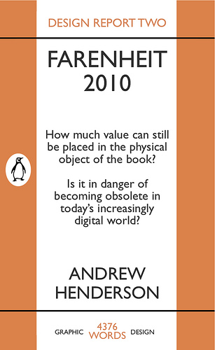
To be honest, I wasn’t really that impressed with any of the results so far. But one of Coupland’s examples (above) caught my eye, and one of the “crowd” submissions (below) caught my eye, and seemed relevant to this series. And, again, I really do think Penguin’s design style is iconic.
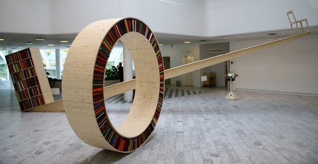
David Garcia Studio; Click for more.
Core77 picks up the circular bookshelf mentioned here in an earlier installment in this Murketing.com series, and notes the creator (whose name I didn’t have): David Garcia.
More to the point, Core77’s item cites this Dvice post, which in turn cites a blog called Bookshelf: The home of interesting bookshelves, bookcases and things that look like them — which is an absolute stunning trove of bookshelf/case-related images. I’ve just spent half an hour click through the archives and barely made a dent. In addition to several of the things from this series there’s a ton of stuff that should be in this series (and perhaps will be). It’s really an amazing blog.
In addition, one Bookshelf blog item is about a site called Lookshelves, whose proprietor asks people to send in pictures of their shelved books and answer a few questions. Meghan Beresford explains:
When I go to someone’s house, I am immediately drawn to their bookshelves. I want to know what they read (or buy), how they display their books, what’s well-thumbed and what’s in the darkish corners. I want to stumble into their secret interest in banjo, or ouija boards, or the Ottoman Empire. I love seeing that we’ve read the same thing, or being reminded that I meant to read that book, or seeing a bunch of books by an author I’ve never heard of right next to a writer I know and love. For all of these reasons, I love bookshelves.
More on this later, too.
“What is it with all these books?” Nicholson Baker asked in the 1995 New Yorker piece about books used as props in catalogs (as mentioned yesterday). And given that date it’s a little surprising that he continues: “Isn’t the Book supposed to be in decline – its authority eroding, its informational tax based fleeing to suburbs of impeccably edged and weeded silicon?”
Fifteen years later, that’s still the conventional wisdom. (Which doesn’t mean it’s wrong – just that like so much of today’s digital euphoria, it’s really familiar. Sometimes it amazes me how little has changed in the past decade and a half. But that’s another story.) Baker’s story wasn’t about the future of publishing, it was about what books, as objects, signify — after all, those catalog pages weren’t full of random cassettes, or old magazines, or stray cell phones. I mentioned some of his answers in yesterday’s post.
What I got curious about is whether, fifteen years later, books still serve this sort of function – not in mail-order catalogs, per se, but in their online descendants. I spent a bit of time poking around the site of The Company Store. Poking around a web site is a far different experience than paging through a catalog — much more lean-forward, as they say, clicking and making decisions instead of idly following the flow while letting the mind wander. But I found a few things before I got tired of the exercise.
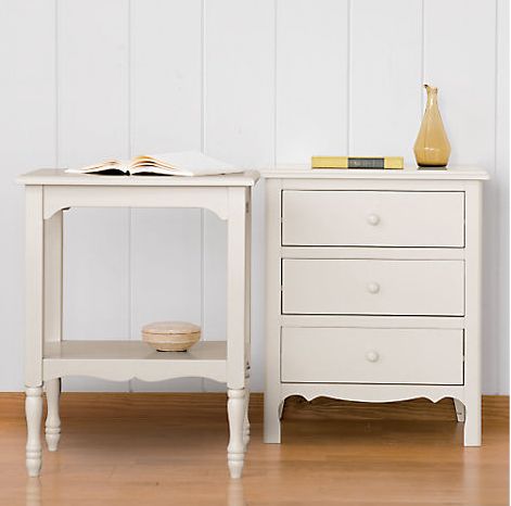
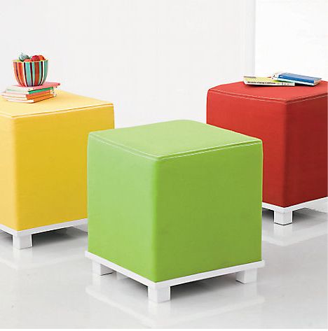
At the top of this post is the Romantic Table Collection (it now seems to have disappeared from the site) — included a couple of volumes in a manner that I suspect would have fit right in with the catalog imagery Baker pondered a decade and a half ago. Below: Vivid Ottoman. I enjoy this use of books as props, because the little stack on the left is being deployed, somewhat absurdly, as a superfluous and probably unwieldy stand for a vase. This seems to degrade the of the book, if you ask me: The possibility of these books being opened is basically eliminated; books become just things lying around to be put to some kind of “use,” however pointless.
In this entry for Colorblock Bedding (also now gone), I noticed the books under the nightstand, but …
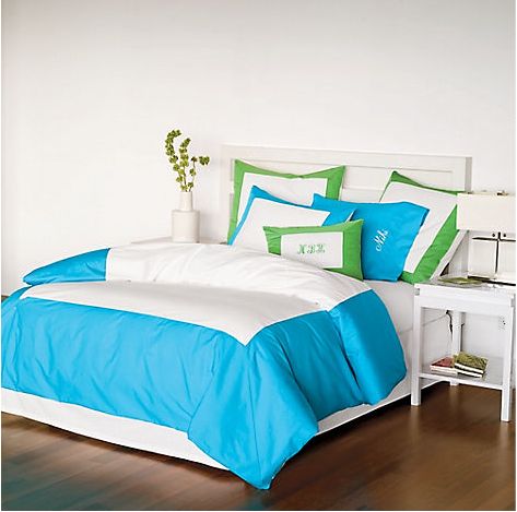
… what’s odd is that if you look closer you’ll notice that these appear to be two identical copies of each of two books. What would explain this? Baker noted certain books popping up in multiple photographs in a single catalog — but multiple copies of the same title in the same image? This seems like sloppiness on the part of the props person, no? And again: a bit of an insult to the idea of the book.

One more post related to the Baker piece next week – sorry to go on about it, but there’s so much in that seems important to the this occasional series on idea of the book.
Posted Under:
The Designed Life
This post was written by Rob Walker on April 23, 2010
Comments Off on The idea of the book: Catalog props revisited
Click for more.
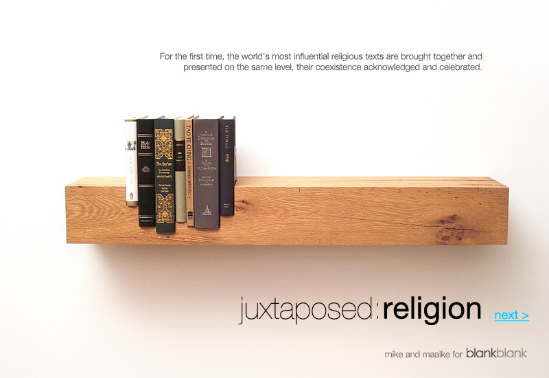
This shelf and set of religious texts are (or I guess were) sold together — the idea is the world’s religions are “presented on the same level,” according to BlankBlank. I suppose you could read the books, too; or you could simply co-sign on the general concept and treat this as a statement of your enlightenment, and leave it at that. Note that the shelf, while taking a rough-and-ready “reclaimed hardwood” form, is elegantly branded:
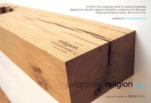
This was the first in a “series of curated bookshelves.” The second in that series: “Seven of the world’s most seminal texts on power and its relationship to the ordering of society are brought together and presented on the same level.”
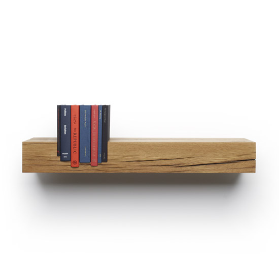
Power. Click for more.
The books: Leviathan by Thomas Hobbes, The Federalist Papers by James Madison, Alexander Hamilton, and John Jay, The Republic by Plato, On Liberty by John Stuart Mill, The Communist Manifesto by Karl Marx, The Conquest of Bread by Peter Kropotkin, and Social Justice in Islam by Sayyid Qutb.
The price is $3,000.
I’m thinking a wall-decal version might a good alternative to offer entry-level consumers. (And perhaps a small, sticker version to put on a mobile reader device?)
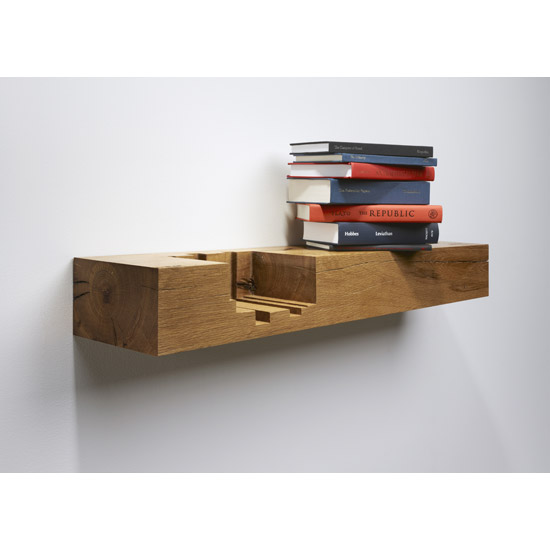 Part of a series. Thx for the tip: Harold.
Posted Under:
The Designed Life
This post was written by Rob Walker on April 23, 2010
Comments Off on Books, the idea, cont’d: the “curated bookshelf”
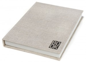 This was commented earlier, but here is BOOK.
Designed by two Minnesotan bibliophiles, BOOK began as a project to produce artist’s monographs. After designing and constructing our first book, we realized that the book jacket is a time-tested method of protection applicable to other materials beyond pages. While we believe that that BOOK is a great companion for digital devices, we also believe in the power of paper books. A portion of the profits from BOOK will be used toward producing artists’ books at Location Books.
The upshot is something that makes your e-reader look like a real book — albeit not a specific book, but just, well, the idea of a book.
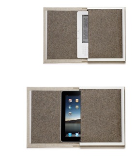 In a sense the Kindle version is a higher-end take on Busted Typewriter’s revision of books into device-holders. (You will recall the Buying In iteration.) What I’m more curious about is the iPad version. The iPad strikes me as a display device — people who buy these want to wave them around and accrue status via their prize possession, don’t they? But maybe that’s not fair. Perhaps there is a segment of the iPad early adopter public that is sheepish-to-modest about the gadget, and prefers to keep it on the low? If so, here is the $89 solution.
Posted Under:
Uncategorized
This post was written by Rob Walker on April 22, 2010
Comments Off on Books, the idea, cont’d: Disguising your Kindle .. or iPad?
 A couple of weeks ago now I mentioned Nicholson Baker’s piece, “Books as Furniture,” from the June 12, 1995 New Yorker. (Thx again Jim Rosenau.) Like much of Baker’s best work, it’s based on simply noticing something that seems curious — and going to fantastic lengths to explain what that something is all about.
In this instance, what he noticed was how frequently mail-order catalogs for furniture and clothing other lifestyle-product companies featured, as casual props in their carefully staged photographs, books. Along the way he makes several observations that, in addition to being quite relevant to this site’s occasional series on the idea of the book, are also just flat-out wonderful.
Poring over catalogs from The Company Store, Crate & Barrell, Crabtree & Evelyn, Tweeds, J. Crew, etc., Baker spotted book after book. Though their titles were often illegible, and many seemed chosen more for the color of the spine than whatever was on their pages, it was nonetheless the case that these images were
surrounding printed fiction with life-size fictional rooms that resemble our own real rooms except that they are a good deal neater, costlier, and more literate….
There isn’t a self-help book or current best-seller to be seen, because the men and women who live in the rooms of the mail-order catalogues never read best sellers. In fact, they never read paperbacks.
This leads into a highly useful history of book display, going back to the first century, “when some books were still published – that is, multiply copied – on rolls (volumina), and stored on their sides” in armoire-like cabinets that were the precursors to the bookcase, “with little tags hanging from their ends which bore their titles.” A Pottery Barn catalog perused by Baker alludes to this history in the blurb for an armoire. “But can its copywriter truly believe that anyone is now going to keep a book collection behind the closed pine doors of a nine-hundred-and-ninety-nine-dollar cupboard?” He answers: No.
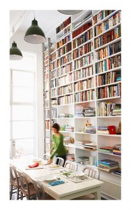
Catalog designers know perfectly well that books, if we are fortunate enough to own any, should be out there somewhere, visible, shelved in motley ranks or heaped on tables as nodes of compacted linearity that arrest the casual eye and suggest wealths of patriarchal, or matriarchal, learnedess.
Unlike other collectibles, books “represent a different order of plenitude,” Baker writes, one that encompasses “the camel caravans of thought-bearing time to read them through.” And he quotes William Gladstone arguing against a fashion for ornamental bookcases; those objects should remain plain, Gladstone says, because books “are themselves the ornament.”
Is the fate of this ornament at long last threatened? That’s been an undercurrent of this series, I suppose. Or maybe it’s more accurate to say that I think this series has been suggesting that the ornament will survive, but will also evolve. Whether books have a future or not, I think the idea of the book does.
More on this tomorrow.
Marginal Revolution points to this:
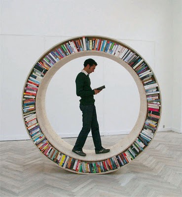
No attribution at present for artist/designer. Click pic for more.
That’s from a blog called Bioephemera, which asks its readers if anybody knows who made thing [UPDATE April 23,2010: Core77 mentions this object and its creator: David Garcia], and also points to this somewhat similar item:
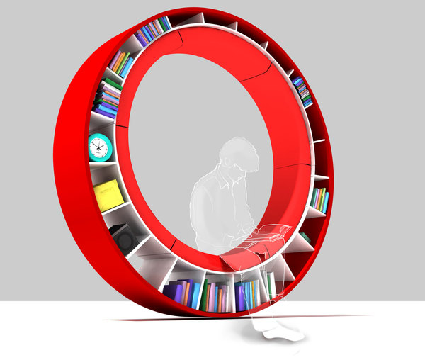
By Irina Zhdanova, click for detiails.
This post is part of a series.
Monocle has launched a “book collection,” with a reprint.
First in the series is a limited edition of Alain de Botton’s The Pleasures and Sorrows of Work. Originally published by Penguin, each book is printed on (retin-a) quality paper, bound in linen and signed by the author. They also contain an exclusive DVD interview.

£60
I’m quite interested in the idea of a sort of fancy, limited version of a book that was actually published earlier by a mainstream house. What do you think of that concept?
It’s a little odd in that the conventional thought would be to do this concurrently (or to reprint a more obscure “forgotten,” older book), I think. But I think this timing, as a kind of almost-belated endorsement, is rather interesting.
That said, Caleb Crain absolutely kicked the shit out of this particular book in an NYT review last year. But I suppose that’s neither here http://pted.org/Propecia.php nor there.
Part of a series.
Via Harold Check. Part of a series.
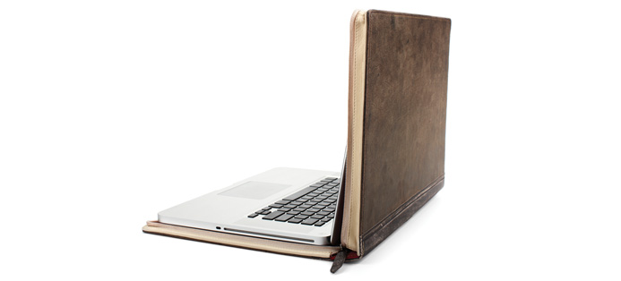
BookBook, click for more.
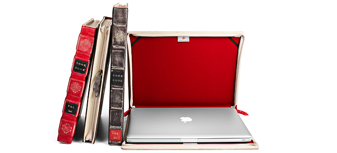
BookBook, Click for more.
Posted Under:
The Designed Life
This post was written by Rob Walker on April 18, 2010
Comments Off on Books, the idea, cont’d: Laptop-disguising bookform
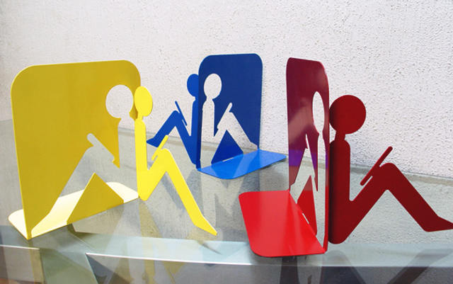
By Cubo3 via BoingBoing, click for more
BoingBoing published this. At first I was interested in bookends depicting someone reading. Then I wondered: What are they reading? The comments suggest others had the same thought. Is it a Kindle or an iPad? somebody wondered. Someone else countered, amusingly, that those devices require hands to use, and these figures lack hands or even arms. So perhaps it’s flat-laid book of poetry. Somebody else noted that some of the angles actually suggest a sort of spy-holding-a-gun pose. And finally: “Those are velcro-backed ebook readers. Stick right to your lap, no hands required. To turn the page, lean forward and tap with your nose.”
I suppose even if the figures are reading electronic devices, these items still require physical books for proper use. Unless we some day have so many devices they are shelved and displayed. Hm.


 "
"








 Kim Fellner's book
  A
A