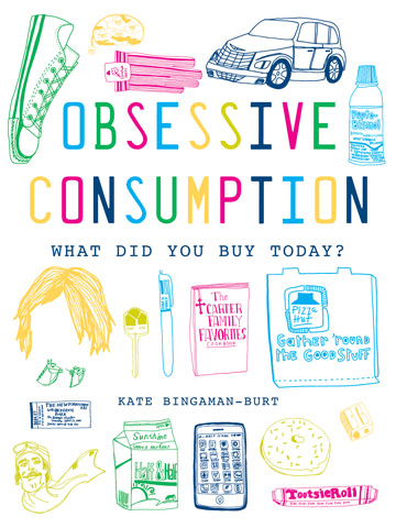
Kate Bingaman-Burt’s book. (Click pic for details.)
So above is the cover of Kate Bingaman-Burt’s new book. Below are some of the interpretations by assorted artists who love her.
I have NO IDEA how it feels to be on the receiving end of an astonishing creative outpouring such as this.
AMAZING.
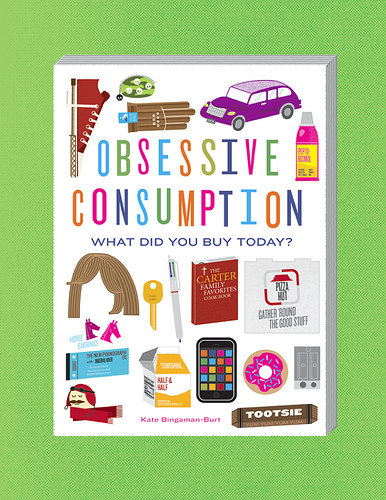
Frank Chimero
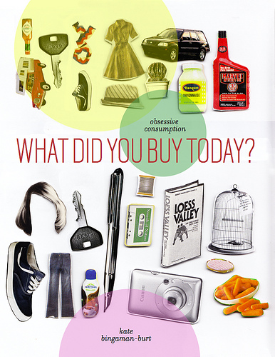
Lis Charman
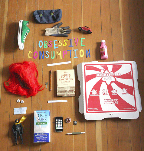
Lucy Berkley
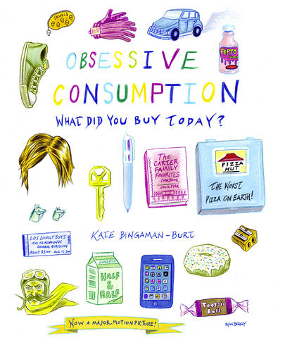
Ryan Berkley
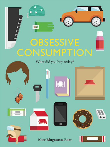
Always With Honor

Lis Charman

Jason Sturgill
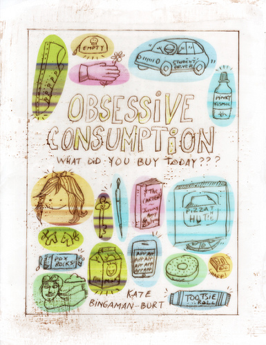
Amy Ruppel
Posted Under:
Artists,
Pleasing
This post was written by Rob Walker on April 6, 2010
Comments Off on Pictures of Stuff: pictures of pictures of stuff edition
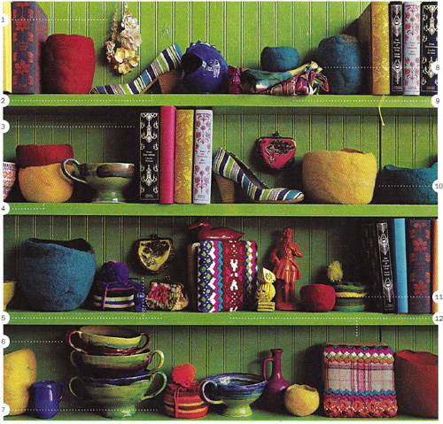
Via Jezebel, click for more.
In a thoughtful comment to a December 2009 post on Significant Objects (in which I noted examples of art made from books, and ruminated on the possibilities of “upcycling with words”), Jim Rosenau mentioned a Nicholson Baker New Yorker essay called “Books As Furniture.” I finally got around to tracking that down and reading it this weekend, and I must thank Mr. Rosenau. The piece, from 1995, is amazing.
It’s in the New Yorker archive, here, but I guess you have to be a subscriber to access it. It’s going to take me more than one post to deal with all the great observations in this essay (are you out there RAOJ?) but by chance there’s opening to get started today.
In a nutshell, Baker starts noticing the books used as props in home decor catalogs, and looks into it. And, you know, he does that Nicholson Baker thing, of learning a shocking amount, conveying it to us with one insight after another, and basically just making the whole experience a reading pleasure. More specifics in the days ahead, but in the short term I happened to become aware by coincidence just today that Jezebel (a site I visit rarely, not that there’s anything wrong with it) has a kind of recurring feature that involves … scrutinizing catalogs. The image at the top of this post, for instance, is from an Anthropologie catalog.
You’ll notice, of course, the books, looking quite pleasing there with all the other stuff on that just-so shelf. But those aren’t props (or at least not just props) like the books that Baker noticed in various catalogs: Anthropologie evidently actually sells ’em:
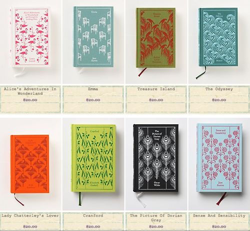
Anthropologie book selection. Click for more.
And let’s face it: They look great.
More on Baker’s 1995 piece as this series continues.
This Retro Thing post caught my eye:
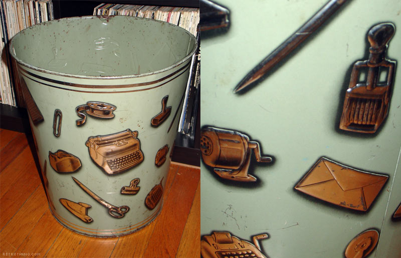
Via Retro Thing. Click to read Retrothing post.
It’s not just a thing decorated with images of other things, it’s a thing for discarding things, decorated with images of things.
This post is part of an occasional series.
Posted Under:
Things/Thinking
This post was written by Rob Walker on April 5, 2010
Comments Off on Pictures of Stuff: Stuff on an object
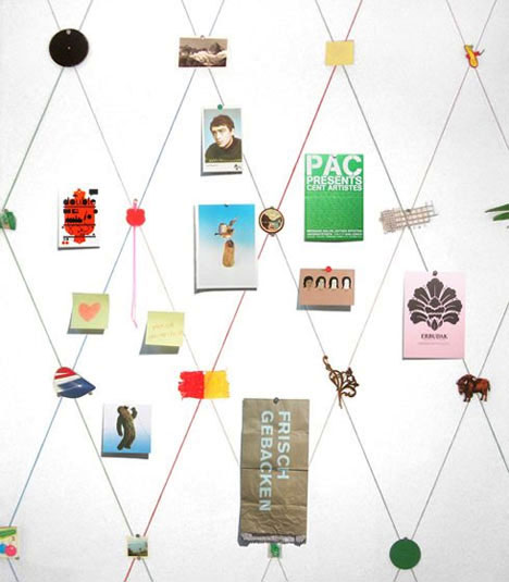
By Sarah Kueng. Click for more info.
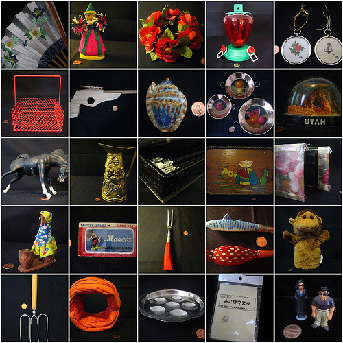
Creator Sarah Kueng writes: “I composed the wallpaper from everyday objects and found objects. The objects are arranged in a grid designed to generate calm. The wallpaper inspires the viewer to add personal objects. The result is an interesting mixture of new and old, and two and three dimensions.”
Via Core77’s Lisa Smith, who has more to say, here.
Pictures of Stuff is an occasional series.
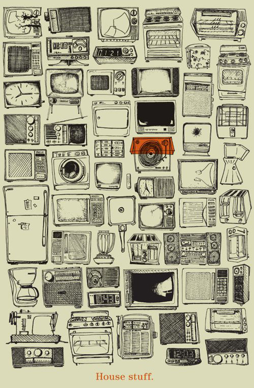
Via The Design Cubicle
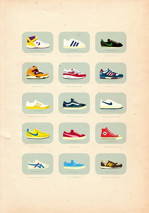
Via The Design Cubicle
Both from this post (artists not named). Pictures of Stuff is an ongoing series.
Posted Under:
The Designed Life
This post was written by Rob Walker on March 30, 2010
Comments Off on Pictures of Stuff, cont’d: house stuff; sneakers
This is a departure for the Pictures of Stuff Series, but having just posted those images of stuff shot from underneath, this seemed worth mentioning: Artist Simon Menner would like to do a series of images of the backs of famous paintings, like the one below. But as his statement explains: “Unfortunately it is almost impossible to get any permission to take such pictures. So I will see if this project ever continues. I haven´t lost my optimism yet, so currently I still say that it is ‘in progress.'”
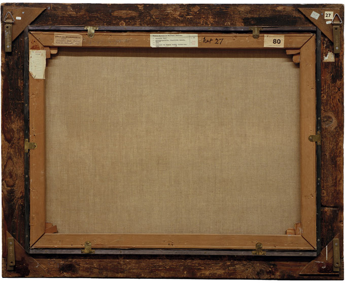
By Simon Menner: The back of Salvador Dali's "Portrait der Madame Isabell Styler-Tas," 1945.
Via Junk Culture.
Posted Under:
Artists
This post was written by Rob Walker on March 29, 2010
Comments Off on Pictures of stuff, cont’d: The back of art
Randy Ludacer/Box Vox points to the work of Brock Davis, which includes some really great pictures of stuff taken from below. (“In designing packages,” Ludacer writes, “we usually think in terms of how a product will look “on the shelf” — but this is surely an unforeseen angle.”)
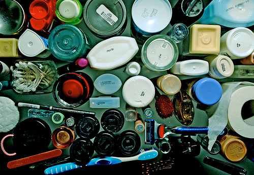
By Brock Davis; click pic for more.
Apparently Davis set out to do “One piece of creative work made every day for 365 consecutive days,” cataloging the results here. A mini-series of shots-from-underneath is just one of many ideas he explored; if you check out the full results search for “under” to see more of these. But check it all out while you’re there.
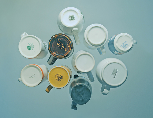
By Brock Davis. Click pic for more.
I had to include coffee mugs. And of course I have to throw in one more, since it involves books.
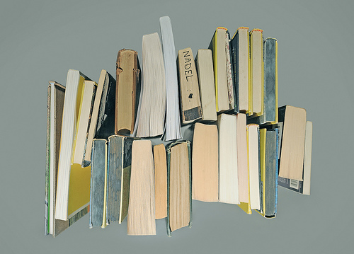
By Brock Davis. Click pic for more.
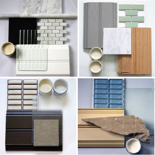
Poppytalk has this: You can order for $59 a batch of interior design materials samples, from desiginabag.com. Stuff in its rawest form. What to do with it when you’re done? Pretty, though.
Posted Under:
Things/Thinking
This post was written by Rob Walker on March 22, 2010
Comments Off on Pictures of Stuff, Cont’d.: Samples
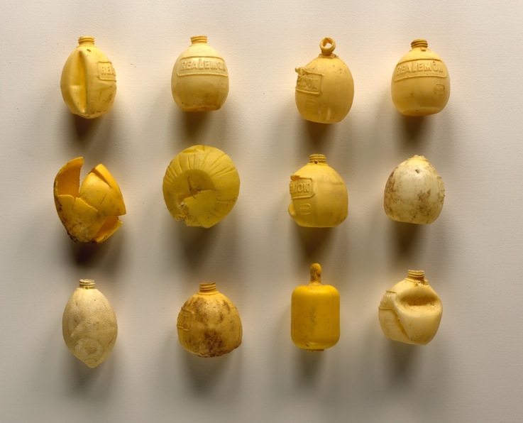
Judith Selby Lang & Richard Lang, click pic for more.
The artists write:
In 1999 we started collecting plastic debris—carrying it away by the bagful— all from Kehoe Beach, a remote stretch of the Point Reyes National Seashore, in Northern California. Certain items would catch our interest: milk jug lids, combs, toy soldiers, disposable lighters, cheese spreaders from lunch snack packs. We were attracted to things that would show by their numbers and commonness what is happening in the oceans around the world.
The plastic we continue to find is not left by visitors; it is washing up from the ocean. Back in our studios we clean, sort and categorize the pieces according to color and kind. We use the plastic to make artworks including large sculptures, installations, photo tableaus and jewelry.
This via the consistently impressive Junk Culture. Does it fit with Joshua Glenn’s “significant objects meme“? I don’t know. Nice connection here though between this work and the activities of Underwater New York, one of our S.O. collaborators.
Posted Under:
Things/Thinking
This post was written by Rob Walker on March 19, 2010
Comments Off on Pictures of Stuff, cont’d.

I really have no information on this, at all.
Posted Under:
Things/Thinking
This post was written by Rob Walker on March 16, 2010
Comments Off on Pictures of Stuff, cont’d.
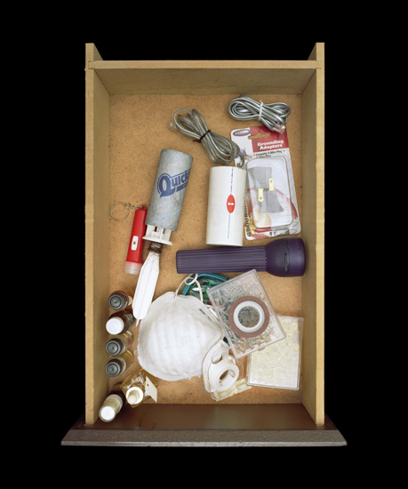
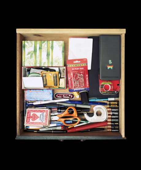
“Junk Drawers” by Paho Mann, via Junk Culture.
Posted Under:
Artists
This post was written by Rob Walker on March 13, 2010
Comments Off on More pictures of stuff
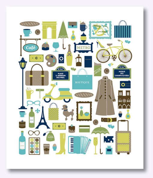
Flowers In May (click pic for more info)

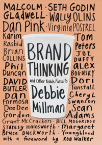
Kate Bingaman-Burt's book. (Click pic for details.)

Objectified Poster. (Click pic for details.)
Posted Under:
The Designed Life
This post was written by Rob Walker on March 12, 2010
Comments Off on Pictures of stuff, cont’d
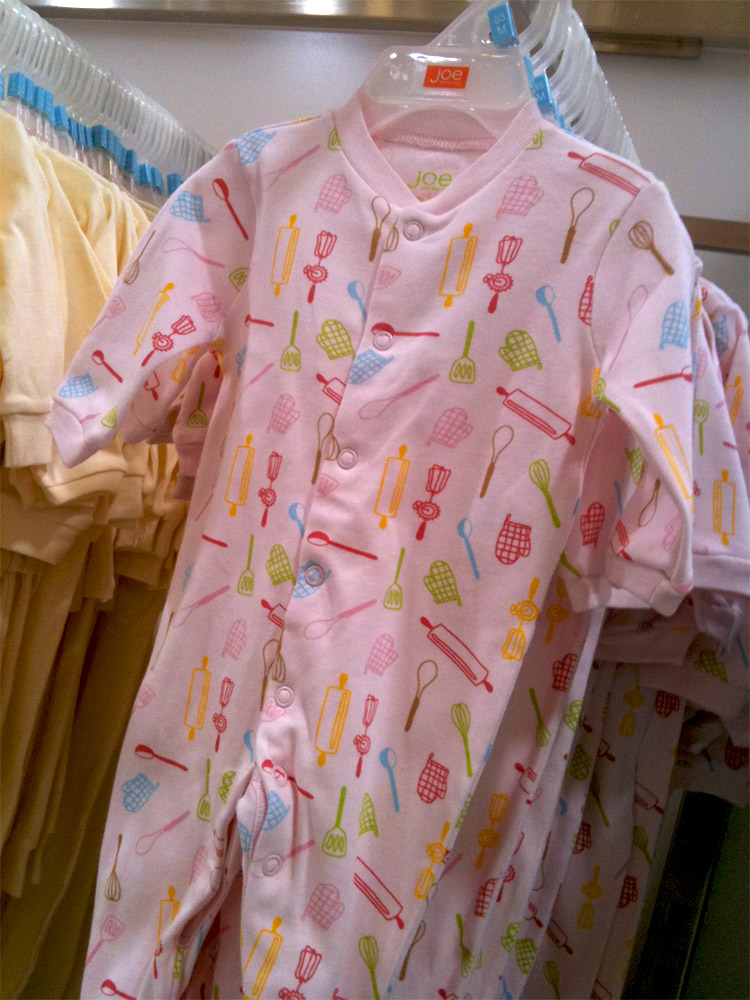
Here we have pictures (okay, drawings) of stuff as a design motif. What does this stuff communicate? Sociological Images, from which I have stolen this image, comments: “Just a reminder: being a girl means wearing pink and thematically attiring yourself in cooking and baking implements!”
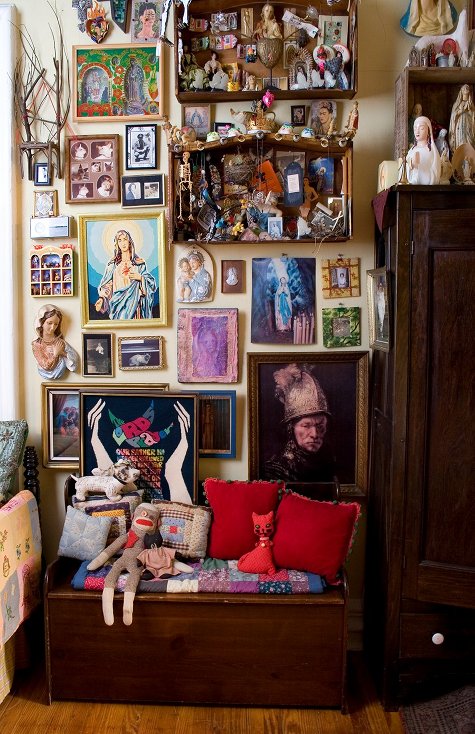
Click the pic to see more on Design*Sponge
When Unhappy Hipsters started making the rounds, I linked to it from the Consumed Facebook page, where Braulio alerted me (thanks again) to this Psychology Today column by Ingrid Fetell, asking: “Are there elements of modern design that inherently make us feel gloomy?” Her answer klonopin is that, in fact, there might be.
Modern design was born out of a desire to leave (https://www.pawsgistclinic.org.uk/stromectol-ivermectin/) behind the ornamentation and excesses of 19th century Europe. In essence, it’s a stripped back, pared down style of design, favoring clean, often angular lines, neutral colors in tones of gray and beige, bare materials, and a general sense of spareness and minimalism….
She’s generalizing, of course, and at first that doesn’t sound so bad. But then she notes research on emotional responses to color, and angular vs. curved forms. The short summary would be that many of the tropes of “modern” design are at odds with good vibes. “I think,” she writes, “that modernism’s restrained quality is fundamentally in tension with the idea of delight. Delight is an emotion of abundance — a celebration of sensation and richness. Delight and joy are primally connected to wellness, and wellness in nature is lush, plump, vibrant, and bountiful.” (Fetell also has a project/blog called Aesthetics of Joy, here.)
I am somewhat cautious about that connection between delight and abundance. Buying into that idea full-on would be emotionally catastrophic — I mean, maybe those “hipsters” are unhappy, but watch an episode of Hoarders and decide for yourself how delightful that abundance seems.
But on some level I think Fetell has a point. Just yesterday I was browsing Design*Sponge and I was struck by the “sneak peek” pictures of Michael Quinn’s apartment. (Two examples, above and below.) I wrote here earlier about how much I enjoy D*S’s “sneak peek” series pictures: “They’re interesting because they’re so unlike the spare and clinical celexa interiors often featured in more mainstream Design Think contexts, such as certain shelter magazines (not to mention catalogs) and the like, where the decor is always minimal, and there’s no clutter beyond one or two art books.”
Misgivings aside, then, I’d still rather look at these pictures than what I see celebrated in most sharp-and-clean-focused “good design” sources.
The combination of Fetell’s piece and these D*S images actually brought to mind a number of topics I’ve pondered here in the past — the visual jumble of MySpace, the more recent post about groups of stuff, and of course the significance of otherwise-oddball-seeming-objects.
What do you think? Is clean, spare design a bummer? Is the notion of clutter-abundance delightful — or a rationale that dead ends unpleasantly?
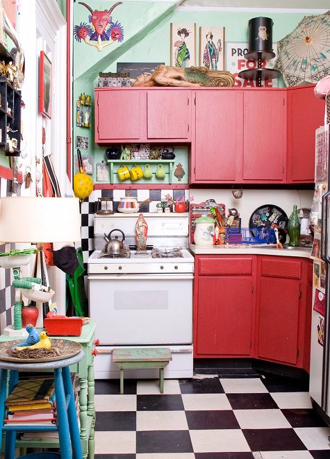
Click the pic to see more on Design*Sponge
As some of you know, we’ve launched Significant Objects — Volume 3. This series of objects/stories/auctions raises money for Girls Write Now, which is a great organization.
This week we’ve published stories by Jennifer Weiner, Padgett Powell, David Levine, and Charles Baxter (and tomorrow Jim Hanas). Much, much more to come, including many team-ups and special events.
Please check it out and help us spread the word.
Thanks.
Posted Under:
Things/Thinking
This post was written by Rob Walker on February 25, 2010
Comments Off on Significant Objects, v3


 "
"








 Kim Fellner's book
  A
A