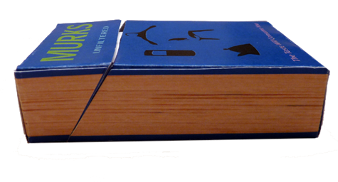
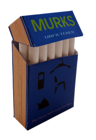
Earlier, the new yet surprisingly comprehensive imaginary-branding-related blog Not A Real Thing made available a template inviting readers to invent their own imaginary cigarette brand. I mentioned it, and to my (happy) surprise, I see that Justin Kirkwood himself has offered up Murks. As he notes, the design is inspired by this site’s rather obsessive cataloging of the idea of the book. (Click either pic for more, and to see his design for a made-up brand of smokes from his spec-screenplay days, Blonde Horses. Nice stuff.)
And yes, that’s right — Murks are unfiltered. The type along the bottom reads: “The Taste Will Consume You.” Yes.
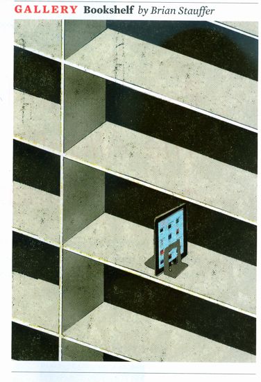
Spotted in the April 2010 issue of The Atlantic (go buy a copy so they don’t make me cease-and-desist this image!). Part of a series.
Posted Under:
Things/Thinking
This post was written by Rob Walker on April 12, 2010
Comments Off on Books, the idea, cont’d: Amusing Atlantic cartoon
Friend of Murketing Randy Ludacer points out two pieces by Steve Roden that are relevant to this site’s occasional series on the idea of the book.
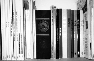
Steve Roden. Click for more.
From 1999, a piece called Observatory.
the piece was inspired by a quote from joseph cornell’s diary regarding the 5 things he always saw from his kitchen window. he oftern referred to his kitchen as his ‘observatory’. 5 tape loop compositions were composed; each using one of cornell’s 5 things seen. there were electronically transformed tape loops from the sounds of birds, trees, sun (in this case the sounds of the sun harnessed through a magnifying glass burning a contact mic), snow (tv static) and rain.
each of the 5 loops was placed in a cassette player that was concealed in a hollowed out book. each book had a speaker embedded in its spine, so that the audio equipment was concealed and the sounds seemed to quietly eminate from the books. MORE
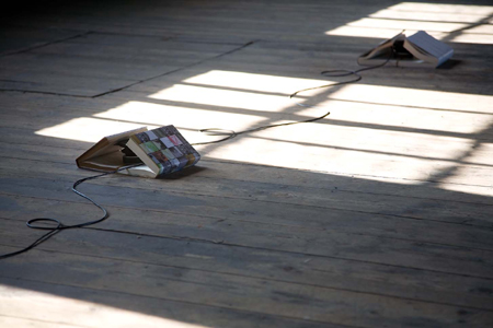
Steve Roden. Click for more.
And from 2008: “When books are like butterflies.”
i began by notating every sound in the book as well as every color that appears in sequence, and used these lists to generate a sound work, a text work, and a set of images. the installation consisted of a series of 15 sculptural forms, each using two books and an audio speaker. the text and images exist in the form of printed dust jackets which cover the books, and visually frame the sound as it eminates from the speaker. the text follows the description of every sound in the book, in sequence, with each text also following the color sequence of the book. the images are mostly background images from victorian photographs i have collected over the years, that somehow relate to the generator of every sound in the text (such as swan’s wings, or a bell). MORE
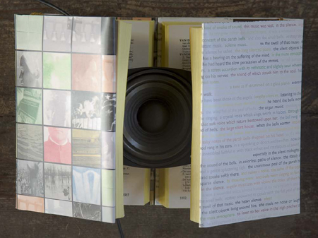
Steve Roden. Click for more.
Posted Under:
Artists,
Music
This post was written by Rob Walker on April 8, 2010
Comments Off on The idea of the book, cont’d: As source of music
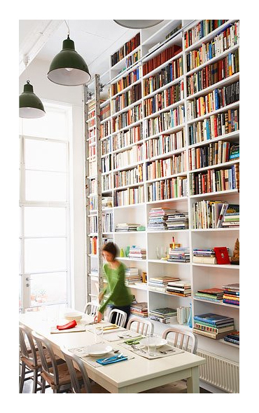
Dining room designed by Diane Bergeron Interiors. Click for more info.
Posted Under:
The Designed Life
This post was written by Rob Walker on April 7, 2010
Comments Off on Books, the idea: The classic book wall
This Smithsonian.com writeup on Penguin paperbacks makes some interesting observations about how their success was tied to their object-ness — both in terms of design and branding:
Penguin’s graphic design played a large part in the company’s success. Unlike other publishers, whose covers emphasized the title and author of the book, Penguin emphasized the brand. The covers contained simple, clean fonts, color-coding (orange for fiction, dark blue for biography) and that cute, recognizable bird. The look helped gain headlines. The Sunday Referee declared “the production is magnificent” and novelist J. B. Priestley raved about the “perfect marvels of beauty and cheapness.”
Posted Under:
The Designed Life
This post was written by Rob Walker on April 6, 2010
Comments Off on Books, the idea: “Beauty and cheapness”
For obvious reasons the discussion of the idea of books has focused quite heavily on the e-variety these last few days, as speculation abounds over The Meaning of the iPad For The Printed Word.
The Telegraph reports on a book that will have a sort of instant sequel “assembled from the best comments by readers of” the author’s Website. A publishing type who is involved comments:
With devices like the iPad nearly at our shores and more routes for communication than ever before, I believe that especially in non-fiction, the distance between the author and reader should start to disappear. Authors will become more like curators and take influence from their readers’ suggestions during and after they have written their work.
Meanwhile, Nicholas Carr suggests that what we’re headed for is books becoming multimedia apps, in a sort of post-reader world. He quotes some other publishing-world guy:
“The definition of the book itself seems up for grabs,” he said at a recent media industry powwow. Unlike traditional e-book readers, which had a rather old-fashioned attachment to linear text, the iPad opens the doors to incorporating all sorts of “cool stuff,” Makinson continued. “We will be embedding audio, video and streaming into everything we do.” He foresees sprinkling movie clips among Jane Austen’s paragraphs in future editions of “Pride and Prejudice.”
Hm. What do you think?
Perhaps I’ll “curate” the best of your responses into a follow-up post!
With video?
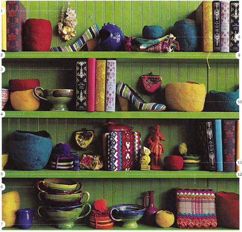
Via Jezebel, click for more.
In a thoughtful comment to a December 2009 post on Significant Objects (in which I noted examples of art made from books, and ruminated on the possibilities of “upcycling with words”), Jim Rosenau mentioned a Nicholson Baker New Yorker essay called “Books As Furniture.” I finally got around to tracking that down and reading it this weekend, and I must thank Mr. Rosenau. The piece, from 1995, is amazing.
It’s in the New Yorker archive, here, but I guess you have to be a subscriber to access it. It’s going to take me more than one post to deal with all the great observations in this essay (are you out there RAOJ?) but by chance there’s opening to get started today.
In a nutshell, Baker starts noticing the books used as props in home decor catalogs, and looks into it. And, you know, he does that Nicholson Baker thing, of learning a shocking amount, conveying it to us with one insight after another, and basically just making the whole experience a reading pleasure. More specifics in the days ahead, but in the short term I happened to become aware by coincidence just today that Jezebel (a site I visit rarely, not that there’s anything wrong with it) has a kind of recurring feature that involves … scrutinizing catalogs. The image at the top of this post, for instance, is from an Anthropologie catalog.
You’ll notice, of course, the books, looking quite pleasing there with all the other stuff on that just-so shelf. But those aren’t props (or at least not just props) like the books that Baker noticed in various catalogs: Anthropologie evidently actually sells ’em:
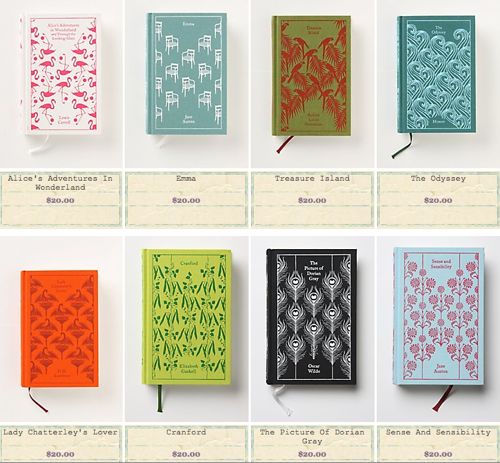
Anthropologie book selection. Click for more.
And let’s face it: They look great.
More on Baker’s 1995 piece as this series continues.
Via Book of Joe:

Workaholic Pillow. Click for more.

Workaholic Pillow. Click for more.
Part of an occasional series.
Also added, of course, to Things That Look Like Other Things.
Posted Under:
Things/Thinking
This post was written by Rob Walker on April 3, 2010
Comments Off on The idea of the book, cont’d: As pillow
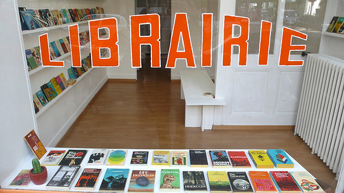
LIBRARIE. Click for more info
“CONRAD BAKKER: Untitled Project: LIBRAIRIE [Geneva] is a simulated bookshop made of hundreds of hand carved and painted copies of used paperback books from the 1960’s and 1970’s whose subjects range from social issues and existential philosophies to DIY crafts and self improvement. These representations of vintage paperbacks reveal their status as public things in the gathering of persons/things around a specific issue or matter of concern. The very space of the constructed bookshop/librairie reiterates the objective of public things as it becomes a literal platform for considering the relationships between persons, things and ideas.”
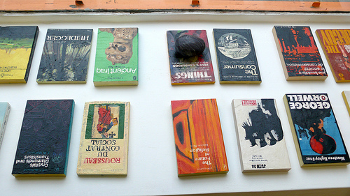
LIBRARIE. Click for more images.
Posted Under:
Artists
This post was written by Rob Walker on March 31, 2010
Comments Off on The idea of the book, cont’d: Book-like sculptures
NYT:
Among other changes heralded by the e-book era, digital editions are bumping book covers off the subway, the coffee table and the beach. That is a loss for publishers and authors, who enjoy some free advertising for their books in printed form: if you notice the jackets on the books people are reading on a plane or in the park, you might decide to check out “The Girl With the Dragon Tattoo” or “The Help,” too.
And:
Some readers expect makers of electronic devices to add functions that allow users to broadcast what they’re reading. “People like to show off what they’re doing and what they like,” said Maud Newton, a popular book blogger. “So eventually there will be a way for people to do that with e-readers.”
Perhaps what will happen with e-readers will be an option for displaying the cover of the book you want people to think you’re reading — a mobile version of the digital “bookshelf” I proposed here.
See also: “Destroyed Copy of ‘Buying In’ as Kindle Holder.”
This post is part of an occasional series.
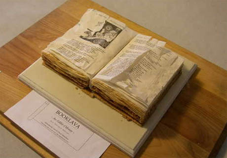
“Booklava,” by Chuck and Cara Matteliano, the winner at the 2009 Western New York Book Arts Collaborative Edible Books Contest
More on Edible Geography. Via @nicolatwilley.
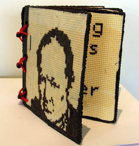
“Eating Words – Winston Churchill,” by Richard Kegler, 2009 (wafer board, chocolate, Twizzlers)
Much more at the Edible Books Gallery.
Posted Under:
Things/Thinking
This post was written by Rob Walker on March 30, 2010
Comments Off on The idea of the book, cont’d: Edible
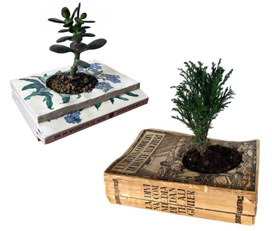
As planters.
Assessment: “Here’s a line of brilliant eco-planters: recycled book pots from Italy’s Gartenkultur. The concept — old books with holes carved into the middle to accommodate soil and a small houseplant — is simple enough (perhaps even enough for a DIY job) and quite beautiful.” Via.
Posted Under:
The Designed Life
This post was written by Rob Walker on March 29, 2010
Comments Off on The idea of the book, cont’d: As planter
Randy Ludacer/Box Vox points to the work of Brock Davis, which includes some really great pictures of stuff taken from below. (“In designing packages,” Ludacer writes, “we usually think in terms of how a product will look “on the shelf” — but this is surely an unforeseen angle.”)
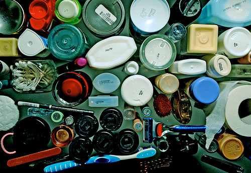
By Brock Davis; click pic for more.
Apparently Davis set out to do “One piece of creative work made every day for 365 consecutive days,” cataloging the results here. A mini-series of shots-from-underneath is just one of many ideas he explored; if you check out the full results search for “under” to see more of these. But check it all out while you’re there.
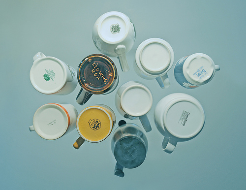
By Brock Davis. Click pic for more.
I had to include coffee mugs. And of course I have to throw in one more, since it involves books.
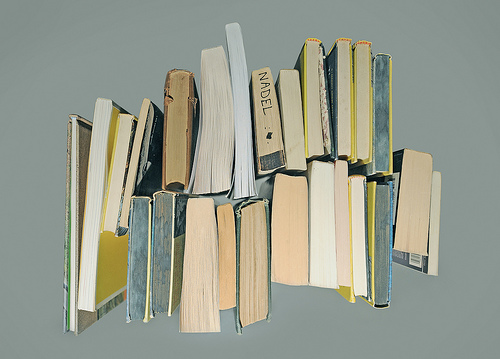
By Brock Davis. Click pic for more.
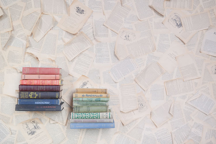
Click for more details
This series of posts started with book wallpaper; now Design*Sponge notes this DIY tutorial on how to make your own. Ruche explains: “We picked up some used cheap paper back books at the thrift store. You don’t necessary need old antique books, just books with pages with a yellow tint. (If you’re wondering, we used Secret Garden, 3 Ninjas, and some other one. haha) We used a paint roller to roll “Sta-Fold” (liquid starch that use for iron clothes) all over the wall, stuck old book papers on wall, and rolled another coat of “Sta-fold”. Work one section at a time. Wait for it to dry..and TADA!”
The D*S post notes the use of this look in a fashion shoot for a clothing brand (below).

By Stephanie Williams. Click for more details.
Posted Under:
DIYism,
The Designed Life
This post was written by Rob Walker on March 23, 2010
Comments Off on The idea of the book, cont’d: DIY book-page wallpaper
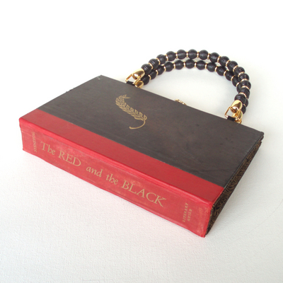
Stendahl's novel as handbag, by Rebound Designs. Click picture for more info.
To go with necklace and ring?
Via Slog, where you can see a wallet made out of a “damaged paperback.”
(Thx: Andrew W!)
Posted Under:
Things/Thinking
This post was written by Rob Walker on March 23, 2010
Comments Off on The idea of the book, cont’d: Converted to purse or wallet




 "
"






 Kim Fellner's book
  A
A