This earlier post linked to work by Jane Mount, but only in passing, and it’s something I wanted to return to. So, here’s something more specific:
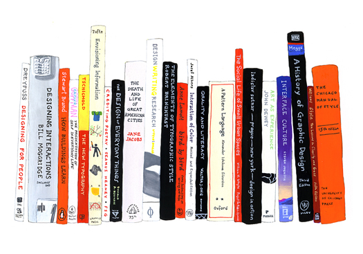
"Early version" of Danzico books portrait by Jane Mount; click for details.
Mount paints “portraits of people’s bookshelves” (or rather, of the book spines on them). In this case she asked Liz Danzico if she could paint a portrait of some of her design books. More info here.
Posted Under:
Artists
This post was written by Rob Walker on March 22, 2010
Comments Off on The idea of the book, cont’d: Ideal bookshelf
The Book: Terms Of Service, by Matthew Battles:
I. Privacy
What takes place in the exchange between your brain and the contents of The Book is your exclusive private concern. The Book will never download the contents of your brain, either whole or in part.
II. Intellectual Property
A. The Book often contains ideas and information created by others. The continued appearance of such ideas and information depends on the recognition of a limited property right enjoyed by creators of said ideas and information. But recognizing that the terms of service also require access to ideas and information and the ability to repurpose them in the creation of new works, the creator’s monopoly right shall be understood to be limited and circumscribed.
Continue here. Or check out the video/movie interpretation, here.
I have a feeling David Shields would be particularly into this, no?
One more bit I have to quote, given the nature of this site:
V. Special Provisions
A. The Book will not place ads in your brain, nor seek to control placement of such ads by others.
Posted Under:
Pleasing
This post was written by Rob Walker on March 18, 2010
Comments Off on The idea of the book, cont’d.
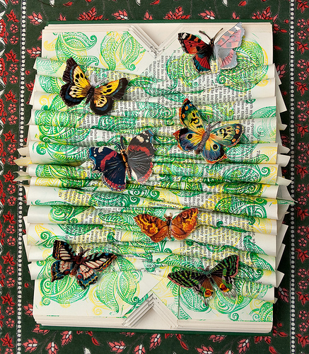
Rachel Ashe; click picture for details.
James informs me of Rachel Ashe’s “altered book” works. The materials list for this one includes glue, rubber stamp and ink, and “book.”
Posted Under:
Artists
This post was written by Rob Walker on March 17, 2010
Comments Off on The idea of the book, cont’d.
In all cases, you can click on the image for more info:
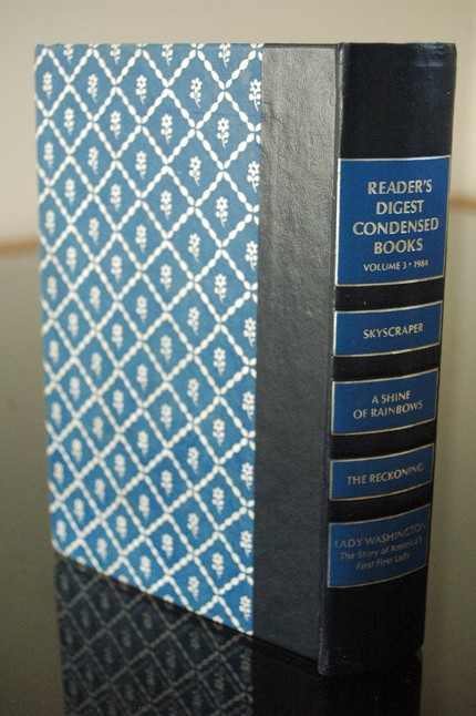
This Etsy seller, as I understand it, uses the virtual remains of books that are crumbling into nothingness as material to create new, hand-bound notebooks. In other words, the material nature of the book is redeemed, and extended.
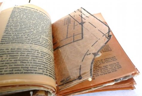
“Abstract Beeswax Book,” from Tocornal Design. It’s made from thread, beeswax, and “pages from 7 different sources.” Via Design*Sponge.
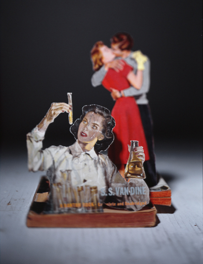
Garth reminds me of the work of Thomas Allen — I think I’ve highlighted it in the past, for different reasons, but I’m definitely a fan.
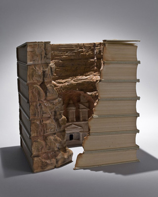
And Zeke points me toward the work of Quebecois artist Guy Laramée, “who sandblasts encyclopedias and then gives them evocative names.”
[Update: Some clarity on the credits thanks to a just-received comment.]
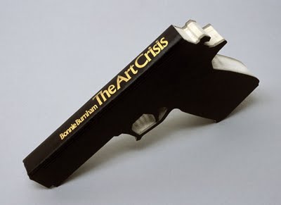
Robert The
Via this site.
Robert The (for Tobias Wong — see comments)
Via me.
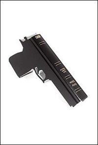
Robert The (for Tobias Wong see comments)
Via this site.
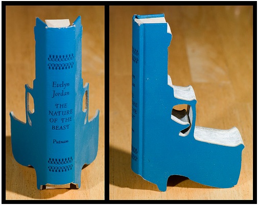
Artist unknown. Unless you know. In which case speak up.
Via Hilobrow.
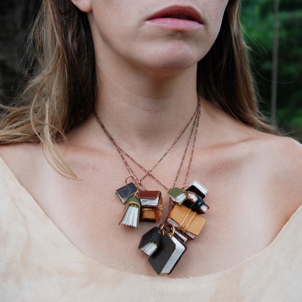
Click for details.
To go with the earlier book ring? (Thx: Susan C!)
Posted Under:
Things/Thinking
This post was written by Rob Walker on March 12, 2010
Comments Off on The idea of the book, continued
Since the destruction of books and/or use of books as sort of raw material to build something else, has been a theme of some recent posts, here are some different sorts of visual approaches to the idea of the (https://comfortdentalcareofbrookline.com/ativan-2-5mg-lorazepam-online/) book:
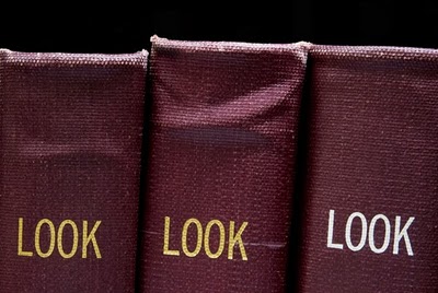
Mickey Smith / click pic for more.
Via Junk Culture: “The act of hunting for and photographing bound periodicals and journals is fundamental to Mickey Smith‘s process. She does not touch, light, or manipulate the books and words – preferring to document them as found in the stacks, created by the librarian, and positioned by the last unknown reader.”
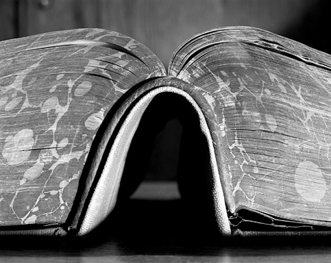
Abelardo Morell / click pic for more.
And E has reminded me of this series by Abelardo Morell.
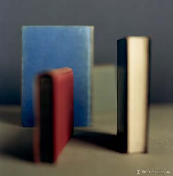
Victor Schrager / click pic for more.
… as well as this one by Victor Shrager.
Finally, while randomly poking around on this a little more I encountered, via this site, the “Sorted Books” project by Nina Katchadourian. “The process is the same in every case: culling through a collection of books, pulling particular titles, and eventually grouping the books into clusters so that the titles can be read in sequence, from top to bottom.” To wit:
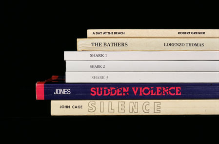
Nina Katchadourian / click pic for more.
Posted Under:
Artists
This post was written by Rob Walker on March 11, 2010
Comments Off on The idea of the book, continued some more.

A bit late on this, but over the weekend Virginia Heffernan’s column was a consideration of physical books by a professed ebook fan. Jumping from Walter Benjamin’s “Unpacking My Library: A Talk About Book Collecting,” which rhapsodizes about the the amassing even of books you never read, she writes:
If he says not reading books can be as sophisticated and European as reading them, I believe him, and I will try to think of my books as Sèvres china. But Sèvres china, if I had any, would be for display on its days off, wouldn’t it? So how do I display or otherwise admire all these books I keep buying for the Kindle?
Unpacking my Kindle library, I click “menu” on my screen and find . . . a list. First, the words “The Happiness Project,” the title of a book by Gretchen Rubin, in stout dark gray lettering, underscored by a lighter, less stout line.
This might be depressing. I can’t tell if I’m supposed to consider this underlined title to be the “book” I ordered from Amazon. Maybe it’s more like a catalog listing. If I click on it, I’ll get to the words in the book. Maybe it’s analogous to a book’s spine.
I want to rhapsodize, as Benjamin does, when he remembers the tactics he employed to acquire the book “Fragmente aus dem Nachlass eines jungen Physikers” (Johann Wilhelm Ritter, 1810) after a Berlin auction. But the only memory I have of purchasing “The Happiness Project” is no memory at all….
Read the rest here. It’s interesting. See also if you missed it the Murketing post on book spines as wallpaper, here.
On a slightly related note, I offered some examples a while back of artists and designers making things out of books in a post on Significant Objects. Two more examples here: the one above by Paul Octavious, via SwissMiss, and the other by Matej Kren, below, via Book Of Joe.
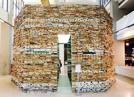
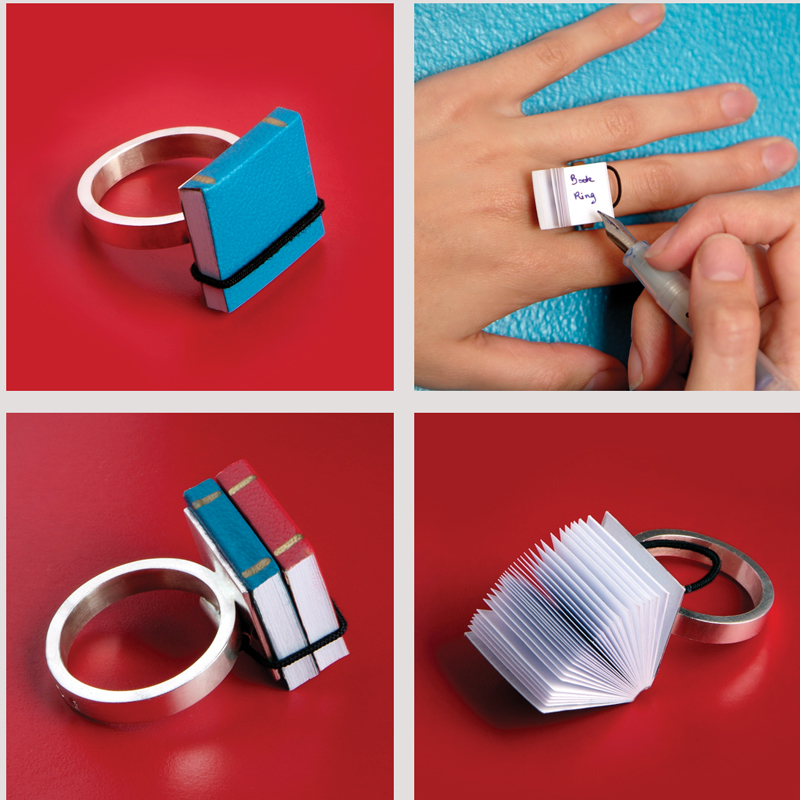
This is the Book Ring, from Ana Cardim. Just a quasi-related follow to this post.
Posted Under:
Just Looking
This post was written by Rob Walker on March 6, 2010
Comments Off on The idea of the book, continued…
Book-walls are just aesthetic now, just an unusually dense wallpaper: We don’t really need them for consultation. I can probably find the complete text of most of them online within an hour.
That’s from a Globe & Mail essay, A Lament For The Bookshelf. And of course when I read it I thought: Now there‘s an idea — a book-spine wallpaper pattern! [IMPORTANT UPDATE: Please see after the jump — it exists! Sort of!]
I can easily imagine a variety of choices for different consumer segments, based on what identity each one wants to project. Old-school classics? Dense philosophy? Hip contemporary fiction? Art tomes? Hilariously ironic “bad” books? Etc.
Or how about this: A flat screen that hangs on the wall and is about the size of a bookshelf, or even a book case, that displays a rotating assortment of book spines? It could be tied to what’s actually in your Kindle or whatever, or it could be a complete fantasy. There could be a subscription service so your virtual shelf is always displaying whatever got the best (https://www.maulanakarenga.org/ativan-lorazepam-online/) reviews in the Times in the past few months.
Moreover, the book spines don’t even have to be photorealistic, they could be executed in various visual styles, like this. Or, again, a subscription service so a different artist rendered the idea of the books you would like have on display, if you actually had a bookshelf.
C’mon. That could xanax happen.
[Update: Or has it happened already? More after the jump.]
Read more
The January 2010 issue of The Believer has an interesting book review — interesting in that the reviewer, Justin Taylor, was prevented from knowing anything about the book: who wrote it, who published it, to what genre it belonged, etc. “Its covers, front matter, and endpages had all been stripped, and the spine blacked out with a Sharpie.”
Toward the end of the review, Taylor addresses the “sensory-deprivation school of reading” he’d just experienced:
Jacket copy does more than simply entice you to buy. It supplies a framework for one’s experience. It is less a movie trailer than a placard on a museum wall, telling you not just how to look at the painting, but what to see there when you do.
I think that’s a very good point. Taylor adds some positive words about being a reader “freed from the tyranny of the preprogrammed response.” That’s an interesting notion, too.
That said, physical books will continue to have covers, front matter, blurbs, and other elements of the “framework” Talyor describes. In my (limited) experience, publishers do think of these things as something like a movie trailer or advertisement. That is, they think about the cover design and title and so on in terms of potential readers: How to attract them, get their attention, hook them, reel them in. Will a shorter subtitle grab more people? What snappy language on the flap is most likely to lead to a sale? Is the cover bold enough to stand out from the pile at Barnes & Noble? Etc.
I wonder how these things might be different if they were created with actual readers in mind: Not the person wandering through the bookstore, but the person who has bought the book and is reading it. Would this affect the look of the book, the nature of the jacket copy, maybe even its title? Would the “framework” have more to do with reinforcing (or even influencing) the reading experience, and less to do with the point -of-sale experience? (To use/abuse Taylor’s terms, if these things were thought of more as a placard in a museum and less as a blaring moving trailer.)
Maybe there would be less difference than I assume. But it might be an interesting experiment or design assignment, to think about how a book would look, and how its jacket copy etc., would read, if it were crafted not for the potential buyer, but for the actual reader.
[ NOTE: This is a retroactive cross-post from SignificantObjects.com. That is to say, I wrote it for that site, with a view to making a point about how our project is a form of upcycling — but because it’s done with words, not by physically altering low-value objects, we get no “green” cred from the people who are in charge of doling out said cred. I partly made the point by noting that art that involved destroying (presumably unwanted) books gets props by converting these vessels for words into raw material; meanwhile, actual words don’t get the same respect. That was sort of my point, anyway. Since then, since I’ve been doing the books: the idea series, and this stuff relates to it, I’ve retroactively ported a cross-post over here, giving it the same date that it appeared on S.O. I hope that’s okay! ]
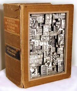
By Brian Dettmer
Significant Objects has many obvious virtues — but is it eco-friendly, too?
In the early days of trying to drum up traffic, I brought our project to the attention of several eco-blog types. Why? Because we figured that in converting near-worthless thrift-store junk into valuable and meaningful objects, our project was in effect upcycling with words.
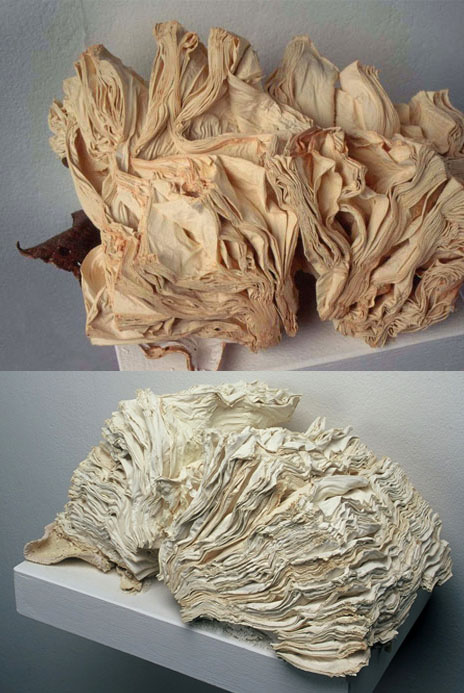
By Jacqueline Rush Lee
I guess I did a bad job making this case, because none of the eco-bloggers bit, and it beats me why that is. Okay, so we’re not converting metric tons of spent plastic water bottles into hip t-shirts or somesuch. But surely if a sculptor incorporated some of the very same doodads you’re used to seeing on this site into a physical work of art and displayed it in a gallery, anybody would recognize that action as redeeming a bit of borderline junk with no particular use-value. Aren’t our writers doing the same?
Probably as a result of this I’ve been interested lately in examples of upcycled art and design that uses one specific form of object as its base material: the book.
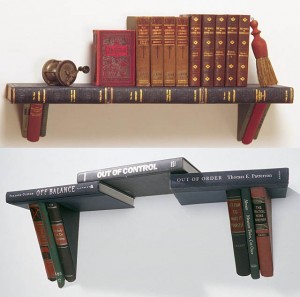
By Jim Rosenau
This rather astounding roundup at Dark Roasted Blend (which I used to find the images for this post; click on any picture to go to the artist’s site) will provide you every example you need of books converted into pure objects; whatever words they contain hardly matter.
But I’m not here to rattle on about the special-ness of physical books and whatnot, as there are plenty of people around doing that already. And besides, a lot of these book-repurposings are pretty cool. I respect the artistry and craft involved. Speaking of artistry and craft, what I am here to do is say it loud and proud: The writers who’ve been participating in the Significant Objects project are also deploying their artistry and craft in a way that redeems borderline junk with no particular use-value. Read more
I mentioned this the other day. Somebody bought it! I don’t know who, and I’m not certain I’d want to know why. But maybe I would.
In any case, I was weirdly pleased to learn that it had sold.
BustedTypewriter is still selling other hollowed-out books to hold/hide devices or objects, here.
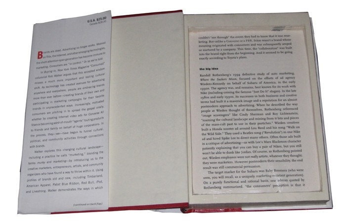
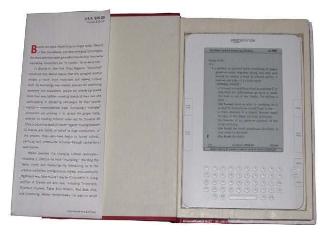
Available from BustedTypewriter on Etsy, for $25 — part of his Don’t Judge Me project.
This hardcover copy of “Buying In” by Rob Walker has been sealed and cut by hand to fit Amazon’s Kindle 6″ Wireless Reading Device.
More here. Thanks for the tip, BT. (I think.)
Save


 "
"



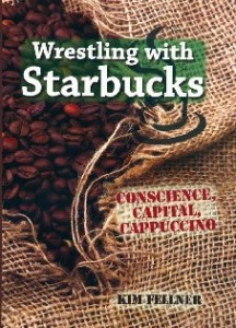 Kim Fellner's book
  A
A