
Flickr Interlude
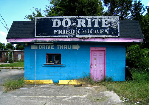
Originally uploaded by Morris Brum.
[Join and contribute to the Murketing Flickr group]
------------------------
--> The Metapoll. Take it.
 Things That Look Like Other Things.
 Counterfunctionality (A Gallery).
 MLK BLVD: Open-source photography project: Contribute to the Flickr pool; browse the blog.
 "Where Were You?" Annual.
 Titans of Finance: True Tales of Money & Business
Originally uploaded by Morris Brum.
[Join and contribute to the Murketing Flickr group]
A piece in Salon offers a debriefing on the subject of “What’s up with black names, anyway?” Apart from being a generally well-done overview of the subject, it points to a March post on a blog called Stuff Black People Hate, titled “Stupid Names.” The category of interest to me is “Luxury Latch-Ons,” regarding which the blogger opines:
For whatever reason, black parents all over the country decided that naming their children after expensive things would bode good fortune for them throughout their lives. Consequently, there are legions of unfortunate people (mostly girls, again) with names like Chanel, Mercedes, Chandelier, and even Prada (yes, I did meet a girl named Prada, and it was the worst day of my life.)
To which Salon adds:
It is true that an unfortunate culture of naming children after brands of champagne or fancy cars has sprung up over recent years. “But that’s a class thing, not a race thing,” says Cleveland Evans [ID’d as “former president of the American Names Society”], noting that he has encountered twins named Camry and Lexus who were white. If you are poor and wish a better life for your kid, a name like Lexus declares that hope.

Alienation, originally uploaded by Manuel Valcarce.
[Join and contribute to the Murketing Flickr group]
The big news on the front page of the local paper here yesterday was that Savannah is the latest city/town to ponder a ban on “below-the-rear” baggy pants. This absurdity aside, what’s interesting about the story is the section in which young baggy-pants-wearers defend their style.
Or rather, they say style isn’t really the issue at all. Because it turns out that their argument turns on function — low-riding baggy pants are all about “ease of wear.”
“I feel like a Pee-wee Herman when I have my pants up,” [Michael] Hodges said. “I need to feel comfortable.”
When the situation calls for it, [Calvin] Middleton said, he and his friends know when to change their look.
“When we go to church or have a job interview or go to school, we want to look presentable,” he said. “But we don’t want to walk around looking like a teacher all day.”
Middleton also disputed that the low-drawer look originated from prisoners, whose pants droop because they are not issued belts.
He said it began because so many young men were given their older brothers’ hand-me-down pants, which were usually too big. The fit was so comfortable, young men preferred wearing oversized pants, he said.
Adam Pinell, 17, has worn the below-the-waist look before, too. “It’s more comfortable,” he said.
I have a feeling Jonah Berger at Wharton, who studies this sort of thing, and who I interviewed for a 10/28/07 Consumed on counterfunctional watches, would zero in on that comment from the guy who doesn’t want to “walk around looking like a teacher.” That’s a style/identity motive — not a functional one. Counterfunctionality can make for a useful identity marker precisely because (in this case) it’s not likely that teachers are going to poach this young man’s style by wearing ill-fitting pants.
On the other hand … low & baggy pants have been around quite a while now, and perhaps it’s possible that their fit (or lack of fit) feels like the norm to a young guy who’s worn them that way since he was 12.
Dunno how uncomfortable you find the practice of wearing pants, or whether you wear pants at all, really. But: You buying the argument of these low-pants-wearers that it’s all about comfort?
 MIXED MEDIA:
Corny Salesmanship or entertainment — what’s the difference?
Today in Consumed, a consideration of “Will It Blend?” as both a brand builder, and a de facto media property.
Watch the recent iPhone 3G shredding — 1.5 million views and counting — and you’ll notice Dickson pausing to enumerate the great features in the gizmo’s new version. This is because Blendtec worked directly with AT&T to tape part of that episode outside one of its stores the day the 3G was released. Longtime devotees may have noticed a gradual drift toward the blending of hot products and pop-culture artifacts. Blendtec responded to that Weezer star turn by blending the band’s new CD, and Dickson has lately destroyed a copy of “Grand Theft Auto IV” and a “Guitar Hero III” attachment.
Read the column in the August 24, 2008, issue of The New York Times Magazine, or here.
Consumed archive is here, and FAQ is here. Consumed Facebook page is here.
Michael Phelps to endorse Frosted Flakes, and the Daily News notes some health experts who don’t like it: “I would not consider Frosted Flakes the food of an Olympian,” says one. But really he’s an ex-Olympian, isn’t he? “Frosted Flakes: Breakfast of Former Champions Who No Longer Have to Worry About Staying in Shape.” “Frosted Flakes: The Official Cereal of Going To Seed.” Right? [Via Commercial Alert.] …
More seriously, Bill Moyers had a great interview this week with Andrew Bacevich. It’s better to see it than read the transcript, and the quote that follows isn’t the part the made it so compelling, but I’ll just throw in one bit, because it relates to earlier posts here and here: Moyers asks about GHW Bush’s 1992 pledge that the “the American way of life” is not up for negotiation, and Bacevich replies most Americans would concur, but: “If you want to preserve that which you value most in the American way of life, then we need to change the American way of life. We need to modify that which may be peripheral, in order to preserve that which is at the center of what we value.” I believe you can watch the whole interview here. …
 Much less seriously, I meant to mention this earlier but I don’t think I ever did: Andrew Andrew keep mentioning this site, The Impulsive Buy. I’d heard of it before (and maybe you have too) but only recently actually checked it out, and it’s pretty entertaining. …
Marginal Utility contemplates “wrongness” — that is, “purposeful attempts to alienate an audience through a kind of puerile repetition or offensiveness that on its face contains no politically subversive content.” Possibly relevant to recent-ish discussions on this site of MySpace and other unappealing aesthetics. Either way, worth a read. …
Here’s an interesting post on The Consumer Trap, that questions the use of words like “consumer” and “consumption.” Michael Dawson writes: “Usefulness, pleasure, longevity, and cost minimization are our normal goals as product users. Consumption, the final using up of a product, is almost never our intention.” I thought this was an interesting framework. Do we think of consumption as happening at the moment of purchase? Or at the final-using-up of a product? …
Sabrina Gshwandtner, in American Craft, writes about “many long-standing DIYers” who “feel that craft fairs are now, for better or worse, a hybrid mix of straightforward commercialism and viable counterculture practice.” Etsy, too. Or maybe Etsy even more so. …
Core77 points to an excellent video comparing iPhone in adland vs. iPhone in real life. Ouch!
 Funny deconstruction of some weird Burger King place mats on Idea-Sandbox. I’d missed this earlier, but I guess it’s made the rounds. If you missed it … well, check it out. (Thx: B.A.) …
Coudal points to an anti-bottled-water video. I actually hate it: It’s everything that’s wrong with “cause” marketing, shrill, insulting, lecturey, overlong, and smug. But for a good cause! And maybe you’ll disagree. …

That — my new favorite reader, I mean — would be Allen Weaver, for the above Murketing foam finger image. Nothing captures the spirit of Murketing.com like a foam Number One hand. Seriously.
In the WSJ’s story today about Seinfeld doing ads for Microsoft, I thought the most interesting thing was this bit, toward the end, about the state of “Seinfeld” ten years after the sitcom ended:
After 10 years of reruns and only occasional appearances by Mr. Seinfeld in the media, keeping the franchise fresh with younger adults is a concern. Last week, Sony Corp.’s Sony Pictures Television, which distributes “Seinfeld” in U.S. syndication, announced the “Seinfeld Campus Tour,” in which it’s sending a 60-foot “Seinfeld”-themed bus to U.S. colleges to drum up interest in “a new generation of viewers,” a spokeswoman said.
Will people watch “Seinfeld” forever, like “I Love Lucy”? Actually, what about “I Love Lucy” — will there come a time when those reruns finally fade from the airwaves? How about, I don’t know, “MASH”? Is anybody watching those shows for the first time, or do they stay on the air for reasons having more to do with nostalgia?
Maybe it’s routine, but I’ve never heard of an explicit marketing effort to rope in a “new generation” of fans for a dead show.
Then again, maybe a dead show that achieved near-universal awareness from the mass era has a built-in advantage.

I’m not sure why I got invited to this event above, and of course I didn’t go. But I’ve hung onto the email invite because of the way it looks. Aside from the recent posts here about the aesthetics of Asics sneakers and YouTube embeds, a couple of months ago there was an interesting discussion on this site here and here about MySpace aesthetics — specifically about why it is that MySpace seems popular despite such unpleasing aesthetics. (After all, aesthetics are supposed to matter today, etc.).
This invite, reminded me of that a bit.
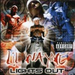
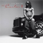
When we lived in New Orleans in the early 2000s, when the whole Cash Money thing was really huge, I was always fascinated by the Cash Money aesthetic. Here are some Hot Boys covers, for instance.
Hideous! And yet … a pretty distinct graphic identity, no?
I’m not expecting any design-crit mag or site to delve into the Cash Money aesthetic and tell us its history, and who are its Peter Savilles and Stephan Sagmiesters — or even its David Carson. (Although I would sure read it, and I wish such pubs would assign articles like that.) But couldn’t one make the case that this isn’t an aesthetic mess at all, but rather a coherent visual language?
As a footnote, despite the recent party invite, interesting to note the way Lil Waye’s album covers have evolved, graphically speaking (left to right: 1999, 2005, 2008):


Illustrator Brian Coldrick, via Drawn!
(Drawn highlights Coldrick’s Sloth character — worth a peek.)
Following the passing mention, in the recent post about Murketing videos, that I “positively hate the way embedded videos, especially YouTube videos, look on Murketing.com or my other sites,” I got an email from someone who says he is a product manager at YouTube. (I have no reason to doubt that he is, I just have no way of confirming it.) “If you had a moment I would love to get some more detail so perhaps we can incorporate that feedback into our product plans and understand what you’re looking for in an embedded player,” he wrote.
I already replied, but since the topic of unappealing aesthetics has come up recently here, I thought I’d share an excerpt of that reply here.
I would point to two aspects in particular:
One is the start screen, the blurry image and the big arrow “play” button. It just looks bad. Why not a crisp screen image? Doesn’t everybody know at this point that you click the screen to start the video? And even if they don’t, there’s a play arrow right below in the control bar.
Second is that the YouTube logo is, for my taste, too large. I understand wanting brand the thing, but it seems to me it could be handled with more subtlety, preferably in the control bar, so that the embed doesn’t look like a big ad for YouTube.
If you just glance at a blog or other site that has a YouTube embed, it invariably jumps out as a visual spoiler. There’s nothing else blurry on the page (most likely), nothing else that looks so incomplete and tentative. For many viewers of that page who have no intention of viewing the video, it’s just visual noise; a distraction. And I actually think a crisp, focused image is MORE likely to make someone want to click.
As a side note, I wish there was more control in the “customize” feature for embedding YouTube videos — different sizes being the most obvious thing. The current visual customization option, changing the colors of the control bar and so on, is kind of meaningless.
Just to be clear, I’m not solely picking on YouTube; I’m not crazy about the way any embedded video looks. Although I do think YouTube may be the worst.
Your thoughts? YouTube may be reading!
Business Week posted an open call for reader feedback on various workplace issues, including generational issues. Someone identified only as “Gen Y Guy” chimed in to explain that Gen X workers don’t understand how members of his generation have “been BOMBARDED by information since the beginning.”
Thanks to the Internet, ya know.
Then this:
It’s really interesting to hear all you Gen Xers complain about Corporate America. That is probably why the Gen Y people hate working for you. If you’re not happy, go do something else, period. Leave your management job and make a little bit less doing something you want to do. It’s a free market, and you have to think like the billionaires of the world controlling your company and know that you’re a piece of labor to the hedge funds and they’re not looking out for you and your family.
Okay!
Back in April I mused here about Muxtape — I liked it but wasn’t clear on certain legal issues etc. (You may recall I was not impressed by the Muxtape boilerplate: ““By uploading a song you agree that you have permission to let Muxtape use it.” Uh-huh.)
Quick update: Listening Post notes the site presently says it “will be unavailable for a brief period while we sort out a problem with the RIAA.”
Maybe this is actually good news. It had to happen at some point, after all. So I hope they can now work something out and make it possible for the thing to continue, and for people like me to use it, in a public way, without concern, etc.
[UPDATE: A secret admirer whispers that I should just use 8Tracks.com, described here. I’ll look into that soon.]
 Imagining implausible uses for unpopular places. A project in collaboration with Ellen Susan and G.K. Darby.
 Great creative writers invent stories about thrift-store objects. A project in collaboration with Joshua Glenn.
 Letters From New Orleans, by Rob Walker.
  Foreward to Brand Thinking and Other Noble Pursuits
 Introduction to Ad Nauseam: A Survivor's Guide to American Consumer Culture
 Essay for OBEY: Supply & Demand - The Art of Shepard Fairey - 20th Anniversary Edition
 Consumed column about Obama as muse is included in Obama: The Historic Journey.
 A piece I wrote way back when for Slate is included in Sponsorship: The Fine Art Of Corporate Sponsorship/the Corporate Sponsorship Of Fine Art
.
 Gary Hustwit's industrial design documentary Objectified.
 Anne Elizabeth Moore's book, Unmarketable: Brandalism, Copyfighting, Mocketing, and the Erosion of Integrity.
 Kaya Oakes' book, Slanted and Enchanted: The Evolution of Indie Culture
.
 Elizabeth Currid's book, The Warhol Economy: How Fashion, Art, and Music Drive New York City
 Kim Fellner's book Wrestling with Starbucks: Conscience, Capital, Cappuccino
.
