Pictures of Stuff, cont’d: house stuff; sneakers
Both from this post (artists not named). Pictures of Stuff is an ongoing series.
Both from this post (artists not named). Pictures of Stuff is an ongoing series.
These links compiled via delicious, and repurposed here with plug-in Postalicious. Not enough stuff? Not the stuff you wanted? Try visiting unconsumption.tumblr.com, murketing.tumblr.com, and/or the Consumed Facebook page.

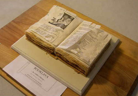
“Booklava,” by Chuck and Cara Matteliano, the winner at the 2009 Western New York Book Arts Collaborative Edible Books Contest
More on Edible Geography. Via @nicolatwilley.
Much more at the Edible Books Gallery.
This is a departure for the Pictures of Stuff Series, but having just posted those images of stuff shot from underneath, this seemed worth mentioning: Artist Simon Menner would like to do a series of images of the backs of famous paintings, like the one below. But as his statement explains: “Unfortunately it is almost impossible to get any permission to take such pictures. So I will see if this project ever continues. I haven´t lost my optimism yet, so currently I still say that it is ‘in progress.'”
Via Junk Culture.
Assessment: “Here’s a line of brilliant eco-planters: recycled book pots from Italy’s Gartenkultur. The concept — old books with holes carved into the middle to accommodate soil and a small houseplant — is simple enough (perhaps even enough for a DIY job) and quite beautiful.” Via.
–> Hey! Consumed is back! It’s in tomorrow’s issue of The New York Times Magazine, so go buy the paper, even though you can read the column below.
 CROSSFIRE
Starbucks would prefer to be left out of the latest gun-rights debate. Here’s why it can’t.
Drawing a line between official institutions of lawmaking and the daily sphere where citizens move about is not so easy. And one thing the pistols-and-Frappuccino moment has demonstrated is that this is acutely true for a business with an image carefully devised to blur the line between public space and commercial space.
Read the column in the March 28, 2010, New York Times Magazine, or here.
Discuss, make fun of, or praise this column to the skies at the Consumed Facebook page.

Maybe you’re aware of the controversy about this map. If you’re not: What does it communicate to you, visually? Does it look like a graphic from some movie about a violent assault on the United States? Or just a mundane political-strategy graphic?
If you are aware of the controversy, then you know that’s pretty much what he controversy boils down to. The full map below was published on Sarah Palin’s Facebook page, and critics say it’s sending a dangerous visual message in a moment when lawmakers are reportedly receiving death threats about their positions on health care reform. Palin, I gather, says such critics are making a phony argument and the imagery is benign.
An interesting design-interpretation disagreement. And one that seems pretty hard to hash out, because it’s hard for any observer, I suspect, to separate what one sees from one’s politics.

Raise the subject of aesthetics when you’re wondering aloud about design, and somebody is sure to pipe up and say something along the lines of “Design isn’t how it looks; it’s how it works.” This is true — but false. True: A great-looking product that does not work is indeed Bad Design and will fail in the marketplace. And yet: Please show me a product or object hailed by the design elite as Good that doesn’t just so happen to be aesthetically pleasing. (To the design elite, anyway.) “How it looks,” in other words, matters, both to the critics and to the market.
Julie Lasky has an essay on Design Observer, Superbeauty, that is very much about “how it looks.” She contends that “beauty” has made a comeback in the 21st century, and evidence can be found in the design world; the essay is in connection with an exhibition called The State of Things: Design in the 21st Century, for which she co-curated a set of objects under the heading Super Beauty:
The category is based on the premise that nothing in today’s domestic environment is too modest or obscure to be prettified: sink strainers, dish soap packages, extension cords, humidifiers, radiators, computer components, fire extinguishers. It is as if contemporary designers have vowed to make an utter sweep of domestic inventory and leave nothing unpleasing to the eye.
The rest of her essay is here. I can’t speak with the sort of authority that Lasky can about this subject in the broader context of design and art criticism, so I was interested to get that perspective.
For what it’s worth, since the early days of Consumed I’ve addressed how I think “how it looks” makes a discernible difference in the marketplace. Please continue…
 The recent call for new contributors to the Unconsumption Tumblr has yielded some very fine results: Joining Steve Chaney, Tom Hosford, Brian W. Jones, and myself are:
They’ve already started adding items, and good ones, too.
Still sorting through some of the other replies and deciding whether to add one or two more folks, but I’m thrilled to be off and running with these new volunteers. As always if you have feedback about the Unconsumption Tumblr — what it needs more of, or less of — speak up. Below or at unconsumption @ gmail.com.
Okay, so, I think I’ve more or less fully updated the monster post on The Idea of Cassettes, with the many, many suggestions and tips from readers. (Example left.) Probably I’ve missed some stuff.
Quick notes:
It looks like someone has started a Facebook page called Cassette, that seems to have been inspired by the post? I’m merely a reporter. But if you’re a cassette fan, be A Cassette Fan.
Also: It was great to see the post get noticed by MetaFilter, and Coudal (“Now that’s a blog post”), but for some reason I was particularly amazed to be noticed by Fark.com. Needless to say I was ID’d as “Some Guy”:
![]()
Also needless to say, the post was not a “history of the audio cassette tape.” But I’m thrilled to see it tagged “interesting.” Zero complaints.
Anyway there are a crazy number of additional items and links added to the original post. But I recommend just perusing the comments and reading what those who didn’t have a link, but had something to say. It’s really amazing, I think, how evocative the cassette clearly is to many — memories, romance, nostalgia. All from such a crummy hunk of mass-plastic!
Finally: Disquiet, which played no small role in inspiring this whole thing, happens to have a great post up that notes this cassette discussion and segues into some great info and observations about other music-object events and insights of the moment. Recommended.
Thanks again.
Randy Ludacer/Box Vox points to the work of Brock Davis, which includes some really great pictures of stuff taken from below. (“In designing packages,” Ludacer writes, “we usually think in terms of how a product will look “on the shelf” — but this is surely an unforeseen angle.”)
Apparently Davis set out to do “One piece of creative work made every day for 365 consecutive days,” cataloging the results here. A mini-series of shots-from-underneath is just one of many ideas he explored; if you check out the full results search for “under” to see more of these. But check it all out while you’re there.
I had to include coffee mugs. And of course I have to throw in one more, since it involves books.
This series of posts started with book wallpaper; now Design*Sponge notes this DIY tutorial on how to make your own. Ruche explains: “We picked up some used cheap paper back books at the thrift store. You don’t necessary need old antique books, just books with pages with a yellow tint. (If you’re wondering, we used Secret Garden, 3 Ninjas, and some other one. haha) We used a paint roller to roll “Sta-Fold” (liquid starch that use for iron clothes) all over the wall, stuck old book papers on wall, and rolled another coat of “Sta-fold”. Work one section at a time. Wait for it to dry..and TADA!”
The D*S post notes the use of this look in a fashion shoot for a clothing brand (below).
[I’m bringing this back on a Tuesday/Friday basis. Thoughts?]
These links compiled via delicious, and repurposed here with plug-in Postalicious. Not enough stuff? Not the stuff you wanted? Try visiting unconsumption.tumblr.com, murketing.tumblr.com, and/or the Consumed Facebook page.
Via Slog, where you can see a wallet made out of a “damaged paperback.”
(Thx: Andrew W!)