Speaking of ugly… here’s a question …
Posted Under: Murketing.com
So highly alert readers may notice that I added a little “share this” sort of button to the Murketing post template. Look down there at the bottom of this post. See it?
I’m not sure about this thing. If people see it as a useful sharing tool, great. On the other hand, I tend to save things via del.icio.us, using a button in my Firefox toolbar, and I don’t (or very rarely) use any of the other multitude of sharing options contained in the button below, so I’m not well-positioned to judge the usefulness of said button.
And what’s really bothering me is how ugly it is.
Anybody have an opinion on this? Keep it or get rid of it? Some better alternative?
I’m definitely open to any and all perspectives.
Update: Well the reactions are in, and the button referred to has been removed, and I feel good about it. Thanks to all who commented….
(Also, did anybody notice that I now sign posts with my actual name, instead of “murketing”?)


 "
"



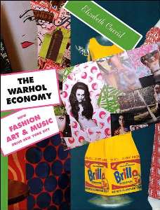
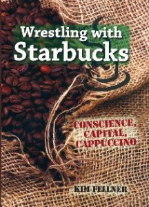 Kim Fellner's book
  A
A
Reader Comments
It’s not really a question of its attractiveness to me, it just causes the page to load very slowly.
I’m with you, let folks use their own tools to bookmark & share.
You don’t use ’em, eh?
Hm.
Thanks for that, that’s a vote confirming my instinct.
Meanwhile, if you’re checking back: Did you see the piece about food bloggers and free samples? What are your thoughts? Sorry to start an off-topic discussion but … candy is food, so this is up your alley!
http://www.chow.com/grinder/5098
Anyway, much obliged/ rw
Rob – I was actually interviewed for that article.
As I commented over there on Chow, I don’t have a problem with it as long as the relationship is declared. I’ve gone to great lengths to let my readers know where my candy comes from. The vast majority is purchased, so I have a somewhat smug feeling of being above it all. (Much of it I can afford to buy, but usually it’s the fact that I can try something before it hits the market that I’m after, not the monetary value.)
I find that trade show samples are easier for me to swallow in that sense, since they’re kind of anonymous and I don’t feel obligated to review it at all.
Sometimes I’m not sure it matters to my readers … I think they’re just at my site for the photos!
However, I do read blogs where I get irritated because those relationships are not revealed, especially when it’s big media blogs that are supposed to have policies like magazines.
I think it’s an interesting topic and I keep proposing it as a panel at various trade shows, but no one seems as interested in how word of mouth marketeers are influencing bloggers and forums.
I guess I got overly fixated on the Amy’s-related stuff (that brand has been on mind for months) and overlooked you. Sorry!
Anyway I agree with most of what your’e saying, though i’m a bit the opposite, I get most annoyed when it’s the NON-big media blogs that don’t disclose. Because they are the ones who are supposed to be “grass roots” and “your friend” and all of that, and the rules are so murky.
Part of this is that I know a lot about the “big media” so I have my own assumptions about which ones are likely to be more trustworthy than others. When I come upon someone who is “just a person somehwhere,” I assume they are just a person somewhere — not a person being buttered up by corporate PR. And, really, much more likely to be swayed by that than a typical media employee at even the most ridiculous publication. That may not make sense, but I’m happy to clarify.
It is a GREAT topic for panel. but also a topic that I suspect precisely zero companies want to see discussed.
Rob,
I don’t see the Share this button because it doesn’t show up in the RSS feed, which is how I read your blog.
I’m with Jackie, I read the RSS feed more often than not for all the blogs I follow. When I clicked over here to comment I almost left a message saying “what button?” when I realized that all the scripts were blocked in my browser. After allowing them and seeing the button, I can’t say I’d use it, but I rarely bookmark anything anyway.
LIke you, Rob, I don’t use any of those tools for sharing, preferring just to bookmark things. What I do use most often — when it’s made available — is the “e-mail this” function (oddly, not one of the tools offered by that share button), because otherwise I have to copy the URL and create my own e-mail. It may take only 10-15 seconds longer, but sometimes that can be the difference between sending and not sending. Plus, it’s another message that eventually will have to be deleted from personal e-mail.
Well it looks like it’s just a matter of time before I get rid of it. But also looks like maybe it would be worth seeing if it could appear just in the RSS feed, actually. I’m a heavy RSS user myself, and it’s actually interesting to think about how it basically makes a site’s design irrelevant. There are a lot of sites in my feeds that I haven’t actually looked at in quite some time.
But I digress. I’ll have my tech staff look into this matter. Oh wait, I am my tech staff.
Braulio: That’s interesting about email this, I’ll look into that as well.
Thanks much for all the feedback, very useful.
I’ve been toying with this same issue for my blog and for clients’ blogs. On one hand, heavy users of bookmarking services have tools for bookmarking efficiently, so why clutter your post with redundant gadgets. On the other hand, the button acts as a call to action, asking readers to spread the word, and that seems like a good thing.
Getting bookmarked has such a big effect on site traffic that it’s worth it to make bookmarking easy and to ask to be bookmarked. Assuming you want more site traffic, that is.
I’m not sure the Add This button is the right solution; personally, I don’t like the placement next to the comments link — I keep accidentally bumping the button when I try to read comments, which makes that annoying thing pop up. It startles me every time. Given that I visit the site when I want to look at comments, it’s particularly vexing to me.
Agreed about the placement and the interference with the comments link.
And you raise a critical question on the issue of traffic. I want readers, not traffic. That is, I’m interested in keeping up the growth of people who come back and know what the site is about and are interested.
Traffic is different — I don’t care about raw numbers of hits from “drive by” types. When I wrote for Slate in the early 2000s I had a lot of experience with that kind of “reader,” and as a writer, those people don’t interest me. If I had advertising I would care for business reasons about raw click numbers. But I don’t, so there’s no upside.
Okay, any minute now I’m getting rid of that button…