


 "
"
Q&A: Harriete Estel Berman
Identity Necklace 2007, originally uploaded by Harriete Estel Berman.
On a brief visit to Portland back in April, I had a chance to stop by a pretty cool show at the Museum of Contemporary Craft, titled “Framing: The Art of Jewelry.” Among the pieces that I found most interesting were some by Harriete Estel Berman, a jewelry maker based in California. So I was really pleasantly surprised when Berman coincidentally contacted me a few months later.
After learning a little more about the breadth of her work, which is consistently fascinating both in terms of her actual mastery of craft and materials, and in terms of its thematic exploration of consumer culture.
I immediately figured she’d be a great Q&A subject here, and after some delays that were entirely my fault, I got some questions together for her. Her answers did not disappoint. And here (after another delay that was again my fault) they are. Read on for Berman’s thoughts on advertising language, on where she gets the raw material that she converts into art, about consumer culture and identity, trying to imagine sexy furniture at Ethan Allen, and her take on the impact of Etsy/the DIY scene/the Internet on creators such as herself, so far.
[Plus: It happens that she also has work at a show that opened more recently at the Museum of Contemporary Craft, called Manuf®actured: The Conspicuous Transformation of Everyday Objects, which is up through January 4, 2009 and sounds pretty interesting.]
Q: We’ve been in touch for a while, and I’ve wanted to do this Q&A for a while, but part of what’s slowed me down is that you’ve done so much interesting work and I don’t know where to start. So I’m actually going to start at the end. What are you working on right now — and how does it fit into the general themes you’ve been exploring since (I think I have this right but correct me if not) about 1980.
A: Usually, I am working on several different pieces at the same time, all at different stages of progress. Generally, this is a necessity, as ideas often gestate for months to years or time is needed to collect the right tin cans for a specific idea.

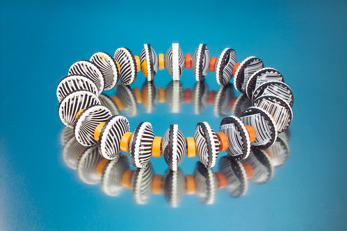
Currently, I am in the middle of a series of work called, Bermaid, the California Collection. (Image above.) These three-dimensional fruit crate labels and bracelets are constructed from recycled tin cans providing layers of images and symbolism. The images and repurposing of post consumer material to construct the fruit crate labels and bracelets reflect upon California as both the archetypal consumer culture and a leader in the recycling movement and green design.
Fruit crate labels were actually invented by California growers as an early 20th century promotional image for California produce. The fruit crate labels symbolically convey the fertility of California’s bountiful agricultural industry of fruits and vegetables. Orchards once covered Silicon Valley, but it now blooms with inventions and technology ventures. The bracelets symbolize the innovative and entrepreneurial spirit of California exporting ideas and products from its fertile valleys.
Bermaid is a play on words. First, my name — Berman — is not a very good name for an avowed feminist. Using “maid” instead of “man” indicates the artist is a woman and suggests a pun on “made”, as in made by hand.
A new sculpture, constructed from over 50,000 pencils, will take the shape of a bell curve as a commentary about the national focus on standardized testing. The pencils were sent to me from all over the United States from students, teachers and individuals who wanted to lend their voice to this project. This installation will be assembled by hundreds of educators attending the annual conference of The California Art Educators Association Conference in November.
Relevant to your theme of marketing, many of the pencils are promotional items embossed with advertising messages selling a product, idea or political message. Older pencils promote merchandise from appliances to cars while more recent pencils promote events, schools, high academic achievement or improved test scores.
Almost completed is a Seder plate titled, Eons of Exodus, for an exhibition at the new Contemporary Jewish Museum in San Francisco. The Seder service which takes place on the first night of Passover speaks specifically about the exodus of the Jewish people from ancient Egypt. This Seder plate addresses the Diaspora of all people through time who choose to leave their familiar surroundings to escape assault and hardship due to religious or ethnic persecution. (More of Berman’s Judaica work here.)
 I think a natural question for someone immersing him or herself in your site, and recognizing that you often work with what seem like discarded materials, might be: Where do you get all this stuff? Do you have a garage heaped to the ceiling with trash or what?!
Actually, you described it pretty closely. My studio is overwhelmed with tins from floor to the ceiling. I get tins from the East Coast and West Coast, from the depths of basements and attics, from friends, my children’s orthodontist, curators, and total strangers. After working with recycled tin cans for over 20 years, word spreads.
The tins are organized by color, pattern, or subject matter (such as standing women, sitting women, words, candy, chocolate, tea, and crackers, to moth balls, etc.). But it is not just about recycling; the tins also make a statement about our consumer culture and how branding and marketing affect our identity. These are recurring themes in my work. Sometimes the images are very familiar and people can identify the brand even if only a portion of the image is visible.
When I am working on a new piece, I’ll have heaps of “inspirational tins.” It can be incredibly difficult to make all this eclectic found material work into one coherent piece. Successful work comes from being able to edit and simplify; integrating layers of meaning so that the audience is enchanted at every level.

In addition to your obvious concerns with and interest in material, you also clearly have a fascination with language — commercial language. What’s your take on the difference between the marketing language of, say, the 1960s, compared to today. Does ad language treat us with more respect than it used to? Or … not?
How advertising and branding creates an identity in our consumer society is a major theme in my work. What happens to an individual’s identity when he or she wears a sweatshirt with a gigantic brand name emblazoned across the front? Why do we buy what we buy? It is very interesting, for example, that Tiffany sells a line of jewelry that has an oversized hallmark for Tiffany on the jewelry. Clearly, the consumer is buying the brand name Tiffany on their I.D. tag, instead of their own name.
Commercial language in advertising, specifically on the tin cans, is often a theme in my work. Advertising from the 1930’s through 1960’s seemed sincere, though possibly inflated, such as “Automatic Beyond Belief.” More recently, commercial language tends to sell power, seduction, and impulse; “Now,” “New,” “More.” When examined closely, the suggestions are sneaky and manipulative — really like brainwashing with a heavy undercurrent of sexual innuendo.
Have you seen a recent Ethan Allen furniture ad on television? It has a strong, tribal or techno drum beat; heart pounding, pulsating, pumped up. The images of furniture are flashing quickly, alternating with words, one of which is actually “SEXY”. Can you imagine sexy furniture from Ethan Allen?
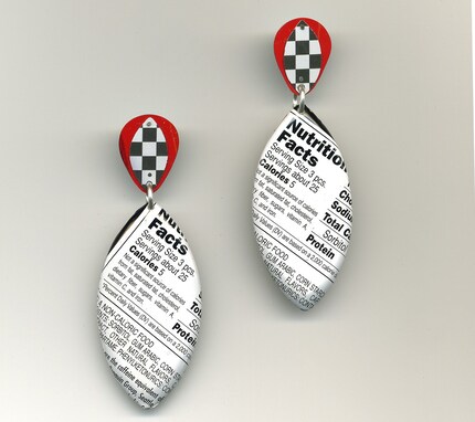
Advertising words are often highlighted within my artwork. In “Nice and Easy, Even if Your Marriage Doesn’t Last Your Color Will” (picture above) the title was taken from a very short-lived television ad for Clairol.
 “Witnessing the Weight of Words” (at right) is constructed from over 575 metal triangles from recycled tin cans, cut, folded, and riveted together. By fabricating the piece with materials originally used for consumer packaging, it becomes a commentary on art as another product in our consumer society.
Commercial language occasionally borrows words from the art and craft world to enhance the promotion of consumer products. The irony of a “limited edition” tin container for Ritz crackers reveals many aspects of our consumer society and the marketing of art. (This work is part of the Manuf®actured show.)
In “Hourglass Figure: the Scale of Torture,” words from the Slim Fast tin cans give people an instant insight into the work. The scale’s dial includes words used in advertising often used to describe both food and women, such as “muffin”.
How do you think about the audience for your work? Who is it you want to reach?
 I try to engage a broad audience. As an artist, I consider it a personal responsibility to draw the general public into the work. First of all, I am using recycled tins, or trash, to put it bluntly. Many of the pieces have a sense of humor or colorful patterns that would appeal to even a casual audience. On the other hand, I work very hard to include intelligent, insightful commentary within the work. Conceptually there are multiple levels, so that people with more knowledge about art or the content can appreciate and think about the issues within the work.
Hopefully, the detail in the construction of the work and in the multi-level commentary engages the viewer as they decipher the messages.
What’s your take on the recent rise of the sort of DIY/craft trend via things like Etsy. I know you have a shop on Etsy (here). But I also know that there are mixed feelings out there among people who do work like yours, that seems like it would fit comfortably in a fine art setting, about (for lack of a better word) the “trendiness” of handmade goods these days. I’m sure you’ve seen the various “new wave vs. old guard” debates here and there.
Etsy and the D.I.Y. issues have been a huge topic in the last year or so. I immersed myself in the Etsy/ D.I.Y. websites to thoroughly participate and experience the online communities. I even made a line of jewelry and posted them on Etsy. I firmly believe that the Internet can be an enormous asset for the art and craft communities.
Overall, however, I am somewhat disappointed with the Etsy and D.I.Y. world so far. My main complaint is that too much of the merchandise is priced unrealistically low. The site is watered down by the onslaught of $6 “do-dads” and such. And the general Etsy consumer doesn’t seem to be interested in buying higher quality or more adventuresome work. Unfortunately, the discussion seems to have devolved into an “us vs. them” debate.
From my personal assessment, the Etsy site has serious technical flaws — poor search engine, lack of filters for the buyers, and lack of sophistication in the marketing to the general public. The social networking aspect can be fun, but if you feel that “time is money,” it is not worth the investment. It appears that Etsy is making most of their revenue off people posting their items 20 cents at a time. So far, from everyone I know, Etsy is not contributing significantly to their income.
What is great about Etsy and other online sites is that the maker controls the posting of items. You don’t have to develop relationships with a network of galleries or exhibitions in remote places — you post it and it’s up for sale within minutes. Plus it reaches an extensive potential audience with the idea of buying something handmade from a real person. Perhaps it will influence future consumer habits or develop new markets.
I think that the Internet’s impact on the art and craft communities is still embryonic. I look forward to the evolution of this dynamic environment.
Murketing thanks Harriete Estel Berman for her time and her very thoughtful answers. Check out many more images at her site, here; her Etsy store, here; and her Flickr stream, here. And if you’re in or going to Portland, check it out in person at Manuf®actured, or see that show’s site, here.


 Kim Fellner's book
Reader Comments