Surface Effects (re: Shepard Fairey)
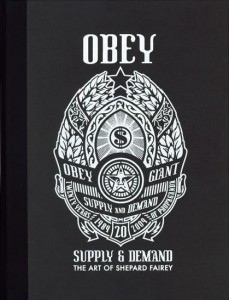
A few years back I met Shepard Fairey when I wrote an article about him and his design firm, Studio Number One, for Inc. We stayed in touch a little bit, and I was later invited to contribute a piece to the book Supply & Demand. Normally I decline such offers, but for various reasons I made an exception in this instance. Lately I have decided that that it might be interesting to publish that essay here. Partly because Fairey is obviously much in the news, partly in order to mark the occasion of his first major museum show at the Institute of Contemporary Art in Boston, and partly because people keep sending me email asking me what I think (or telling me what they think) about his work.
Keep in mind that this was written in 2004 and first published in 2005, so adjust the date references accordingly. (Among other things, there is obviously no reference at all to the Obama imagery.) Here it is:
SURFACE EFFECTS
 The story goes like this. Some 15 years ago, when Shepard Fairey was a student at the Rhode Island School of Design, a friend wanted to know how to make stencils. Fairey offered to show him, using picture of the wrestler Andre the Giant, chosen basically at random from the newspaper. The friend objected that this was a stupid image. Fairey said no, it’s a cool image — because Andre the Giant has a posse. Later they made some stickers, slapped them up here and there around Providence. That might have been the end of it, except that Fairey overheard strangers at the grocery store, discussing what the stickers might “mean.” So he put up more stickers, and a prank turned into a campaign. In a way, it’s a story that has everything. The never-ending of river of pop culture flotsam. The mastery and teaching of a skill. The seductiveness of persuasion. The power of repetition. And the curious human yearning for symbolic meaning.
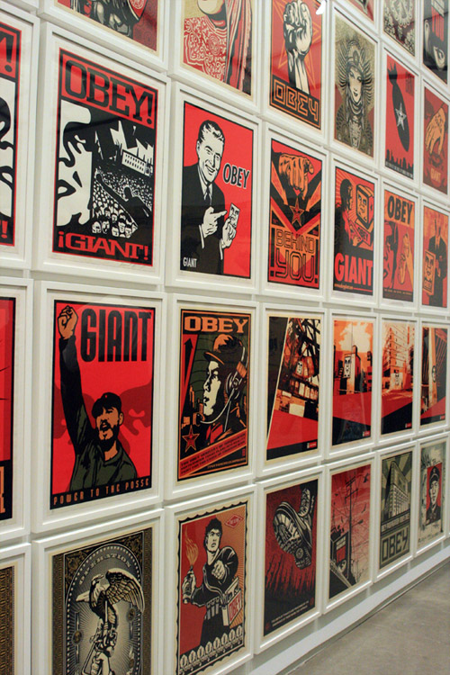
That crude early image has long since shifted to a more stylized visage – the icon face — and is now most familiarly paired with the words “Obey Giant,” or simply “Obey.” It has been reworked dozens and dozens of ways, and as an open-source project that pre-dates the Internet, it has been spread by countless volunteer confederates all over the world. The icon face has been in movies, in art museums, it has been tattooed onto people’s bodies, and, yes, it has even appeared in commercial messages, and on clothing. People are still arguing about what it might “mean.”
In 1990, Fairey wrote a manifesto that called the campaign an experiment in phenomenology. “Because OBEY has no actual meaning,” he wrote, “the various reactions and interpretations of those who view it reflect their personality and the nature of their sensibilities.” Does that explanation satisfy you? I suppose it depends on your personality and sensibilities.
I first encountered the Obey campaign in the early 1990s, in New York. Like most people at the time, I had no idea who was behind it. It wasn’t until years later that I met Shepard Fairey himself, and wrote an article about him – for a business magazine. By then he had been doing design work for corporate clients like Levi’s and Universal Pictures for several years, yet he was still extremely active on the street, and in fact he had recently been arrested for the seventh time. “Sometimes I feel like a double agent,” he had said, and I was interested in that. I was falling back on a familiar way to frame almost any pop-culture or sub-culture or alt-culture debate: Who is authentic, and who is a sellout? Who is hardcore, and who is a poseur? Who is an outsider, and who is commercial? Who is an originator, and who is a biter? These are all variations on the same theme, the conflict between the real and the artificial. Which, of course, is not just a conflict within art or self-expression, it’s a conflict within life.
This debate has been going for a long time, and one of the places it is documented is in a book called Fables of Abundance, by Jackson Lears. Although the book is billed as “a cultural history of advertising in America,” Lears has a lot to say about why those “familiar dualisms” are limiting, even false, in suggesting that we have only two choices. For starters, the 100-plus-year-old romantic vision of the artist as a pure, outlaw being, apart from the crass culture of the marketplace, has generally been a dead end, just another marketable pose. And meanwhile, the need for the marketplace to invent meanings for increasingly interchangeable commodities has meant that “the orchestration of surface effects became a major industry.”
The idea of “surface effects” is, obviously, a pretty compelling one when you’re talking about a campaign that manifested itself on neglected urban streetscapes, on buildings, on billboards, on signs, and the bases of lamp-posts. The whole point of graffiti, really, is to give fresh meaning to surfaces – and in the process to promote the graffiti artist as the author of that meaning. Today, if you go to any of the best-known street-art spots in New York, the walls that people come from all over the world to hit, you’ll see who else has figured this out: the “street teams” of the marketing industry.
When I interviewed Fairey for that magazine article, I of course asked him about the contradictions involved in, say, being someone who has both wheat-pasted the icon face over Sprite billboards – and who has actually done professional design work for the company that owns Sprite. “People make this very black-and-white delineation,” he said. “But I say, ‘How would you feel about it if it were a little more ambiguous? If all companies had marketing materials that didn’t insult the consumer? That were somewhat creative and intelligent and almost like an art piece with a product behind it?”
In other words, instead of responding to the encroachment of evil branding into the supposedly pristine authenticity of the street by withdrawing – why not engage? If the idea of spreading the Obey image is to see how far the Obey image can spread, doesn’t it make a certain sense for it to show up on apparel that is sold in chain stores? If a multinational can put its icons on the street, maybe the street should put its icons into the shopping mall.
A hero in Lears’ book is Joseph Cornell, whose meticulously constructed boxes painstakingly filled with materials at hand “demonstrated that it might be possible for the artist to reclaim the most forlorn, forgotten, and banal fragments of commodity civilization … and resituate them in the architecture of the imagination, transforming them into numinous artifacts.” Kind of like a DJ digging out beats from a record store basement, from the junk that has so little market value it doesn’t even make it to the selling floor. Or like clipping a random picture from the newspaper and turning it into an icon.
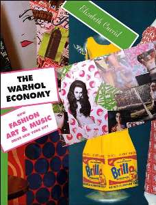
Lears also writes that while Andy Warhol’s Brillo Box “aimed to demystify museum art by assimilating commodities into it, Cornell pushed his aesthetic in the opposite direction, toward the reanimation of the commodity world.” This seems, to me at least, like the kind of ambiguity that Shepard Fairey is engaged with, and that the Obey project ought to make the viewer consider, wherever he or she encounters it.
Of course, I could be way off. (Ever get the feeling you’ve been cheated?) Probably it should go without saying by now that there is no “right answer” to the questions that the icon face silently raises. Presumably you have your own worldview and ideology and set of rules and guidelines for how to evaluate the symbols and the surfaces around you. So all you have to do is look inward, and obey.
[As indicated, this essay first appeared in Supply & Demand (2005)]


 "
"



 Kim Fellner's book
  A
A
Reader Comments