Branding the recovery (2)
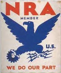
Okay well I just said I wasn’t going to offer an aesthetic critique of the new recovery logo. But, since McChris, in the comments, mentioned the National Recovery Act emblem from the Great Depression/New Deal era and even offered an image link … Well, I can’t help but say that I think there’s a boldness in the old emblem that’s definitely not present in the new one. The new one seems a bit wimpy to me, a bit, I don’t know, Facebooky or something — or like it represents an iPhone app. It also strikes me as a little too busy for its own good.
BUT, maybe my view will change in time. Again I think it does its job only via repetition and context. So … we’ll see.
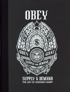
Anyway what seeing this old emblem really makes me wonder is: Why in the world didn’t the Obama team hire Shepard Fairey to do the new recovery logo? Whether you’re pro or con Fairey, you’ve got to admit: The guy really knows how to do propagandistic icons.
[3/5 UPDATE: I really have nothing to say today, so instead read Brian’s comment on government iconography below, as it is superior to the post itself. Oh, and here, via Design Observer‘s “observed” links, is info on who designed the new recovery logo. I’m going to guess that when the design blogs get to assessing (I still haven’t seen any writeups), they will generally like it. But maybe not. Very curious to know… ]


 "
"






 Kim Fellner's book
  A
A
Reader Comments
I’m not sure that I can point to particular visual cues, but the new logo looks like 1970s institutional design, like the government literature I would have seen as a child in the late seventies and early eighties. I think my two reference points would be the EPA logo and this film produced by the US Information Agency to commemorate the bicentennial. The palette strikes me as being of the seventies, but the fluid, naturalistic iconography is probably what does it.
The NRA eagle is far more robust, I agree, but I suspect that the Obama administration would like Americans to view the government as more gentle than the government of the previous eight years. I also think that the borderline-paranoia of Fairey might work for a candidate, but not a person in power. Also, the original Obama campaign logo also looked like an OS X Dock icon.
ZOMG, i love talking about government agency logos!!!!!!!! here’s the thing – they fall into two distinct styles, classical and modernist.
we started with a verrrrrry long classical period, which lasted through the 1950s. most of these logos look like they were designed by and for a small-town school district; not only are they conventional, almost all of them are pretty amateurish in execution too.
some of the New Deal logos tried to break out of the mold – not just the NRA, but the WPA and CCC, for example – but as far as i know, this was a short-lived period of experimentation. there are limits to my govt logo geekiness, so i don’t know them all, but for the most part, the Truman and Eisenhower logos went back to the classical form (like the HEW logo, 1953).
the Eisenhower admin was responsible for the greatest US govt logo ever, the original NASA logo in 1958. but the true modernist period didn’t start till LBJ – HUD (65) and Transportation (66), the second greatest US govt logo ever. what’s really interesting, though, is that several Nixon logos stayed in the modernist style – the aforementioned EPA (70) and the fantastic Star Trek logo for the Consumer Product Safety Commission (72). note that the modernist logos feature not just an abstract graphic, but sans serif typefaces (classical logos always use serif). also note that the fact that modernist logos continued under Nixon is yet another sign that he was forced to run a relatively liberal administration because of the weight of the preceding presidencies.
the Carter logos are a mixed bag, a sign that while he was a Democrat, he was also the most conservative Democratic president in decades. his first 2 depts returned to the classical style – Energy (77) and Education (79) – and they’re also classically amateurish, looking like they were designed by the principal’s secretary in her free time. the HHS logo (80) is an interesting attempt to place a very smart abstract graphic (the eagle outline mutating into 2 human faces) within a classical frame that uses a serif typeface.
recent Republican presidents, not surprisingly, have stuck with the classical style, especially the throwback logo for Reagan’s Veterans Affairs (89). the logo for Homeland Security (02) is mostly classical, but it has an interesting modernist component in the center (the stylized mountains and waves).
so, within this historical context, the new logo for Recovery.gov suggests that Obama logos may be swinging back to modernism – i.e., to a “liberal” graphic style. (if you start seeing eagles and serif fonts in Obama logos, be afraid, be very afraid.)
it’s also worth noting that the 3 periods of modernist logos – the 40s, the 60s/70s, and now – merely reflect the corporate design trends of their day. you might think that the new Recovery logo looks like it’s for a generic tech-oriented business being advertised in WSJ or Wired. but if you flip through any issue of Life from the 40s you’ll see lots of NRA-style logos for manufacturing companies, power companies (the electrical grid was still being built then, so you see *lots* of thunderbolts), etc. all i’m saying is that the NRA logo, like everything else old, has gained a patina through the passage of time. if we were critiquing it back then, we probably would have been equally bored and snarky about it.
i should add that off the top of my head, i don’t know what Clinton logos look like. (were there any new agencies created in his administration? surely there must have been, though i can’t think of any.) but given that logos reflect both the president’s political philosophy and the prevailing ideology of the day, Clinton’s logos in theory should be classicist, since he had to end up governing as essentially a conservative president.
Although a lot of us might appreciate a good, propagandistic-style, Shepard Fairey logo, if I were on the Obama team I’d be worried that these associations are negative for too much of the country and would, in fact, provide fodder for right-wing efforts to cast aspersions on the program and its intentions.
True, the new logo is not as dynamic as the vintage one, but there’s a fine line between “dynamic” and “fascistic.” It’s probably also a good thing that they did not use those same initials. (I think for most people “NRA” now stands for “National Rifle Association”
Heh, I just came back to say that I ran across some Obama Dock icons, which amused me after my comment the other day. I also wonder if Rob’s seen the Obama dingbat font.
@Randy, another reason Obama wouldn’t want to revive the NRA of the New Deal is that it was ruled unconstitutional.