Iraq Inquiry: The logo!
I don’t know how closely you’re following the inquiry over in Great Britain about that country’s decision to involve itself in the Iraq war. And I don’t have much to say about that.
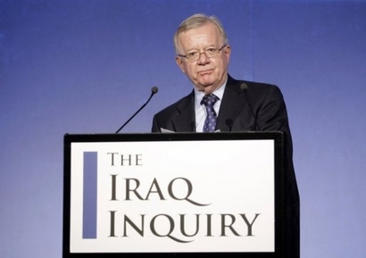
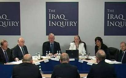
But hey, how about the logo! What do you think of the type treatment? Is this going to make the Iraq Inquiry the breakout inquiry of 2010?



 "
"


 Kim Fellner's book
  A
A
Reader Comments
Wow. I had thought this type of political branding was confined to the U.S. But OK, U.K. — the blue “I,” I guess, is for “Iraq.” Those fancy Qs make it look a bit like a Cristie’s auction catalog, but the designer probably wanted to capitalize on the repetition of this rare and exotic letter in both words. (10 points each, if it were a game of Scrabble)
Maybe it’s reasonable, since it’s televised, that they wanted to include some way-finding signage for channel surfers. Still, it is funny to think of an “inquiry” requiring this type of thing.
Maybe they plan to get a Zazzle shop going?
The ‘Q’ is meant to be like a magnifying glass, isn’t it? The inquiry will sift the smallest detail, to uncover the truth.
Of course, too much sunlight focused through a magnifying glass means that the object underneath it burns.
I love the comment “too much sunlight focused through a magnifying glass means that the object underneath it burns.” Which is going to be the case here for sure. If it is supposed to be a magnifying glass then they could have done a better job in my opinion. And if it isn’t it should be.
I am glad to see that they kept it simple and that they cared enough to make it look good even though it is only going to be around a couple of months.
Maybe I should name my next brainstorming session or project and create a logo for it too? It will help me make the right decisions—hopefully.
Jolly good, I say.
I saw this while watching the news and was fascinated that a logo was designed. I really like the Q’s on this logo the over accentuation of ‘Q’ ‘Q’ is for questions.