Rules and covers
Posted Under: The Designed Life
I’m not sure if I’ve ever said so here, but I’m an advocate of the idea that rules and limits are things that spark creativity, rather than stifle it. I know I have said here that I wonder about how book design would be different if it were guided by thinking of the actual reader, actually reading, rather than the potential reader, theoretically considering a purchase at shelf.
This brief post is relevant to both thoughts, perhaps, in quoting an article from the Guardian:
Before his death, JD Salinger’s publisher, Hamish Hamilton, worked with him to produce jackets for reissues of his books … [said]Simon Prosser, publishing director, Hamish Hamilton: “There are strict rules about JD Salinger’s covers. The only copy allowed on the books, back or front, is the author name and the title. Nothing else at all: no quotes, no cover blurb, no biography.”
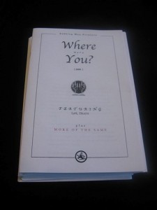
As you can see, the jacket looks great.
The only flaw is the little publisher logo in the corner. Why is that there?


 "
"


 Kim Fellner's book
  A
A
Reader Comments
It is a sharp cover. The logo is there for perhaps the same reason I include my signature logo in as many of my works as possible. It’s the stamp, the mark. We live in a world where there are too many marks, it’s true, but a subtle logo conveys just what it needs to: this is a Penguin book.