Books, the idea: “Beauty and cheapness”
Posted Under: The Designed Life
This Smithsonian.com writeup on Penguin paperbacks makes some interesting observations about how their success was tied to their object-ness — both in terms of design and branding:
Penguin’s graphic design played a large part in the company’s success. Unlike other publishers, whose covers emphasized the title and author of the book, Penguin emphasized the brand. The covers contained simple, clean fonts, color-coding (orange for fiction, dark blue for biography) and that cute, recognizable bird. The look helped gain headlines. The Sunday Referee declared “the production is magnificent” and novelist J. B. Priestley raved about the “perfect marvels of beauty and cheapness.”



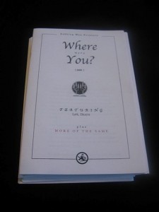 "
"







 Kim Fellner's book
  A
A