New additions to the Unconsumption project
Posted Under: Unconsumption
I haven’t mentioned the Unconsumption project all that much here lately, but the Unconsumption Tumblr continues to get more awesome, and its audience keeps growing as a result. Not only that, but super-excellent Unconsumptioneer Molly Block has made the @Unconsumption Twitter feed a fun, vibrant, useful, and fast-growing entity of its own.
And now I’m pleased to pass along two pieces of news.
- First, we’ve added another contributor: Lee Sachs is a writer, user experience consultant, and filmmaker, in New York, NY. He is also the curator and creator of the always-entertaining Museum of Marketing Madness; check it out. In addition to contributing to our flagship Tumblr, he’s putting some fresh thought into what we can do improve the Unconsumption wiki. Stay tuned!
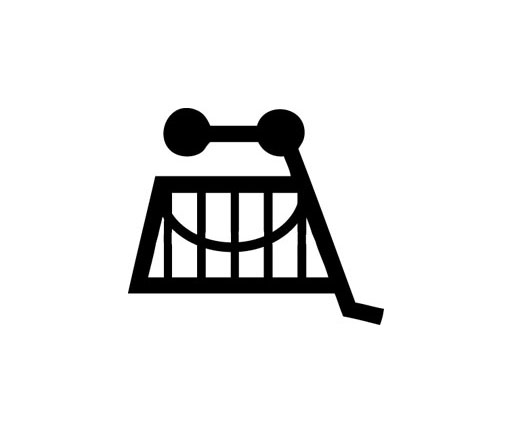
- Second: We have a logo! Please meet (above) the symbol we have come to refer to amongst ourselves as Mr. Cart, created by Unconsumptioneer Clifton Burt, who is thoroughly wonderful. I’m really excited about this.
Now you might wonder: Why does Unconsumption need a logo? Are we opening a Zazzle shop or something? No. As I’ve said in the past, I consider the Unconsumption project to be in part an experiment in branding that is connected to a set of behaviors, instead of a line of products. In fact, I consider Unconsumption to be, in effect, the ultimate lifestyle brand: It’s just a lifestyle, one that does not require any set of buyable objects or services. But just because we aren’t selling anything doesn’t mean our “brand” can’t benefit from a visual identity-symbol. And now we have a great one!
I have a few thoughts about how to propagate such a symbol without advertising or selling merch, for the benefit of spreading the underlying idea(s). So stay tuned for that, too. If you have ideas about what a brand-with-no-products might do with its logo, please chime in, I’d love to hear. And of course, if you find value in the Unconsumption notion, help us spread the word.



 "
"


 Kim Fellner's book
  A
A
Reader Comments
Great upside down shopping cart logo. And it’s also a smiling face. (A la Amazon.com?) But the Unconsumption smiling face looks a bit like Fred Flintstone with shades–which is cool.
Kudos to Clifton!