“Scalies” update
[2/12: Be sure to see the updates at the end, and also I’m adding a “Scalies” tag to my Letters From Here Tumblr to track future notable items. Click here.]
I couldn’t be more pleased with the reaction to last weekend’s Consumed, which has practically made it mandatory for me to take time I really don’t have to assemble this post.
If you read the column, you know the most recent one was about the little figures in architectural renderings, and their function. On one level that function is simply to suggest the scale of whatever building or project is being proposed, which is why, as I say in the column, one architect friend of mine refers to these figures as “scalies.” (Revealed here exclusively: That friend is Kirsten Hively. And as of this moment, there’s evidence on Twitter that people like that term; thus I feel she should get credit.)
The reason this update is mandatory is that the feedback I’ve gotten has included lots of great visuals, so I am collecting them below.
But before I get to that: Maybe the most surprising response I got was from Amy Herzog, Associate Professor of Media Studies at Queens College, CUNY, who is presenting a paper on this very subject at the Rendering The Visible Conference, this very weekend, in Atlanta. I so wish I could attend! On the off chance any of you go, please report back.
Now on to more reactions & visuals:
Most of all, I was thrilled to see a follow-up (click on the image above) on BLDBLOG, a truly great site whose proprietor, Geoff Manaugh, I interviewed for the column. In addition to what I was able to include, he made at least two excellent observations that I couldn’t get in for lack of space. Both are revealed in this post that you should read right now. One involves parkour, the other Don DeLillo.
I also really recommend clicking through the images and reading the captions on this Curbed post. Smart, entertaining, funny — exemplary critical/design writing in my opinion!
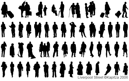
On Twitter, @jmuspratt asked: “Have you ever seen Kapitza’s human typologies as fonts?” (Above.) I had not! But what a great tip! Check it out here, pretty fascinating.
Longtime pal Marc Weidenbaum, a font of unexpected knowledge on all things, dropped a line to draw my attention to An Apartment For Space-Age Lovers. The image above will probably make it clear why he made this connection.
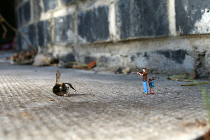
Also via email: K.B. Norwood alerted me to this post on Never Learned, comparing scalies to the famous “Little People in the City” street-art project of Slinkachu. An insightful connection.
Finally, there were a lot of really useful and smart reactions on the Consumed Facebook page, but since this post is getting long I’ll just single out Andy Hickes, who said he is writing a history of architectural rendering in the 20th century, an idea that I think is laudable. If you like looking at renderings you’ll love this site: Rendering.net. Some fabulous examples. [Feb 10 update: To be clear, that site is not connected to his historical project; see comments. Didn’t mean to imply it was related, but I did.]
The other FB comment I have to note came from Laura Forde, who wrote about how interesting she found it that “architects refer to not just the people in the renderings—but trees, plants, vehicles—as the grammatically singular word ‘entourage.’ It certainly makes everything subordinate to the building. The ‘scalies’ may be chosen for their style, but are a group of faceless attendants (in the same category as plants) more than individual participants.”
Also taking note of the column: Unbeige, with a nice post, @architectmag, which declared “scalies” the “word of the day.”
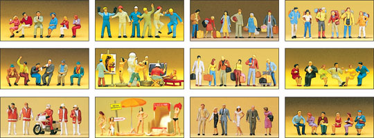
Feb 10 Update: This morning I came upon this post on Things Magazine, which cites the column and observes that “generic digital offerings” have “largely replaced the characterful and highly detailed figures made by Paul M.Preiser, many of which have that casual central European sauciness.” I clicked around on that Preiser site for quite a while. I don’t totally get what’s on offer (reader Mike D. says these appear to be railroad model figurines) but I sure enjoyed looking.
Also: The comments on the above-mentioned BLDGBLOG post are particularly good. Aside from thoughtful reactions, somebody chimed in with nothing more than a link — but it’s an awesome link: People For The Architecture is “an index of imagined realities from a growing list of architectural offices, minus everything but the people.” The screen grab above (“Zaha Hadid / Cairo”) does not do it justice, please go waste some time there, it’s great.
Feb 12: Fantastic short film stars animated scalies! Watch it here: Real Estate by Jonathan Weston.


 "
"













 Kim Fellner's book
  A
A
Reader Comments
Rob,
I may have been unclear. My ” History of Architecutral Rendering” is independent of the renderings on Rendering.net. The renderings on the Rendering,net site are a few of the renderings I myself have done.
thanks for your interest,
Andy Hickes
Some footnotes to your excellent column on these little people. Marlin Studios sold countless CDs full of these people, and I’ve discussed their use with many architects and visualization artists. Never did we quite reach the point where we considered them little salespeople, which is what they really are. Fascinating concept that you drew from your research.
Also, these tiny folk will soon be inhabiting (in at least the new three-dimensional versions) some new civil engineering infrastructure environments such as proposed new streets, highways, bridges, water projects, etc. Construction contractors will be using them to help sell their bids to Departments of Transportation.
A final note of what happens to some of the people who pose for these images. Throughout their lives in the endless rendered environments they inhabit, they will always be the ageless, seemingly content people that walk around, converse with each other, and even hold hands. Yet, I already know of two people who have been immortalized in countless renders, then in real life fell in love, got married and are now divorced. Maybe life doesn’t imitate art after all!
Tom Marlin
Marlin Studios
Andy: I did not think they were the same thing, so let me revisit the language I used, I didn’t mean to imply they were/are.
Tom: Thanks for that, good stuff!
Rob, it was good to read your blog , you are right architectural visualisations definitely do require more scrutiny. I thought you might be interested in seeing an animation I produced in 2009, that exposed an architectural visualisation to a little bit of reality.
Real Estate – http://vimeo.com/12690053
“Scalies” is okay but I think those things should be called “peeps” — more irritating, smarmier: “Gotta run. . . dinner with my peeps.” Whatever we call them, it bothers me that even though you can see through the semi-transparent ones, you can’t see through their clothes — Eros denied.
Jonathan: That video is so great! Thanks for sending!
Glenn: Ha! Someone should take your advice, would be interesting…