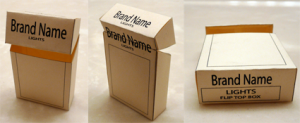
Imaginary branding is one of my favorite topics, and I’m not alone: In addition to Gladys Santiago’s impressive Product Displacement Tumblr, there’s a new arrival on the brands/fiction scene: Not A Real Thing, a blog by Justin Kirkwood.
In addition to compiling a good master list of imaginary brands, Kirkwood is doing some real work here, not just pointing out fictional brands like Red Apple Cigarettes but telling us who created them (in this case, “longtime Tarantino friend, art department employee, and former video rental store colleague Jerry Martinez”). And as a bonus, for that entry he’s created a downloadable template for you to create your own cigarette brand-design.
Would a Murketing cigarette pack be cool? Design one and send it to Kirkwood! And keep an eye on his site.
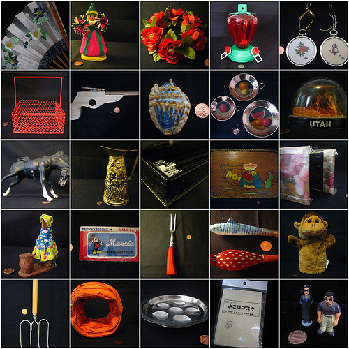
As some of you know, we’ve launched Significant Objects — Volume 3. This series of objects/stories/auctions raises money for Girls Write Now, which is a great organization.
This week we’ve published stories by Jennifer Weiner, Padgett Powell, David Levine, and Charles Baxter (and tomorrow Jim Hanas). Much, much more to come, including many team-ups and special events.
Please check it out and help us spread the word.
Thanks.
Posted Under:
Things/Thinking by Rob Walker on February 25, 2010
Comments Off on Significant Objects, v3

If you recall the earlier Gallery of Default Anonymity, you may enjoy this. Above: Anton Mircea’s No Profile Pictures Gone Famous: Facebook Edition. Click for more info.
Thx: Max!
Posted Under:
The Designed Life by Rob Walker on February 25, 2010
Comments Off on FB anonymity riff
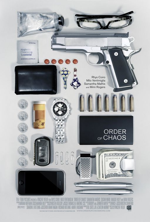
Over at Significant Objects, Joshua Glenn highlights the above image, a movie poster, evidence of a possible S.O. meme. I can’t comment on that, but the image did strike an odd chord, reminding me in different ways of other recent object imagery I’ve encountered. These images are all very distinct in their approach (the sorts of objects, the number, etc.), but to my eye at least there’s some visual similarity despite that. See below.
Click any image for more information.
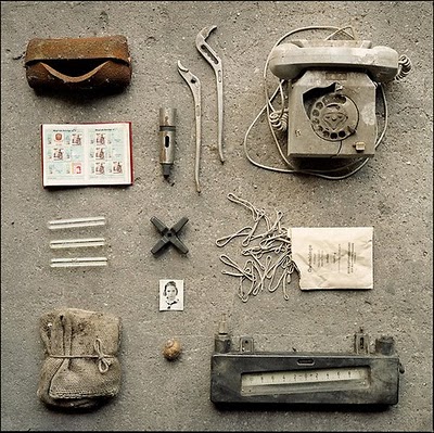
On Junkculture.com, Fritz Fabert’s Archealogy of Work series.
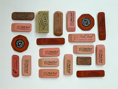
The first image from Lisa Congdon’s A Collection A Day project.

An image from Adam Voorhees’ “Exploded” series
Also, I suppose, many of the images in the Flickr What’s In Your Bag pool.
I can’t claim to be thoroughly versed in the Olympics, but having weighed in on what I think is the most compelling uniform development of the games, I may as well say this. From what I’ve (https://www.pawsgistclinic.org.uk/priligy-dapoxetine/) seen, the absolute worst and dumbest uniform, hands down, is this:
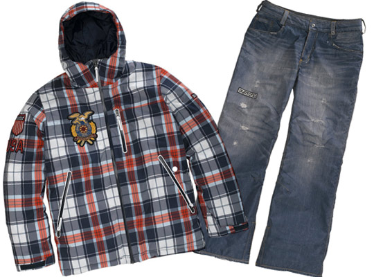
This is what members of the U.S. snowboarding team — men and women — are wearing. Back in December ESPN dubbed this lame grunge getup an “(anti) uniform.” Riiiiight. Super-“anti.” It’s as transgressive, subversive, threatening, and spectacular as, um, stuff half the kids at the mall have been wearing for ten years, and that nobody really notices https://drbarletta.com/retin-a-tretinoin/ anymore.
The mission statement for this supposedly radical outfit comes from the “vice president of creative” at snowboarding megabrand Burton:
The inspiration behind the U.S. Snowboarding Team outerwear for the 2010 Olympics is classic Americana, Although we are creating a uniform, our first objective is to express the individuality of snowboarding. As such, we are taking vintage American looks and interpreting them in a very unique and unexpected fashion. Finally, we will ensure that all of the highest technical attributes are maintained in the pieces, so that performance and function are not jeopardized. The result will be a progressive and fresh look that challenges the former conservatism of the Olympics.
Oh really? A challenge to conservatism? Via”classic Americana”? Yes, nothing challenges conservatism like classic-ness. I look forward to the overthrow of reactionary footwear by way of penny loafers. Burton penny loafers.
Anyway, I could go on about this at some length, but I’ll restrict myself to a couple of points. First, note that the hood is completely superfluous, and in fact probably counterfunctional. Far from bucking the dictates of socially derived aesthetics, it imposes a completely unneeded design element for the sole purpose of signaling. It about as “progressive” as having speed skaters wear bow ties. If there’s a more pure example of conformity trumping practicality, I can’t think of it.
Oh, wait, sure I can: Phony-holed jeans. For years the hollow claims of every marketing guru who insists that consumers “demand authenticity” has been neatly debunked by the success of the high-end “distressed” denim phenomenon. Buying jeans whose wear-and-tear is implemented by far-flung factory workers and machinery, according to specific standards devised and overseen by layers of corporate design-management — and in fact paying extra for such jeans, and pretending that this somehow signals rebel style — is a capitulation to simulacra-culture so Xtreme it would make Debord giggle and Baudrillard weep. Or vice versa. Whatevs.
The point is that characterizing these monotonous garments as “a uniform” is an essentially redundant act. Nothing here “expresses the individuality” of the wearer. That rather simple assignment could be fulfilled by simply letting the individuals wear whatever they wanted to! Instead, what is being “expressed” is the market research and trend forecasting of a large retail brand.
All of which just makes me appreciate those Norwegian curlers even more. They didn’t commission some company to cook their (https://conciergedentalgroup.com/propecia-finasteride/) look. They just found some insane pants on an online golfer store, and assembled their own Olympic uniforms with a few clicks. No “vice president of creative” required.
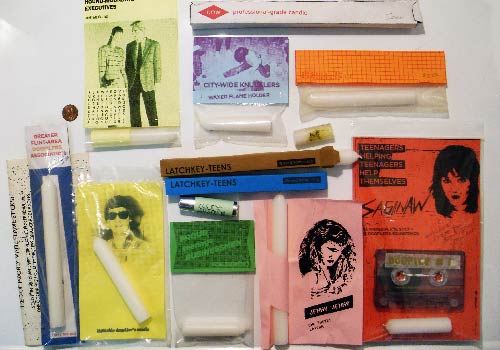
Artifacts of “dogpiling”
Matt Brown, whose work I noted here the other day, has an interesting piece up at his site, in which he recalls “dogpiling,” and its various material artifacts, notably Waxy Fire Rods. He writes:
Sitting here in my cubicle I’m reminded somehow of one of the most memorable eras of my life, and I’m amazed to this day that it hasn’t been documented in any way. In 1985 I was a teenager living in Saginaw, Michigan and like most others in the area I was bored. I remember hearing rumors of a dogpiling movement going on in Flint and I knew at that moment that I wanted in. Dogpiling- it’s when a group of people spontaneously decide to form a pile of human bodies. The “winner” is the one on top of the pile. The kids over in Flint wanted to celebrate once they were on top of the pile, and they started doing that by lighting candles when they were on top. Every teen in flint was carrying candles by the end of 1986. During those two years there was a whole scene built around it- different candle makers, bands, posters, and by the end of it even the biggest corporation in the tri-cities, Dow Chemical, got into it.
This is the story of how it started and where it went…
Read the rest here.
What do you think?
Save
Save
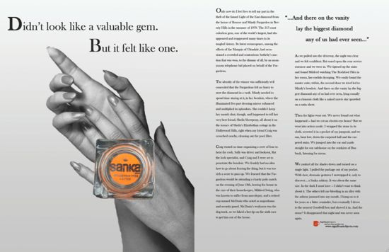
Those of you who know about the Significant Objects project but who haven’t checked it out lately may be interested in a batch of recent posts over there, in which I show off the creations of a SCAD advertising class that made ads for Significant Objects. I’ve noted before that some observers of the project see parallels between S.O. and advertising, so I thought this would be a pretty cool exercise, and I’m really pleased with the results. Fun.
Well, I attempted to get an expert to weigh in on the Norwegian Olympic curling team’s pants, but that didn’t work. But somebody needs to step up and analyze the pants, and I guess it has to be me.
If you’re not up on this, here are the pants:

No, I’m not watching the Olympics. But these pants are a lot more interesting than the Olympics. And yes, those pants are the Norwegian curling team’s official uniform pants, not something they wore as a goof during practice.
Here’s the deal, as I understand it. There’s no crazy-pants tradition, or obnoxious apparel tradition, associated with curling. Normally, curling athletes, or curlers, or whatever they’re called, wear plain pants — black, gray, that sort of thing. The Norwegian team decided they wanted something more snazzy.
Why? Well: Why not?
So one guy on the team found these pants, and he simply bought them online. They are from a brand called Loudmouth — a brand that evidently sells mostly to golfers.
I’m going to take a wild guess that I was not the only person who read this item, which mentions that anybody can buy these pants online, and soon found myself on Loudmouth’s site, out of curiosity. The pants for sale — not just the ones the Norwegians chose — are kind of astounding. (Pix after the jump.) I’m also probably not the only person to immediately think: “You know, I could see these pants catching on.”
And in fact, just a few hours later (as I type this) the brand’s online store isn’t functioning –because its server is overloaded. Coincidence? I don’t think so. (The pants are also available at this site.)
Two things here. First, I think it’s pretty cool that these guys got their official uniforms just by picking some easily-available off-the-rack product from a golfing apparel website.
The second thing about these pants is, they’re kind of amazing. I’m not saying I would wear them, but I am saying that they could easily escape the confines of the golf course, which is where they’ve evidently been stuck before now. But check out the pants after the jump. How long before some celebrity turns up in a pair of these at an awards show or whatever? How long before some alpha ironic hipster strolls down Bedford in a pair of these? Not with the white belt of course, but maybe with a Three Wolf Moon T-shirt.
Maybe it won’t happen — these things are always at least slightly random — but I think it certainly could. See what you think: Please continue…
If you recall earlier posts here and here about MySpace aesthetics, you might be interested in the recent NYR piece about Facebook. There’s a lot in the piece I have trouble with, but there are also some things I found insightful. It is here.
Here’s one passage related to aesthetics:
While MySpace listed details similar to if less sophisticated than Facebook—”Education,” but also “Body Type” and “Zodiac Sign”—a MySpace page could otherwise look like almost anything else online. Every Facebook page, by contrast, was laid out in exactly the same way, painted in an inoffensive if antiseptic palette of pastel blues on bright white. Facebook’s engineers, much abler than their counterparts at MySpace, quickly stifled any attempts to break these rules. To call MySpace “ugly” would be roughly equivalent to categorically denouncing graffiti—to praise Facebook for its “clean” design, akin to celebrating tract housing.
The writer repeatedly compares Facebook to a “suburban” space. (My favorite instance is a bit talking about privacy settings: “One solution: set your privacy options so that no one could see your photos at all—a decision whose wisdom would be confirmed every time a drunken picture of a friend showed up on the News Feed, only to disappear a few hours later, like a Cheeveresque husband seen momentarily wandering, naked, down his front drive.” That’s funny.)
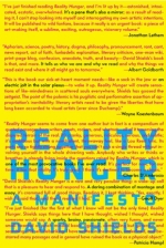 I’m a big fan of David Shields’ work, going back at least ten years now, maybe longer. I think he’s one of the most inventive and ambitious and original writers around. So I had high expectations for Reality Hunger, which I read in galley form a couple of months ago. I was not disappointed. It’s excellent. In fact, when the final copy of the book arrived in the mail the other day I was actually excited to think about reading it again.
The book is billed as “an open call for new literary and other art forms to match the complexities of the 21st century.” The official description:
Shields’s manifesto is an ars poetica for a burgeoning group of interrelated but unconnected artists who, living in an unbearably artificial world, are breaking ever larger chunks of “reality” into their work. The questions Shields explores—the bending of form and genre, the lure and blur of the real—play out constantly around us, and Reality Hunger is a rigorous, radical reframing of how we might think about this “truthiness”: about literary license, quotation, and appropriation in television, film, performance art, rap, and graffiti, in lyric essays, prose poems, and collage novels.
I may write more about it later, with my more specific reactions to it. Also: I may not. Meanwhile, if you are interested in these subjects, I recommend the book. More information here.
Posted Under:
Books by Rob Walker on February 9, 2010
Comments Off on “Reality Hunger”
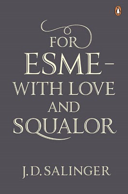
I’m not sure if I’ve ever said so here, but I’m an advocate of the idea that rules and limits are things that spark creativity, rather than stifle it. I know I have said here that I wonder about how book design would be different if it were guided by thinking of the actual reader, actually reading, rather than the potential reader, theoretically considering a purchase at shelf.
This brief post is relevant to both thoughts, perhaps, in quoting an article from the Guardian:
Before his death, JD Salinger’s publisher, Hamish Hamilton, worked with him to produce jackets for reissues of his books … [said]Simon Prosser, publishing director, Hamish Hamilton: “There are strict rules about JD Salinger’s covers. The only copy allowed on the books, back or front, is the author name and the title. Nothing else at all: no quotes, no cover blurb, no biography.”
As you can see, the jacket looks great.
The only flaw is the little publisher logo in the corner. Why is that there?
[This is a slightly tweaked cross-post from SignificantObjects.com.]
Here’s yet another twist on adding an invented narrative to a seemingly low-value thingamabob:
Designer Matt Brown bought a pack of 15 plastic horses for a couple of bucks. Then he dreamed up a name for each one, then packaging, reconceptualizing his two-dollar purchase as a line of toys, Night Horses, that were introduced in the late 1980s, and flopped.
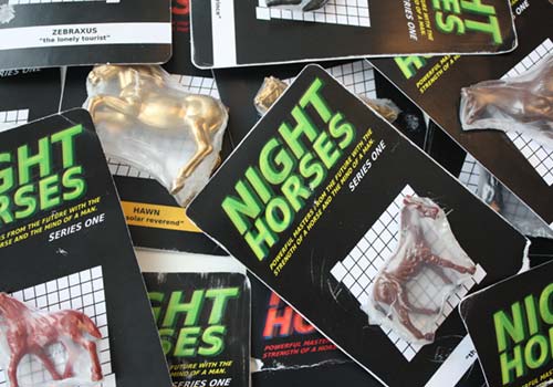
Hey, remember Night Horses? (No, you don't.)
I love it!
More recently Brown has embarked on another project, turning some toy cars into another failed product line. They’ll be retroactively rebranded as Throttle Dukes. More here.
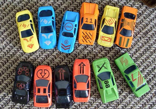
Throttle Dukes, to be.
Is this more evidence of the “significant objects meme” that my Significant Objects colleague Joshua Glenn has detected? I don’t know.
“I like taking things that are basically worthless and neglected and turning them into something that people could enjoy again,” Brown writes. Combine that with my longstanding interest in imaginary brands, and you can see why I’m so into it.
(Via Metafilter, where Brown was referred to as a “design fiction enthusiast.”)
I’m interested in this upcoming Frontline installment, Digital Nation, partly because the correspondent is Douglas Rushkoff. I started a while back to write a post here about his most recent book, Life Inc.: How the World Became a Corporation and How to Take It Back , but for various reasons never completed that, and I guess never will. So I’ll just give you the short version: I read it some months back and found it quite interesting and certainly provocative. I’m not really that well-read on Rushkoff’s work, but based on what I (thought I) knew, it was not what I was expecting.
And while the book seems to have done well, I’m surprised it didn’t generate more mainstream discussion and reaction. That’s too bad because there’s a lot to discuss and react to. The most interesting aspect of it to me was the underlying argument that history since, say, the 1600s is not just a march of progress, but rather has also entailed some extremely significant losses along the way. I read this between reading Margaret Atwood’s Debt, and Lewis Hyde’s The Gift, so it hit on lots of things that have interested me lately. I even started listening on occasion to Rushkoff’s show on WFMU, Media Squat (now on hiatus) and that included some interesting discussions, notably the episode with Howard Bloom. But since most of his guests kind of see the world the same way he does, I still end up feeling a little frustrated — phrases like “bottom up” and “create real value” get tossed around a lot as if their meaning was obvious, and not contestable. It would have been useful if the book had attracted reaction from a broader range of sources, because I have a feeling that would have been provocative, too.
Anyway so it’s because of all this that I’m interested in Digital Nation — which I think under normal circumstances is something I would have shrugged off as likely-to-be-predictable. I’m curious of the ideas he seemed to be wrestling with in Life Inc. will manifest here.
On a possibly related note — related to digital life, anyway — Mind Hacks notes two bits of research of note: BPS Research Digest summarizes a study looking into how people with certain offline personality traits behave online. (Best line: “Students who scored high on psychoticism were also likely to say that they found it easier to reveal their true selves online than face-to-face.” Hmm, great.) And this earlier study finding consistency between online and offline social behavior. Maybe that all sounds sort of obvious, but keep it mind when you hear gurus generalize about social-Webness affects “everybody.”
Posted Under:
"Social" studies by Rob Walker on January 30, 2010
Comments Off on “Digital Nation”

Well, is it?
The Significant Objects project has conclusively demonstrated that narrative adds measurable value to objects.
What does this imply about the objects themselves, and whoever created and produced them? Something I hear often from assorted gurus on design, marketing, and the like, is that consumers value the story of an object in the sense of knowing how that object was made, or designed. Did a recognized Design Genius dream it up? Is there footage of the whiteboard meetings where the genius insight was arrived at? Or: Was the object crafted by hand? Perhaps knowing more about the crafter’s skill-acquisition history, or personal ideology, adds valuable narrative.
Yet the Significant Objects project added measurable value even while explicitly ignoring such matters. Every Significant Object carries two narratives, but neither has anything to do with the kinds of stories just suggested. Instead there is the narrative invented by the writer who has agreed to create a story about whatever doodad is for sale; and, in addition, there is the story of the project itself. Probably both of these narratives add value to some extent, with specifics varying from buyer to buyer. But while most of the objects sold over the course of the project have been mass-produced, the intent of whoever designed them, whoever marketed them, and why, and how, is flagrantly disregarded, replaced with pure fiction. Arguably, Significant Objects obliterates designer/producer intent.
Still, whatever the fate of that intent, its results remain in the form of thing itself. Clearly some item sold by Significant Objects have been more intrinsically appealing than others, and it must be conceded that however much our writers’ stories increased the value of an object in the open market, the aesthetics of the object must figure in somehow.
Which brings me to a recent Significant Object: the Mystery Object, with story by Ben Greenman. In this instance, not only is the designer’s intent ignored, not only is the material backstory disregarded, the object itself is not present.
What we have is Ben Greenman’s narrative about the object, and perhaps the narrative of Significant Objects as a project — to which the addition of a non-present object of course adds yet another pleasing plot twist. By eliminating the object itself from the equation until after the bidding has concluded, this auction sells invented Significance in its purest, most uncut form yet.
In a sense, this makes the Mystery Object unique even among the project’s already-singular series of offerings; as a result, it may be the most valuable object yet, not despite its absence from the scene until the moment that value is determined, but because of that absence. Who wouldn‘t want to own such a thing — whatever it is?
Bidding stands at $28.50.
UPDATE: It sold for $103.50. That’s pretty Significant, don’t you agree? Details here.
While the use of tools by animals is unusual, Neil MacGregor points out in the second episode of A History of The World in 100 Objects, it’s not unique to humans: apes use objects, too, for example. The difference is that humans “make tools before we need them” and, more to the point, “we keep them,” for repeated use. The 1.8-million-year-old Olduvai chopping tool, then, suggests the dawning of a “relationship between humans and the things they create which is both a love affair, and a dependency. From this point on, we can’t survive without the things we make.”
In this instance, the chopping tool could be used to get at the meat and marrow of an animal that the actual predator who killed it (a lion, say) couldn’t. So here we have the birth of use-value — and, perhaps, the birth of design. This chopping tool shows humans becoming “distinctly smarter,” and considering “how to make things better,” MacGregor says. Interestingly, though, he also maintains that instead of the half-dozen or more chippings that sharpened this rock into a tool, the job could have been done in maybe two chippings: “Those chips tell us that right from the beginning, we, unlike other animals, have wanted to make things more complicated than they need to be.” Evidently, then, the dawn of design coincides with the dawn of … overdesign.
This notion comes up again in the series’ third episode, concerning another discovery from Tanzania’s Olduvai gorge: a handaxe. This is believed to be 1.2 million years old, and reflects a good deal more skill, forethought, and imagination on the part of its maker – the sort of “focused, planned creativity,” as MacGregor puts it, that marks modern humans.
James Dyson, however, is not impressed. Please continue…


 "
"



 Kim Fellner's book
  A
A