As a follow up to this past weekend’s Consumed about Crafty Chica:
The sort of sub-theme of that column was that the mainstream/traditional craft industry seems to be making more of an effort to work with or reach out to (or just sell to) the Handmade 2.0 world. I noted in the column that Kathy Cano-Murillo and Jenny Hart were featured speakers at the most recent Craft & Hobby Association convention — and I also mentioned that some of the material at that trade show describing the indie-craft scene was met with exasperation by at least some actual members of that scene.
In light of all that it’s worth pointing out to those of you who are interested in the crafty movement — which I obviously think is a pretty big deal and pretty interesting, which is why I write about it all the time — might want to check out some follow-up thoughts that post-date my deadline on that column.
Specifically, the most recent episode of CraftyPod deals directly with the issue. Sister Diane interviews Mike Hartnett of Creative Leisure News, a longtime observer of the craft-retail business. If you’re an indie crafter yourself, you might be interested in hearing his observations about how that business has changed and evolved over time — he knows his stuff. (Among other things it’s pretty surprising to hear how relatively recently scrapbooking was sort of marginalized, given how central to the mainstream-retail craft idea it is today.)
That said, I remain more than a little surprised at how belatedly the mainstream craft industry seems to be taking an interest in the indie scene. That comes through in the interview. But it’s to Sister Diane’s credit (and actually this is typical of why I like the crafty crowd) that she did this interview, and then even contributed a piece to Hartnett’s publication.
And it’s to Hartnett’s credit that he asks directly for feedback from Sister Diane’s audience. I’m thinking about emailing myself — maybe let him know about an article and a book and a few posts and columns that I guess he missed.
The caption: “I couldn’t help but chuckle at these two signs. “we buy houses ca$h” on one, and “sick of useless marketing” on the other? Classic. I later called the number for kicks, and heard a recording from some guy with a faint New York accent hawking some kind of small business marketing pamphlets.
“Of course, feel free to call, and leave them an entertaining message”
Posted Under:
Flickr Artifacts by Rob Walker on March 3, 2009
Comments Off on Flickr Interlude
One of the more pleasing discoveries made during the period when I was most heavily promoting Buying In was the KERA-Dallas radio show, Think. I enjoyed that interview so much, I ended up subscribing to the Podcast. Which brings me to my point:
On the February 26 episode of the show — archive here — Krys Boyd interviewed George Friedman president and CEO of something called STRATFOR. He has a book out called The Next 100 Years: A Forecast for the 21st Century. And that’s what he talked about: His hundred-year view.
I usually have very little patience for futurist types, but I thought this guy was fascinating. Apart from hearing him make the case for why Turkey and Poland are both likely to be rising powers in the century ahead — not something I’ve ever heard before, to say the least — I was interested in his attitude toward the current economic situation. Bottom line is it was refreshing to hear someone talk about that with a longer-term view, as opposed to the nonstop panic on every news site I look at. Oh, he had some interesting stuff to say about solar power via satellite.
Again the audi0-archive link is here. They refresh it as new shows are done and this episode will disappear in a few days. So if you’re interested, grab the MP3 now.
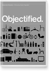
On Sunday March 15, I’m scheduled to be on a panel related to Gary Hustwit’s documentary Objectified, at SXSW in Austin. My understanding is that the panel is titled: “We Have Been Objectified: Identity, Consumerism, and the Future of Designed Objects.” Details are here.
Afterwards I’ll be signing Buying In at the “South By Bookstore.” Please stop by and say hello — and tell your SXSW-going friends who haven’t bought the book that now is the time. Details:
The South by Bookstore is located on the Trade Show Floor (#s 534, 535, 900), labeled South by Bookstore on the Trade Show map. Enter the Austin Convention Center (on 4th Street across from the Hilton), take the escalators up to the fourth floor, take a right when you get off the escalator and walk down the hall. The main entrance to the trade show is on your left. Walk to the back, right side of the room. The bookstore is along the back wall. There will be signs identifying it.
Rob Walker/Buying In: 5 – 5:30 pm, Sunday March 15
Posted Under:
Buying In (the book),
rw by Rob Walker on March 1, 2009
Comments Off on SXSW “Objectified” panel and book-signing
 HAPPY MEDIUM:
How an alt-crafts venture is making its way to the mainstream.
This week in Consumed, Kathy Cano-Murillo, better known to fans as Crafty Chica, as an example of the evolution of the do-it-yourself busines.
Anecdotal reports have suggested that the business of crafting may not be suffering quite so much as the rest of the retail landscape in the current recession. But whatever the state of the economy, the Craft and Hobby Association is largely focused on expanding the sales of its mass-oriented member companies. (Alt-craft aside, the show also included a preview of craft products from, of all people, Paris Hilton.) And it’s fair to say that some indie crafters are skeptical about the attention. CraftyPod, an influential blog and podcast, noted with exasperation that the material at the show described new-wave crafters in the context of “the hippie generation.”
Cano-Murillo is perhaps uniquely situated to bridge this craft gap. She’s widely known in the indie world and has built her own contact list of a few hundred indie stores. But last year she quit her newspaper job to work for Duncan Enterprises, maker of well-known craft products like Aleene’s Original Tacky Glue, and that move made it possible to approach big chains like Michaels and Jo-Ann Fabric and Craft. …
Read the column in the March 1, 2009, issue of The New York Times Magazine, or here.
Consumed archive is here, and FAQ is here. The Times’ Consumed RSS feed is here. Consumed Facebook page is here.
“Letters should be addressed to Letters to the Editor, Magazine, The New York Times, 620 Eighth Avenue, 6th Floor, New York, N.Y. 10018. The e-mail address is magazine@nytimes.com. All letters should include the writer’s name, address and daytime telephone number. We are unable to acknowledge or return unpublished letters. Letters may be edited for length and clarity.”
For Chris Ware’s Acme Novelty Datebook Volume 2:
Product Description
Straggling behind the mild 2003 success of cartoonist Chris Ware’s first facsimile collection of his miscellaneous sketches, notes, and adolescent fantasies arrives this second volume, updating weary readers with Ware’s clichéd and outmoded insights from the late twentieth century.
Working directly in pen and ink, watercolor, and white-out whenever he makes a mistake, Ware has cannily edited out all legally sensitive and personally incriminating material from his private journals, carefully recomposing each page to simulate the appearance of an ordered mind and established aesthetic directive. All phone numbers, references to ex-girlfriends, “false starts,” and embarrassing experiments with unfamiliar drawing media have been generously excised to present the reader with the most pleasant and colorful sketchbook reading experience available.
Included are Ware’s frustrated doodles for his book covers, angry personal assaults on friends, half-finished comic strips, and lengthy and tiresome fulminations of personal disappointments both social and sexual, as well as his now-beloved drawings of the generally miserable inhabitants of the city of Chicago. All in all, a necessary volume for fans of fine art, water-based media, and personal diatribe.
This hardcover is attractively designed and easy to resell.
And for his Acme Novelty Library #18:
Product Description
In keeping with his athletic goal of issuing a volume of his occasionally lauded ACME series once every new autumn, volume 18 finds cartoonist Chris Ware abandoning the engaging serialization of his “Rusty Brown” and instead focusing upon his ongoing and more experimentally grim narrative “Building Stories.”
Collecting pages unseen except in obscure alternative weekly periodicals and sophisticated expensive coffee-table magazines, ACME Novelty Library #18 reintroduces the characters that New York Times readers found “dry” and “deeply depressing” when one chapter of the work (not included here) was presented in its pages during 2005 and 2006. Set in a Chicago apartment building more or less in the year 2000, the stories move from the straightforward to the mnemonically complex, invading characters’ memories and personal ambitions with a text point size likely unreadable to human beings over the age of forty-five.
Reformatted to accommodate this different material, readers will be pleased by the volume’s vertical shape and tasteful design, which, unlike Ware’s earlier volumes, should discreetly blend into any stack or shelf of real books.
Who could resist?
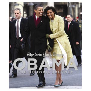
 So I just a got a Fedex — a fair-sized box containing a copy of the rather lavish coffee-table-style book Obama: The Historic Journey. This is, in part, a New York Times production. I got a copy because a Consumed that I wrote about Obama-inspired art is reprinted within.
I gave permission for that column to be included (free) a while back, and that had sort of slipped my mind until I got the nice note from the publisher asking for my address. I must admit I had no idea the book was such an extravaganza. It costs $40. Lush color photography throughout, as well as writing from many Times contributors the general public has actually heard of. I’ll check it out more thoroughly later.
Meanwhile, if you’re interested, more information here.
Somebody was interviewing me today about the book and the current economy and all that, and the conversation turned to Tropicana bowing to consumer pressure (apparently) to junk its recent redesign. What does that episode say about the present state of the “secret dialogue between what we buy and who we are”?
Well, for one thing it’s an example of one manifestation of that dialogue becoming somewhat more open — in the sense that one of the things the Web does is make visible consumer sentiments that would have been harder to quantify in the past.
More interesting, though, I would suggest, is that the episode underscores the surprising degree to which consumers want to participate in this dialogue. By that I mean: If nobody cares about brands anymore (as various experts have claimed for years, and are claiming once again with the recession as the new rationale), then why in the world would anybody go to the trouble of emailing a company, or starting a Facebook group, about package design? After all, the juice didn’t change. So, you know, who cares?
Lots of people, that’s who. Marginal Utility picks up on a comment from some Tropicana exec that the decision was made because the brand’s “most loyal consumers” were supposedly unhappy: “That they bother to complain is precisely what makes them loyal,” Rob Horning writes. “Others would probably just buy something else without a second thought. Myself, I would prefer to be one of those others.”
To me, that’s definitely a more reasoned response: I mentioned that we at Murketing HQ disliked the new design, and responded by trying some alternatives. While we talk about this kind of consumer/design trivia all the time around here, it never occurs to us to get involved in some kind of Web-enabled protest movement, or at least not about the way a package looks.
After all, it’s not like the aesthetics of Tropicana is some kind of important issue worth rallying around — certainly nothing worth treating like a consumer-rights battle that pitted the grassroots against corporate power.
And yet, there’s at least some evidence that certain observers see this incident in precisely those terms. For example, Marginal Utility also noted the Kottke entry on the Tropicana episode, which declares: “We won!”
I have something in The Big Money today: A call to commercial persuasion pros to use their skills on behalf of causes and ideas they believe in — not nonprofit client causes, and not the ideas of socially-responsible-business clients. Their own causes, their own ideas. The piece is here.
It’s pleasing to have something the extended realm of Slate again, after many years.
Posted Under:
Ethics,
rw,
Suggestions by Rob Walker on February 25, 2009
Comments Off on Memo to the ad biz…
A (new) friend of Murketing passes along an interesting example of the, uh, inspiration for a TV commercial from a big agency. It’s a Snickers ad that ran, as I understand it, in Mexico.
Here is the opening sequence of the 2007 skateboarding video Fully Flared, which features skaters doing various stunts amid concrete ruins — made remarkable by various explosions that occur during and just after said stunts. If you’re into that sort of thing, it’s pretty impressive. I gather Ty Evans and Spike Jonze were the principle filmmakers.
Here is the Snickers ad, as posted a few days ago on The Berrics. It features skaters doing various stunts amid concrete ruins — made remarkable by various explosions that occur during and just after said stunts.
You get the idea: Very similar. (Though in the latter, the skaters eat some Snickers bars.)
The Berrics also posts this Smoking Gun-like document which appears to be the pitch & storyboarding for the ad. The agency is BBDO. In case you’re curious what The Berrics’ view is of this, the ad is referred to on their site as “The BBDO Attrocity.”
Perhaps there is more to the story? If not, it does appear pretty blatant and shameless.
 Unless you’re in New Orleans. Then it’s something better than that.
To mark Mardi Gras, I will recommend a book about New Orleans. Immodestly, I will recommend my own book, Letters From New Orleans, published by the mighty Garrett County Press.
It’s not about Katrina and its aftermath. It’s a book of essays about how the city was for us when we lived there. The first edition was published in 2005, mere weeks before Katrina came along, an event that of course recast the book against my will. Kate Sekules’s NYT review here; other reviews and so on are here. (The second edition does include a post-Katrina afterword.)
While I’m being immodest, I’m not being greedy. To this day, all my royalties are redirected to organizations involved in post-Katrina relief efforts. While the specific nature of those efforts have of course changed, they haven’t stopped.
Happy Mardi Gras, wherever you are.
Save
 So, speaking of design: I’m interested to learn, via Better Living Through Design, about the Normal Bookmark. It is “a simple, plain bookmark made from quality paper with a natural texture and color.” It is further described as a reaction to a “flashy” free bookmark that came with a purchase from a shop and that thus included that shop’s logo. This logo-ed bookmark:
reminded me of today’s busy society, where every company is trying to outdo, outsmart, out-compete and out-advertise each other. As a result, I feel our simple human lives have become quite suffocated and fatigued under the overwhelming pressure from modern-day media.
Good design is design that is invisible and should be free of the designer’s ego.
Thus the Normal Bookmark is just a blank piece of thick paper. With rounded edges. A pack of five costs $7.
Now I ask you: Is charging more than a dollar for a blank piece of thick paper really an example of “good design”?
It’s not clear what the specific paper-type is, or whether it’s, I don’t know, recycled or something okay now I see this page says the paper is “quality paper from managed and renewed forests.” That’s still pretty vague for me.
But seriously: Couldn’t anyone “distracted” by overly colorful bookmarks simply look around their apartment/home and find some suitably blank scrap material that could be repurposed into a bookmark? And for that matter, aren’t we in a recession where everybody is supposedly trying to be all conspicuously frugal? Or is this really just a satire?
If you follow the design world at all you know doubt know that Tropicana’s redesign was, um, controversial. There are always those who will argue that controversy is just another form of buzz, and long-term good for a brand. Apparently, Tropicana owner Pepsi doesn’t see it that way in this case:
Redesigned packaging that was introduced in early January is being discontinued, executives plan to announce on Monday, and the previous version will be brought back in the next month.
Wow. I really can’t think of another example of such a retreat (in the context of a high profile package redesign, I mean). Earlier I liked to this Brandweek bit that says “The new packaging has 20 design trademarks and copyrights. It took 30 people five months to develop it.”
Probably this story will largely be positioned as an example of the enhanced power of consumers to complain — the NYT story is full of the usual email-and-Facebook exaples, etc. And maybe that’s partly true.
I also think, however, that this was a particularly egregiously unneeded and badly executed redesign. I say that, basically, as a shopper: Here at Murketing HQ we had several discussions about how weak and generic the new look was — and while we did not bother to write the company or join any Facebook groups to express our displeasure, it did actually cause us to start trying different OJ brands.
Now, Murketing HQ is kind of a weird place, and not representative of normal consumer (or even human) behavior. But still.
My personal take is that as a redesign, this one was emblematic of the worst tendencies of some designers to want to change everything, and for no good reason — to undervalue the power of the familiar. I can just hear the discussion about how the orange-with-a-straw-in-it symbol was corny and “dated,” and that that the excellent Tropicana logo letterforms were stale and should be scrapped and made “contemporary.” The result, inevitably, was a look that I suppose is very “now,” but in the worst way: It looks like everything else. Just my two cents.
Trivia: The design firm on this was Arnell, which came up in a December 9, 2007 Consumed about the (much-hyped in the design world) Home Hero fire extinguisher. Is that still around?

Quick reminder: There is no Consumed column this weekend. And now some updates.
Above: New(ish) from The Black Apple. (You may remember her from the Handmade 2.0 story.)
Rich Brilliant Willing, whose hypothetical design project Green Cell was the subject of this April 20, 2008 Consumed, get some attention for a more recent project — Russian nesting doll tables — here.
I did a January 27, 2008 column about Kiva. This past I got an email from somebody at BetterLabs about an app the created: If you want to make a loan to a Kiva entrepreneur, but have particular criteria (a particular country, or maybe some particular sort of business) and want to be alerted when there’s a loan-seeker who meets those criteria, then you can try Kiva Alerts.
And in new links on the roll: Adding Yu-Ming Wu’s new blog to the Brand Underground section; Yu-Ming is a very smart guy and someone I like a lot, and appears in Buying In. Also adding The Sound of Young America blog to the Hard to Categorize category.


 "
"

 HAPPY MEDIUM:

 So, speaking of design: I’m interested to learn, via



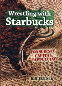 Kim Fellner's book
  A
A