In reading various articles about the alarming increase in the power and violence of the big Mexican drug cartels, I’ve noticed that while it’s always explained that said cartels have used their escalating profits in recent years to stock up on a dizzying array of weapons (often bought in the U.S. etc.)
What I haven’t seen is how their profits are holding up over the past six months or so. Is the downturn affecting demand for illegal drugs? One way or the other the answer would be interesting. Has that been written about and I just missed it?
After yesterday’s barrage of posts, I’ll leave you alone today, or rather direct you elsewhere.
1. Steven Heller has an interesting post about design “empathy,” an idea with its own logo. He also has some questions if you know much about that subject: “What I want to know is, when did empathy become first, a strategy, and second, a brand? Can you shed some empathetic (or sympathetic) light on the subject?”
2.Paola Antonelli is now writing a column for Seed.
3. Update on the 2/12/19 Consumed about the Fail Whale: ” To attract more followers to Baltimore tourism’s Twitter account, the guy who runs it, Tom Rowe, pledged that a friend of his would get a tattoo of Twitter’s iconic fail whale, and broadcast the tattooing on live webcam, if they could get past the 3,000 followers mark.” Adfreak has the picture.

So here’s the poster for Objectified, the documentary I mentioned the other day. The Underwire, which says Objectified is “one of the buzziest movies showing at this year’s South By Southwest film festival,” makes this interesting assertion:
The poster already has the design geeks drooling, and apparently the physical print (metallic silver, 27 inches by 39 inches) is even more impressive in person.
Hm. What does it mean to covet this particular poster? I wonder what director Gary Hustwit thinks of that?
Anyway, keen-eyed observers have noted that my name is in the “cast” list. What that means is Hustwit interviewed me. He was a nice guy and very smart, and I’m sure the documentary will be interesting. But I’ll be seeing it for the first time this coming Saturday evening, and I really don’t know what to expect. (On a personal level, probably some form of humiliation. That’s always what I expect.)
That said, if you’re going to SXSW, you might want want to check out the movie, too, and/or the Sunday panel “We Have Been Objectified: Identity, Consumerism, and the Future of Designed Objects.” Which I’m on. Maybe we’ll talk about poster lust.
And whether you go to those or not, please stop by the South By Bookstore from 5 to 5:30 pm on Sunday the 15th; I’ll be there signing books. Or perhaps just staring idly into space.
The South by Bookstore is located on the Trade Show Floor. Enter the Austin Convention Center (on 4th Street across from the Hilton), take the escalators up to the fourth floor, take a right when you get off the escalator and walk down the hall. The main entrance to the trade show is on your left. Walk to the back, right side of the room. The bookstore is along the back wall. There will be signs identifying it.
Save
Posted Under:
The Designed Life by Rob Walker on March 9, 2009
Comments Off on “Objectified” object
Haven’t done one of these in a while, and may have missed or forgotten some stuff in the interim, but:
The March 26, 2006 Consumed was about Supreme. How is the brand doing in these gloomy times? PSFK points to an interview in Interview with founder James Jebbia (who I must say was one of the more interesting “streetwear” entrepreneur types I’ve ever interviewed). Jebbia says his business is “really good.” And: “Ever since September 11, I’ve been quite conservative in what we’ve ordered. We’ve never really been supply-demand anyway. It’s not like when we’re making something, we make only six of them. But if we can sell 600, I make 400.” There’s also some interesting stuff about Japanese consumers.
The May 15, 2005 Consumed was about Classic Century Dinnerware, sold at Crate & Barrel, and designed by Eva Zeisel. Core77 notes that Zeisel — now 103 — was recently honored at New York’s Museum of Arts & Design. Beyond The Beyond also chimes in to marvel at Zeisel, and to point out this SF Examiner piece about her.
A blog called My Private Brand reprints in its entirety the May 7, 2006 Consumed about Publix’ private-label design. Please note: Both I and the New York Times would prefer it if you would simply link to the column, rather than reprint it without permission. I’m just saying. Anyway, My Private Brand looks interesting so I’ll keep an eye on it. Prior Murketing.com post with a roundup of stuff I’ve written about private label evolution over the years is here.
The April 17, 2005 Consumed was about Moosejaw.The guy I interviewed, a fairly charming young man named Robert Wolfe, has moved from CEO to Chief Creative. Details here on the company blog, which says: “Moosejaw has continued to grow its brick-and-mortar presence, created a state-of-the-art multi-channel e-commerce, mobile commerce and point of sale system, upgraded its call center and warehouse distribution center, tripled the size of the Moosejaw brand apparel line and much more.”
I was going to throw this into the linkpile, but given Brian’s masterly comment on government logos the other actually mentioned NASA’s logo as his favorite ever: In T Magazine this weekend, Alice Rawsthorn assessed the two logos that agency has used, “the meatball,” and “the worm.” It’s pretty interesting. Opinions seem mixed on which is better. I kind of like the worm, now that I’m forced to think about it.
As you may know, Facebook has made pages (like the Consumed Facebook page) look/work more like profiles. That generally seems like an improvement. It has also prodded me to make some minor changes — and to float a new idea (see #3).
1. There are now more ways to offer feedback, which I’m always happy to hear, either by commenting on a particular posted column, or writing on the Consumed page’s wall. (I had that disabled before.) So please chime in as you see fit.
2. The page now has a status-update component, which I’ll use of course to let readers know when a column is online — but also to, for instance, to let people know that I’m going to be on WNYC’s Sound Check today talking about “Obama as muse.” That sort of thing.
3. The new idea: In an effort to put readers (I am not crazy about the word “fans”) in the spotlight, I want to do a series of mini-Q&As with some of the interesting people who have joined the Consumed Facebook page. I will post them on Murketing.com and link from Facebook. I’m approaching people now, but if you’re interested in participating, join the page & let me know.
That’s all for now…
 Revalued:
A maker of recycled-plastic products bets that eco-chic will outlast the downturn.
This week in Consumed, a look at Preserve, and selling an ethical-consumption story in a time of penny-pinching:
Organic-food sales are suffering. Some people are flat-out bragging about shunning cool design. And both Target and Whole Foods, which happen to be Preserve’s biggest retail distributors, are struggling. So what does this new environment mean for a brand like Preserve? Its products aren’t terribly expensive — $2 for a toothbrush, $6 for a set of tumblers, $10 for a cutting board. But shoppers who value frugal over eco can clearly find cheaper alternatives….
CEO Eric Hudson and firms like his are hoping shoppers will ask themselves, “How can I feel really good about the 5 things I’m going to buy in the store today versus the 25 that I used to buy seven months ago?”…
Read the column in the March 8, 2009, issue of The New York Times Magazine, or here.
Consumed archive is here, and FAQ is here. The Times’ Consumed RSS feed is here. Consumed Facebook page is here.
“Letters should be addressed to Letters to the Editor, Magazine, The New York Times, 620 Eighth Avenue, 6th Floor, New York, N.Y. 10018. The e-mail address is magazine@nytimes.com. All letters should include the writer’s name, address and daytime telephone number. We are unable to acknowledge or return unpublished letters. Letters may be edited for length and clarity.”
Posted Under:
Consumed by Rob Walker on March 7, 2009
Comments Off on In The New York Times Magazine: Preserve
Today a blog I read via RSS basically announced its own demise. The reason? The author now prefers Twitter. I checked the Twitter feed and it was, of course, far less substantial than the blog had been. In fact I didn’t seen a single tweet of interest, whereas this person’s earlier blog posts had been, with some regularity, worth a look. If I don’t “follow” this person, I miss the possibility of some future interesting tweet — at least a link I would have missed, something.On the other hand, if I do follow, I clearly have to wade through a bunch of garbage. The signal-to-noise ratio will clearly be way worse than it had been on the now-dying blog. I’m interested in this person’s thinking — but I’m not that interested.
Too bad. Maybe someone else who follows this person will pick up on the occasional interesting tweets and blog about them? Or will I eventually capitulate and start following, the days of (kinda) thought-out blog posts fading into —
Whoa, I better wrap this post up — it’s so long!

Okay well I just said I wasn’t going to offer an aesthetic critique of the new recovery logo. But, since McChris, in the comments, mentioned the National Recovery Act emblem from the Great Depression/New Deal era and even offered an image link … Well, I can’t help but say that I think there’s a boldness in the old emblem that’s definitely not present in the new one. The new one seems a bit wimpy to me, a bit, I don’t know, Facebooky or something — or like it represents an iPhone app. It also strikes me as a little too busy for its own good.
BUT, maybe my view will change in time. Again I think it does its job only via repetition and context. So … we’ll see.
Anyway what seeing this old emblem really makes me wonder is: Why in the world didn’t the Obama team hire Shepard Fairey to do the new recovery logo? Whether you’re pro or con Fairey, you’ve got to admit: The guy really knows how to do propagandistic icons.
[3/5 UPDATE: I really have nothing to say today, so instead read Brian’s comment on government iconography below, as it is superior to the post itself. Oh, and here, via Design Observer‘s “observed” links, is info on who designed the new recovery logo. I’m going to guess that when the design blogs get to assessing (I still haven’t seen any writeups), they will generally like it. But maybe not. Very curious to know… ]
 WSJ:
WSJ:
At the Department of Transportation Tuesday, Mr. Obama unveiled a new logo for projects funded by his $787 billion stimulus plan and announced the first infrastructure project to receive funds.
The logo — with a three-leafed sprig for green jobs, a set of gears for infrastructure, and “recovery.gov” beside a field of stars — will be used to brand projects as well as raise the visibility of the White House’s economic initiatives and try to dramatize their impact.
This is interesting and I think it’s potentially smart. I’ll leave it to others to critique the actual design — and I expect there will be plenty of critiques. But as is so often the case with logos (including the vaunted Obama campaign logo), what will really matter won’t be simply aesthetics, but repetition and context. If people really start to see this a lot, connected to actual work being done, it will have the desired effect: “Wow, that stimulus money is making things happen.”
1. The Zapruder film.
2. Rodney King video.
3. … ?
What do you think? I feel very confident about the top two. But what comes next? The “macaca” thing? Trent Lott’s downfall? The Dan Rather stuff? Something else?
Any significance to the fact that both my top choices predate the IPO of Netscape, let alone the careers of the 50,000 people who now make a living blathering about “citizen journalism”? Or are my choices wrong?
You tell me.

I don’t know who the artist is. By Yue Minjun. [Thx super-awesome commenters! See comments for link to NYT article. (Doh!)] Via ffffound.
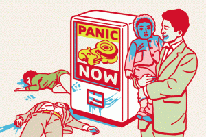 So is frugal still the new sexy? Is thrifty still cool? I don’t feel like I’m seeing variations on that trend story so much lately. Now I feel like what I’m reading more often is that maybe consumer behavior is being shaped less by “new values” than by, oh, I don’t know, panic and fear.
Check out some comments from today’s WSJ wrapup of stock market sentiment:
Gone are the days where the mantra among investors was to “buy the dips,” on the belief that when stock prices fall, they’re likely to rebound. Instead, the opposite sentiment has taken hold.
“It’s like an unending nightmare,” says Kent Engelke, managing director at Capital Securities Management in Glen Allen, Va.
Astonishingly, the piece says: “Many analysts and investors are still worried that earnings estimates are too high.” In other words there is still too much optimism out there. Can that be? I guess it’s possible. From everything I see in the papers, online, on television, expectations are extremely bad. The primary position of most economics experts seems to be finding inventive new ways to say: “That plan won’t work.”
And at the grassroots level? Well, the WSJ story includes an anecdote from an investment adviser who turned bearish in 2007 and started telling his clients to get back into the market late last year: “Their response, he says, has been to send him hate mail.”
Despite all this, the WSJ says “The market has yet to show signs of reaching a bottom,” because “there has been no panic selling in large volume.” So that’s the other problem to go along with too much optimism — not enough panic.
As I go about my day-to-day life, I don’t feel like everybody I come into contact with is freaking out. But maybe that’s because I’m in Savannah, and the vibe in New York and/or Washington is different. But I must say the level of gloom and panic and freaking-out in the press (both mainstream and “citizen” varieties) is something I’ve never seen before. Possibly it’s just a feedback loop, everybody trying to paint a dimmer picture than everyone else, finding new ways to predict maximum collapse. I’m very much a news junkie sort, and this is the first time I can ever remember wanting to avoid reading another take on the “big story” of the moment — the big story of the moment being economic calamity.
If it’s somehow true that there’s not enough panic out there, it’s not for lacking of trying on the part of the contemporary info-ecosystem.
It’s giving me panic fatigue.
Artwork by Shawn Wolfe & used without permission, but with the hope that he’ll be forgiving.


 "
"


 Revalued:





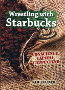 Kim Fellner's book
  A
A