From the trades…

Uni Watch offers a pleasing selection of ads from old issues (1950s — 1970s) of Scholastic Coach, a trade mag, with comments from Uni Watch design director Scott M.X. Turner, and Uni Watch head coach Paul Lukas.
------------------------
--> The Metapoll. Take it.
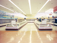
 Things That Look Like Other Things.
 Counterfunctionality (A Gallery).
 MLK BLVD: Open-source photography project: Contribute to the Flickr pool; browse the blog.
 "Where Were You?" Annual.
 Titans of Finance: True Tales of Money & Business
 Uni Watch offers a pleasing selection of ads from old issues (1950s — 1970s) of Scholastic Coach, a trade mag, with comments from Uni Watch design director Scott M.X. Turner, and Uni Watch head coach Paul Lukas.

“The give-away matchbook was one of the most pervasive means ever found of putting promotional images into the hands of the public,” according to Chronicle Books. True? I don’t know. But I sure do love the cover of Striking Images: Vintage Matchbook Cover Art. In fact, I hope the Chronicle folks made some matchbooks with that cover. Via Drawn!: The Illustration and Cartooning Blog.

I’ve been meaning for a while to put in a good word for my friend Sara Ivry’s podcast for Nextbook. Nextbook is billed as “a gateway to Jewish literature, culture and ideas. To be honest, I didn’t think I’d be particularly interested at first, but it turns out I was wrong. She interviews interesting people, and does it really well. I know Sara through the print-journalism world, but she’s a radio (or digital audio) natural. I would say three out of every four episodes have been really surprising, entertaining, or both.
For instance? Well, one recent episode is titled “Minstrel Show: Parodies that make us cringe today used to make people roar. A music critic discovers Abie Cohen, the Jewish version of Aunt Jemima.”
It’s an interview with said critic, who has “curated” an album that’s billed as “The world’s first and only anthology of Jewish minstrel songs.” And toward the end, Borat is discussed, and there’s a snippet of a Mocean Worker remix of one of these old songs. Check it out.

Tony Arcabascio and Arkitip have collected a set of columns that he wrote for the magazine (under the name “The Alife How To”) from 2003 to 2006. The result is Now You Know, a “how-to book for the street smart,” in the form of a nicely executed mini-book, with a handy slip cover. Apart from being a cool little object, the actual columns inside are pretty hilarious (and depending on what kind of life you’re living, possibly useful). Topics include how to: make a slim jim, avoid assault charges, torch a car, talk someone through a trip, and get married.
The avoid-assault-charges piece includes this observation: “As long as you got your mom with you when you fuck someone up, you’ll always have an advantage. You can’t get away with murder, but you can hurt them bad.”
That clarifying second sentence is an example of what I find appealing here. Obviously I’m quoting that bit out of context, it’s even better when you read the whole (somewhate harrowing) story that leds up to him drawing this particular conclusion.
Probably I also find it so appealing because I know and like Tony, having met him while writing a story a while ago and kept in touch. He seems like such a nice guy — he gave me a copy of the book, after all — I can’t imagine him torching a car.
Although now that I think of it, I can imagine him having torched a car. Just not lately. I don’t think.
Anyway, check it out.
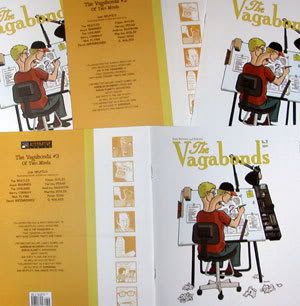
Friend of Murketing Josh Neufeld celebrates the release of The Vagabonds #2: Of Two Minds. It collects his collaborations with (among others) Harvey Pekar, David Greenberger, Nick Flynn, Eileen Myles, R. Walker, and The Beatles. The Beatles? Maybe that particular piece wasn’t exactly a collaboration. Anyway, 17 pieces, 32 pp., brown ink on tinted paper. A very nice package, priced to move at $4.
The party is at Sheep Station — “classy, cozy, has a fireplace and is located just minutes away from the Atlantic Avenue train station/metro hub” in Brooklyn. Josh will be there selling and signing this comic, and other volumes of his, such as Katrina Came Calling and A Few Perfect Hours. Sheep Station: 149 4th Avenue (corner of Douglas). Brooklyn, NY. Wed. Nov. 8, 6:30—8 pm.
Josh Spear’s site just had a glowing writeup about artist Leif Parsons: “talented, creative, fresh, and has a great sense of humor … we think the best is yet to come for thoughtful young Parsons.”
Congrats to Parsons. I’m a fan of his work: He’s the illustrator for Consumed. (So, yes, the best must be yet to come …. )


I wasn’t familiar with Adam Neate before encountering this on the Wooster Collective site a few days ago. Clicking away, I really enjoyed the work. Apparently he’s got a show at Elms Lesters Painting Rooms, a London gallery that’s also shown KAWS, Dalek, and others of note. For those of us not in London, more of Neate’s stuff can be seen here.

Next up: I was looking at Drawn! The Illustration and Cartooning Blog, which is consistently interesting, and was struck by the above image. The artist is Esao Andrews, who I’d never heard of. Here’s his site. This was by far my favorite image, but some of the other stuff is cool, too.
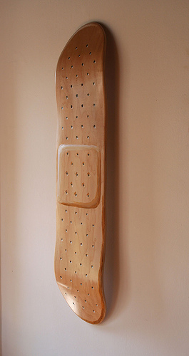
And finally: A skateboard as a band-aid. By Thinkmo, via High Snobiety.

Here’s an enjoyable project from Friend of Murketing (and publisher of Letters from New Orleans), Garrett County Press, on the Powells site:
Garrett County Press asked favorite artists to “color in” pages from Kevin Stone’s latest project, The Pat Robertson and Friends Coloring Book. The artists, who range from Philadelphia designers to Bangkok street artists, were given simple instructions: pick your favorite page and have fun.
It’s quite a lineup, and there are links to the sites of most of the artists. Needless to say, I’m partial to the contribution (above) of Josh Neufeld, another Friend of Murketing and the co-creator of Titans of Finance.
Disclosure: This entire item is so packed with self-serving conflicts of interest it would take too long to explain them. But I still mean every word!
While I basically detest the New York Mets, I’m sympathetic to their fans who feel that:
The addition of black to the team’s color palette in 1998 betrayed and disrupted this proud aesthetic history, transforming the franchise from one of baseball’s best-looking teams into one of its ugliest…
That language comes from an online petition that vigorously protests the use of black in the the team’s uniform, “call[ing] upon the ownership, management, and equipment staff of the New York Mets to DITCH THE BLACK and reinstate blue to its rightful place of chromatic supremacy in the team’s color scheme. It’s time to restore the club’s aesthetic heritage and make the Mets a team we can all be proud to look at once again.” There are already more than 800 signatures, and I’m thinking that number will grow.
Who could be behind this project? There can be only one answer.
Update (10/8): NYT story on Ditch The Black. (Highlight: “To Mr. Lukas, the change bordered on sartorial sacrilege. ‘It would be like if in Washington they decided that the red, white and blue is a little outdated, and maybe we should change the red to a burgundy.'”
 Earlier this year, as you may know, Brian Eno and David Byrne marked the 25th anniversary of their astonishing 1981 collaboration album, My Life In The Bush of Ghosts, by launching a site that made available all the multitracks for two songs from the album to any and all remixers (who sign up with a specific but apparently pretty enlightened licensing agreement). Our friend Disquiet has kept tabs on the results, pointing out some of the more interesting creations — but recently he offered a new spin on the whole idea: “Our Lives In The Bush of Disquiet.” As he explains:
For Our Lives in the Bush of Disquiet, I contacted a dozen musicians whose work I admire; I wanted to hear what their renditions of the Eno and Byrne tracks might sound like, and none of them had yet joined in the activities at the bush-of-ghosts.com website. With only a few exceptions, these individuals already participate regularly in the loose community of musicians who post their own music for free download on the web, via netlabels, social networking services or their own websites.
The 12 graciously agreed to participate in this project and the resulting compilation ranges from tributes to reconsiderations, from distant reflections to associative interpretations. There are takes on “Help Me Somebody” that milk the funk in the preacher’s voice and there are takes on “A Secret Life” so quiet as to make the original sound like rock’n’roll by comparison.
I was quite interested to hear about this, because I don’t know anybody who is better versed on the curious intersections of music and technology than Disquiet; the site, revolving around “Reflections on ambient![]() /
/![]() electronic music, and interviews with the people who make it,” is a constant trove of great information and discovery. Basically, if anybody could come up with a compelling curated iteration of a thoroughly wild-and-woolly phenomenon like the Bush of Ghosts remix project, it’s Disquiet.
electronic music, and interviews with the people who make it,” is a constant trove of great information and discovery. Basically, if anybody could come up with a compelling curated iteration of a thoroughly wild-and-woolly phenomenon like the Bush of Ghosts remix project, it’s Disquiet.
The 12 remixes, as well as front-and-back cover art by boon (design), are available for listening or downloading here (where there’s also more about each of the contributors and their tracks) and here. My own favorites: “My Bush in the Secret Life of Ghosts,” by Prehab; “If You Make Your Bed in Heaven,” by Roddy Schrock, and “Not Enough Africa,” by Ego Response Technician (who, I should disclose, is also a friend of mine).

As promised, I stopped by the opening last night of the latest Hey, Hot Shot! exhibition at the Jen Bekman gallery in Manhattan. And as expected, I particularly enjoyed the photographs from Kate Bingaman. But I also want to mention the work of Phoenix-based Ernie Button. Somehow when I’d looked at his pictures online, they didn’t have the same impact that they had in person. The are pictures of “landscapes,” made of cereal. For example, the picture here is of Cheerios.
His statement for the show reads in part: “When I was a child, cereal was a luxury item. Brand name cereals were a rarity, as they were consistently more expensive. Something like King Vitamin (a popular 70s cereal) or Cap’n Crunch made for pure breakfast heaven. Looking at the cereal aisle today, it’s clear that breakfast cereal has changed. The cereal aisle has become a cornucopia of colors with marshmallows that resemble people and objects and characters from movies. It’s apparent that cereal is not just for breakfast anymore; it’s playtime. In keeping with the playtime theme, I began to construct landscapes that would utilize the natural earth tones of certain cereals. I placed enlarged photographs of actual Arizona skies … in the background of the cereal landscapes, giving the final image an odd sense of ‘reality.'”
Poking around online, I found some more of Button’s images here and (of toys, in this case) here. But if you’re looking to buy, I of course suggest you go through Bekman’s gallery. The Hey, Hot Shot! pictures are on view there until September 10.
One of my favorite pastimes is spying on Kate Bingaman. You may (well, you should) know her as the person behind Obsessive Consumption. She also teaches graphic design at Mississippi State University, and in connection with that she has a newish site going that basically seems geared toward, you know, people taking her classes — but check out the trove of cool images linked from this recent post. See why I’m spying?
Anyway, today my surveillance revealed the following: She is one of ten photographers included in a Jen Bekman project called “Hey Hot Shot!” (“Hey, Hot Shot is the latest effort by Jen Bekman to discover and support emerging artists. Over the past three years, the gallery has established its reputation as a champion of young and emerging artists.”) Since I’m a fan of Bekman and her gallery as well, I’m going to do my best to make it to the September 6 opening, and I think you should, too.
(Today’s headline is a tribute to the blog High Snobiety, even though that site has absolutely no relationship to the above. On any level. At all.)
 From time to time here at Murketing, new features will be introduced. For example: Q&As. There was one yesterday, and there will be one tomorrow. There will never be three in a row again, I can assure you. But this one, here, today, below, is the one I want to introduce with a few words, because I hope it’s an example of the first installment in an open-ended series, a specific subset of Q&As.
The interviewee in this case is Bethany Shorb, and the subject is the ties that she makes and sells, mentioned in an earlier post. (She does a lot of other things as well, and those are addressed below, but see here if you just can’t stand the suspense.) Since that earlier post she has launched the Cyberoptix Tie Lab: “A new take on conservative menswear.” All of this makes for a good example of what I want the open-ended series to be about: interviews with people who are artists and entrepreneurs, finding ways to make a living from creative enterprises.
Clearly, this general theme is a long-time interest of mine, and I’ve pretty much done all I can with it in the various other venues I write in. My focus here is somewhat different, and so is my one and only criteria for these interviews: Here on Murketing I’ll be interviewing people whose work I, personally, find interesting.
Here we go:
You’re from the New York area originally, you have an MFA from Cranbrook, and you live in Detroit. I guess you ended up in Detroit because you went to Cranbrook?
That’s correct — in the Fall of 1999, I packed up all of my earthly possessions into the back of my little red pickup truck and headed for the Great Unknown. I was living in Boston at the time after getting my BFA at Boston University. I cried my eyes out for days upon arrival.
But wait, looking at your blog, your views on Detroit have softened a bit? I’ve never really spent any time with Detroit and sort of fascinated with it.
There are great things to be said about Detroit from a creative standpoint, there is definitely a justifiable fascination with the city. It is relatively inexpensive to live, especially compared to places like New York, Boston and Los Angeles — and that allows you to allot much more time to making art rather than making rent, and there is much more space to do it. Detroit seems to be a unique incubator for quality art and music, there are less distractions and I think people get a lot more done as a result, but if I didn’t make a trip to either coast every few months I’d probably go a bit crazy. Music is a huge exception, there is usually somewhere you can go every night of the week and hear excellent music — whether you want to party or pull up your laptop in a dark corner of a coffee shop or dive bar, I think a flourishing music culture really goes hand in hand with any kind of art making.
The downfall of the Detroit area is that the economy here is not the best at the moment, so people are consuming little else than what is necessary to live, thus why I really want to get my product out to more areas of the country where people are actually spending on luxury and fashion items.[ Read more
Too bad it isn’t available online for free, but the August 10 New York Review of Books has a good writeup by Witold Rybcznski on three recent books about shipping and transportation; two are specifically about shipping containers, how they came to be standardized with specific dimensions and so on. Here’s the part I agree with most heartily:
Globalization is often described as involving the movement of information, people, and employment, but it is largely about the movement of goods, and the cheapest way to move products around the globe is in containers … It is likely that without container shipping, the economic upsurge of China would not have occurred as quickly as it did … Likewise, third-world countries would be unable to sell many of their products to European and American markets without extremely cheap shipping. Modern manufacturing, in which components are made on one continent and assembled in another, would also be impractical without rapid, predictable, and cheap shipping. In a world of high technology, the story of the container is a useful reminder of the continued importance of old-fashioned mechanics.
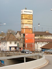
Given my interest in shipping containers, I was fascinated to learn, through this post on We Make Money Not Art, about a store in Zurich made from “17 rusty, recycled freight containers.” The store belongs to a company called Freitag, whose founder said in a mini-interview on the site: “Freitag bags are made of used truck tarps, bicycle innertubes and car seatbelts. Hamburg is one of the biggest logistic Mecca of Europe – the perfect location for a FREITAG flagship shop. Inspired by the trucks and the harbour, we placed a 40″ Container (artificial) into our shop-location. For the shop concept in Zurich we took it one (or even two) steps further: an entire building assembled from 17 used freight containers.”
Freitag’s Flickr stream includes several sets of photos of the shop’s construction, and its final state (see above). Pretty cool.
 Imagining implausible uses for unpopular places. A project in collaboration with Ellen Susan and G.K. Darby.
 Great creative writers invent stories about thrift-store objects. A project in collaboration with Joshua Glenn.
 Letters From New Orleans, by Rob Walker.
  Foreward to Brand Thinking and Other Noble Pursuits
 Introduction to Ad Nauseam: A Survivor's Guide to American Consumer Culture
 Essay for OBEY: Supply & Demand - The Art of Shepard Fairey - 20th Anniversary Edition
 Consumed column about Obama as muse is included in Obama: The Historic Journey.
 A piece I wrote way back when for Slate is included in Sponsorship: The Fine Art Of Corporate Sponsorship/the Corporate Sponsorship Of Fine Art
.
 Gary Hustwit's industrial design documentary Objectified.
 Anne Elizabeth Moore's book, Unmarketable: Brandalism, Copyfighting, Mocketing, and the Erosion of Integrity.
 Kaya Oakes' book, Slanted and Enchanted: The Evolution of Indie Culture
.
 Elizabeth Currid's book, The Warhol Economy: How Fashion, Art, and Music Drive New York City
 Kim Fellner's book Wrestling with Starbucks: Conscience, Capital, Cappuccino
.