Plungerhead
Zinfandel; Dry Creek Valley
$18 (Savannah)
Consumano
Nero d’Avola; Sicily
$12 (Savannah)
[Note: This is the fifteenth installment in a regular Murketing feature. For previous installments and an explanation, go here. As noted earlier, it is also (probably) the last installment in this series.]
 I will admit that I purchased Plungerhead because of this project. But I’m not writing about it for the reason I thought I might.
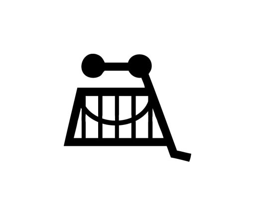
What caught my eye was the illustration: I wasn’t sure if it was interesting enough for the IRoWPaA, but it vaguely reminded me of the “loonies” on Monty Python, and there was something intriguing about this deranged-looking figure as a winery’s icon. Plus, it was visually appealing. I gave no thought at all to the name “Plungerhead,” quickly placing it in the category of “approachable because it’s so stupid – oh, I mean funny.” As you know, that’s a very common tactic among wine packager/branders these days.
If I had read the back label, I would have realized that while a packaging/design element of Plungerhead was in fact pretty important, it was not the illustration.
It was the stopper. Read more
I’ve been saving up a couple of interesting bits related to wine packaging that I intended to highlight shortly before publishing the next volume of The International Review of Wine Packaging and Aesthetics.
However, first I have to say this: After publishing that volume in a few minutes, The IRoWPaA will go on indefinite hiatus. While I love this project, it’s never really gotten much of a reaction, and I can only handle so many quixotic ventures at once. If anybody wants to see it revived later when I have more time, use the comments. (Better, if anybody knows a design publication, online or off, that would be willing to pick up the feature, email me. But please do not email me to say that you want me to revive it later here — I need that to be public, so I can point to the comments, or dearth of comments, when I make a decision.)
Meanwhile, though, I do have those two interesting bits to share. Both come from the blog of How Magazine.
First: Wine Pocket, “constructed of industrial wool felt collected from factory excess.” Personally I haven’t had call for a wine pocket, but maybe you do. Here’s what the $29 item looks like:

Second: How’s blog pointed to this Portfolio article, which says:
To make their products stand out, many winemakers are taking clever, daring, and sometimes even radical approaches to labeling. They’re putting as much attention into what’s on the bottle as what’s in it.
There’s also a slideshow. Clearly I agree with the premise, since it’s kind of what IRoWPaA was about. The piece mentions Yellowtail and “critter” wines, which was the subject of an April 23, 2006 Consumed, and the slideshow has an image of a wine called Plungerhead, which is a subject of the next and final volume of IRoWPaA, coming along any minute now.
Irony
Pinot Noir, Montery County, California; South Eastern Australia
$12 (Savannah)
Sincerity
Chardonnay; Casablanca Valley, Chile
$15 (Savannah)
[Note: This is the fourteenth installment in a regular Murketing feature. For previous installments and an explanation, go here.]
Located several shelves away from each other in the same liquor store, these items simply demanded to be purchased in tandem. In fact, I briefly assumed that they must be offerings of the same vineyard. Not so. Still, it’s a particularly interesting showdown in the context of wine-label design at the present moment: Which is better, looks-wise – irony or sincerity? Read more
Posted Under:
Reviews,
The Designed Life,
Wine Packaging
This post was written by Rob Walker on July 10, 2007
Comments Off on The International Review of Wine Packaging and Aesthetics, Vol. 14
Bitch
Barossa Grenache; Australia
$16 (Savannah)
[Note: This is the thirteenth installment in a regular Murketing feature. For previous installments and an explanation, go here.]
Let’s face it: If you buy a wine called Bitch, you know full well that you’re buying the label, and whatever’s inside the bottle is pretty much an afterthought.
Many labels that are meant to stand out from old-school “traditional” designs do so by presenting a more approachable, unpretentious image. Bitch, however, is an example of what might be characterized as a ’tude wine, with a label that’s not so much unpretentious as defiant. Read more
I meant to bring this up earlier, for those of you who have an interest in wine packaging: There was a really interesting segment on KCRW’s Good Food a couple of weeks back about “the best method for reading a wine label and finding the perfect wine.” In this case that doesn’t mean evaluating packaging aesthetics, it means “decoding” the factual information about the wine, its geographic origins, production history, and so on, which turns out to be a little more complicated than one might suspect. And a good amount of the information is provided in text form here (scroll down when you get there).
The wine label can tell what the grape is, where it came from and how much of a specific grape is in the bottle. This detail can range from a general location, “California,” to a more detail reference — where in California, what region, what vineyard location and literally which row and vine number within that vineyard. (Think of a vineyard as a neighborhood, within a state, region or country.)
Decoding a wine label can make us more savvy and multiply our pleasure with the wines we select.
Meanwhile, speaking of labels, the International Review of Wine Packaging and Aesthetics returns, after an inexplicable hiatus, later today.
Posted Under:
Wine Packaging
This post was written by Rob Walker on June 26, 2007
Comments Off on Label decoding
Yard Dog
Petit Verdot-Cabernet-Melboc blend; South Eastern Australia
$13 (Savannah)
Bulldog Red
Syrah-Grenache-Mourvedre blend; Paso Robles, California
$18.50 (Savannah)
[Note: This is the twelfth installment in a regular Murketing feature. For previous installments and an explanation, go here.]
Yes, that’s right, it’s a special double-shot of wine label aesthetics today, as we assess two dog-themed labels.
First up: Yard Dog.
As you can see, the label depicts a frightening, teeth-bearing dog, who looks starved, angry, miserable, and dangerous. This poor beast is juxtaposed against jaunty polka dots and some newsprint, in a collage effect. It’s quite an image. Particularly for a wine label.
It caught E’s attention the store, and resulted a rare instance of wanting to read the backmatter: “I really wanted some information.” Read more
There’s a very cool one-pager in the current Brandweek, and unfortunately its coolness can’t really be appreciated in the text-only online version. It’s a breakdown of the different iterations in the design of … a wine label! And of course seeing the pictures is what’s most interesting.
But the overall label strategy is interesting, too. Jim Edwards writes:
In February, The Amazing Food Wine Co., New York, will launch “Wine That Loves.” The brand takes the guesswork out of pairing wine with food. Thus, Wine That Loves Pizza, Wine That Loves Pasta, Wine That Loves Roasted Chicken, and so on. …
Challenges: Critics will say it’s wine for dummies. The bottles won’t carry the wine’s year, varietal or regional information beyond the country of origin—information most wine drinkers consider crucial. …
I’m impressed that the firm that did the design, Lippincott Mercer, was willing to share the early rejected attempts. It’s really interesting to see how the look evolved.
Edwards also notes that “wine packaging is experiencing a design revolution.” Agreed. If we spot Wine That Loves in any of our local shops, we’ll review the label.
House Wine
Blends; Columbia Valley
$10 to $14 (Savannah)
[Note: This is the eleventh installment in a regular Murketing feature. For previous installments and an explanation, go here.]
Dr. Vino says: ” Think of this wine as punk rock in a bottle with its loud label and fruit at high volume. Charles Smith, who used to manage a punk band in Demark, now owns K Vintners as well as the Magnificent Wine Co. in Walla Walla Washington.”
Hmmm. With House Wine, we have a case of R. and E not quite seeing eye to eye. Read more
This Pittsburgh Post-Gazette article on packaging (via Agenda) includes, toward the end, a little bit about my hobbyhorse topic: wine-label design.
In the past decade or so, winemakers have livened up liquor store shelves with colorful designs and oddly shaped labels. If those things don’t catch the eye, the words on some of the graceful bottles may. There’s Bonny Doon Vineyard’s Cigare Volant (“flying cigar”) and the distinctive Screw Kappa Napa.
There are exceptions, but labels with attitudes tend to be found on lower-priced wines.
“Humor is a dangerous thing to do,” offered Michaela Rodeno, chief executive officer of St. Supery Vineyards and Winery, a Rutherford, Calif., winemaker that commissions edgy illustrators annually to develop new artwork for its meritage wines.
How about a serious wine called Beauzeaux (pronounced yes, Bozo)? “We wanted to show that wine doesn’t have to be stuffy but can be fun,” said Claudia Schubert, senior director of brand marketing for Diageo Chateau & Estate Wines in Napa, Calif.
Even the French may be loosening up a bit as they seek to improve sales. An American who still eats freedom fries might be willing to try a bottle of Arrogant Frog, perhaps the Ribet Red, from the Languedoc region.
Speaking of trends for 2007, USA Today has this roundup of food-related predictions (via Agenda). One caught my eye. Someone named Alpana Singh, identified as “wine/spirits director for Lettuce Entertain You Enterprises restaurants and author of Alpana Pours,” says this:
Alternatively packaged wines will take off — Tetra Pacs (soft-sided cartons), wines in boxes. People are not ashamed to say they found a good $3 or $4 Pinot Grigio, so we’re over that hurdle. They’re buying those wines in 5-liter boxes made for the refrigerator where you can extract a glass or two at a time.
Six months ago I got a pretty aggressive pitch from a major retailer that I probably shouldn’t name about box wines being “back.” And within the last two weeks someone else randomly mentioned to me that she’d just taken box wine to a BYO French bistro.
Pattern? Or pareidolia?
Posted Under:
The Trend Industry,
Wine Packaging
This post was written by Rob Walker on January 5, 2007
Comments Off on Thinking somewhere in close proximity to the box
El Felino
Malbec, Mendoza, Product of Argentina
About $15 (Jersey City)
[Note: Here I finally finish clearing the Jersey City inventory of wine-label-related entries.]
[Note: This is the tenth installment in a regular Murketing feature. For previous installments and an explanation, go here.]
 Earlier this year, R. wrote a “Consumed” column about “critter wines” — meaning wine labels that featured a representation of an animal. (Or “critter.”) Yellowtail was the high-profile example in that piece, but of course there are many, many critters on the wine aisles these days.
And in this case, we picked this up because we liked the cat illustration. It’s a bit more arresting than a lot of the critters you see. A little more stylish. Yet still somehow cute. And of course it’s all about cuteness. But you knew that.
Read more
Posted Under:
Reviews,
Wine Packaging
This post was written by Rob Walker on December 27, 2006
Comments Off on The International Review of Wine Packaging and Aesthetics, Vol. 10
Terre Del Primitivo “red wine from Puglia.” 2003.
About $12. (Jersey City)
[Note: Here I continue clearing the Jersey City inventory of wine-label-related entries.]
[Note: This is the ninth installment in a regular Murketing feature. For previous installments and an explanation, go here.]
 R bought this wine because of the photo-style label. The photo label approach is generally a bad idea, and by and large we tend not to buy wine with label photography. “It seems wrong,” E explains.
In this specific instance, the results are particularly bad. The photograph tells you nothing, and the inexplicable blocky black shape underneath it has no logical graphic function. The back says the photo “illustrates” some “cone-shaped stone buildings” unique to the Puglia region. Yeah? This strikes R. as something less than an explanation. E is more concise: “I don’t care.”
Bottom line: In our view, wine packaging ought to somehow suggest a handcrafted process, not cheap mass production.
REGARDING THE ACTUAL WINE: We can’t remember anything about it.
Canyon Road Cabernet Sauvignon, 2000
Maybe $10 or $12, Jersey City.
[Note: Here I continue clearing the Jersey City inventory of wine-label-related entries.]
[Note: This is the eighth installment in a regular Murketing feature. For previous installments and an explanation, go here.]
 Although we don’t remember the details, R. suspects this was purchased specifically because it looked like the label had been designed. E agrees that it “looks like they hired a graphic designer, with solid skills. But then the designer wasn’t really allowed to finish the project.” She wonders about the part of the label that’s sort of been slit away — it looks like there is a specific design-related reason for this, but it’s hard to figure out what it might be.
Read more
Sidewise
Pinot Noir. 2003. ($11 in Jersey City)
[Note: Speaking of JC, and of wine, there’s going to be a small avalanche of installments of the IRoWPaA over the next two weeks. I’m extremely busy trying to finish another project, and I have a lot of “inventory” of pictures and notes of wines we bought and consumed before we moved. So I’m going to be clearing that inventory out, and otherwise sort of neglecting this site through the end of the month. Just so you know.]
[Note: This is the seventh installment in a regular Murketing feature. For previous installments and an explanation, go here.]
 When R. spotted this on a liquor-store shelf, he pretty much had to buy it. Yes, because of the label, but no, not because he thought there was anything inherently interesting in its design. R. bought it, of course, because of the blatant attempt to tie the wine to the movie Sideways. A film, by the way, that both E and R. hated.
For reasons that escape us, a lot of people liked Sideways, a movie about an unpleasant sad sack whose only supposedly redeeming feature was being an insufferable wine snob. It’s been widely noted that this character’s rant against merlot actually hurt merlot sales in the real world. The only thing dumber than being embarrassed to buy merlot because a fictious character sneered at the stuff would be buying a wine called Sidewise. “The very idea of trying to attract people who would be attracted to that movie,” as E put it, “is repellent.”
Read more
The Show
Cabernet Sauvignon. 2005. ($13 in Savannah)
[Note: This is the sixth installment in a regular Murketing feature. For previous installments and an explanation, go here.]
 E was shopping at a big ol’ wine store, and when she spotted this bottle she thought: “Wow, that reminds me of Hatch Show Prints.” (Here’s the deal on Nashville-based Hatch, if you’re not up on it.) She took a closer look and found that, according to the back matter, the wine was actually “Inspired by the bold letterpress show posters that Hatch Show Print has produced since 1879.”
Well … what does that mean? That these people weren’t really thinking about making wine until they encountered Hatch Show Prints? And then said: “You know what this makes me want to do – make some wine!” It is, E reflects, “about as stupid a reason to make wine as any I’ve heard.” She wonders what, say, some 10th-generation French winemaker would think of a wine inspired by posters.
And yet, she adds, “I was drawn to it. Because I like Hatch Show Prints.”
Read more
Posted Under:
Reviews,
The Designed Life,
Wine Packaging
This post was written by Rob Walker on December 15, 2006
Comments Off on The International Review of Wine Packaging and Aesthetics, Vol. 6
 I will admit that I purchased Plungerhead because of this project. But I’m not writing about it for the reason I thought I might.


 "
"


 When R. spotted this on a liquor-store shelf, he pretty much had to buy it. Yes, because of the label, but no, not because he thought there was anything inherently interesting in its design. R. bought it, of course, because of the blatant attempt to tie the wine to the movie Sideways. A film, by the way, that both E and R. hated.




 Kim Fellner's book
  A
A