Two Brothers Big Tattoo Red
Cabernet Sauvignon. 2003. ($10 in Jersey City)
[Note: This is the fifth installment in a regular Murketing feature. For previous installments and an explanation, go here.]
 Like the bull wine, this has a dangler (or “dangly,” if you prefer). In this case the dangled item is a pink ribbon, which we will address in a moment.
First the label. Here the style, as echoed in the name, is tattoo-ish. It is a big bold fleur de lys, rendered in a tattoo style. Eye-catching! As is often the case these days, the back label includes a lengthy text that tells us all about the story behind the wine: The two brothers are a wine guy and a tattoo artist. They created this wine “in honor of” their mother, who died of cancer. Thus the pink ribbon. Fifty cents of every bottle sold goes to a cancer-related charities.
We like the illustration quite a bit, and the typography. Also the shape of the label. On the other hand, E suggests the “2 Brothers” at the top of the front label might have looked better, typographically, with the word “Two,” upper-lower. The type face is not so strong in its current all-upper usage.
Read more
Posted Under:
Reviews,
The Designed Life,
Wine Packaging
This post was written by Rob Walker on November 14, 2006
Comments Off on The International Review of Wine Packaging and Aesthetics, Vol. 5
Red Newt
Cabernet Franc (2004) and “Dry White Wine”
Around $10 to $15 (Finger Lakes region of New York State).
[Note: This is the fourth installment in a regular Murketing feature. For previous installments and an explanation, go here.]
 These purchases came about as a result of a trip (a while back) to the Finger Lakes, where there are a number of wineries and not much to do. A brochure promoting winery tours included a number of photographs of relevant wine bottles, and R. was immediately interested in visiting the Red Newt winery, because of the cool newt drawing on the label. It’s probably not a coincidence that the newt kind of reminded R. of the lizard on bottles of Leapin’ Lizard merlot, which we used to drink quite often in New Orleans.

Anyway we went, and ultimately bought a few bottles. E “generally likes the newt,” but prefers the clear, white wine bottle to the red. Sure, she says, the red bottle benefits from the “nice little newt” on the label, and the fine detail of the newt on the foil thingy on top of the bottle, but is otherwise not that special. But the clear bottle is “one of the most exciting bottles of wine I’ve seen.” R. agrees, although he likes the red bottle more than E does. Still, he is on board with E’s contention that if we had easy access to this particular variety we would probably buy a bunch of bottles. “The clearness and the little guy – very exciting,” E reiterates.
REGARDING THE ACTUAL WINE: These actual bottles were pretty good. However, a different variety of Red Newt white wine, purchased in New York City, with a very similar bottle design, was too sweet, and we never bought it again.
Posted Under:
Wine Packaging
This post was written by Rob Walker on September 29, 2006
Comments Off on The International Review of Wine Packaging and Aesthetics, Vol. 4
Four Sisters Winery
Papa’s Red, Dry Red Table Wine
$11.61 with tax (Warren County, New Jersey)
 There are wineries in New Jersey. We have visited one – Four Sisters Winery. We tried a few things and basically to be polite R. bought a bottle of this Papa’s Red stuff, thinking at the time it was the best of what he had sampled.
The bottle design is, self evidently, awful. Says E: “It’s the prefect label for this wine. Tacky. It’s like something you’d buy at a terrible knick-knack store. Cute-kitten-statue-collectors might drink this, and they’d serve it to their guests and everybody would love it. Because it’s horrible.”
R. would like to offer a rebuttal, basically to prevent the state of New Jersey from having to endure any additional criticism. But he cannot, in good conscience, do so.
REGARDING THE ACTUAL WINE: Close to undrinkable, it turned out.
NOTE: The International Review of Wine Packaging and Aesthetics will return in approximately one month, with Volume 4.
Posted Under:
Reviews,
The Designed Life,
Wine Packaging
This post was written by Rob Walker on August 25, 2006
Comments Off on The International Review of Wine Packaging and Aesthetics, Vol. 3
Marquis Philips Cabernet Sauvignon 2003.
About $17. (Jersey City)
 Here the obvious attraction is the creature featured on the label, which looks a bit like an illustration from Alice In Wonderland. Also notable, however, is the two-part label. The top part has a ticket-like look. The only visual tie-in is the double-rule. The result is a pleasing — even if not entirely successful, on a technical level — design. The overall look seems to aim for whimsicality, but with sophistication, and the effect is pretty good. E calls it “one of the best wine bottles we have bought so far,” and I agree.
Still, let us be honest: What made us buy this was the monster illustration. The backmatter on the label on the other side of the bottle explains that this is a “mythological creature” called the Roogle, which “represents the lasting friendship and the shared destiny that link” Australia (where the winemakers are based) and the United States (where the distributor is based).
While E professes no opinion regarding label explanations, R pronounces it “annoying and somewhat disappointingly didactic,” and contends that it would have been better to have left it out. Even just calling the creature Roogle would have been preferable to spelling out the details, like we’re a bunch of idiots.
Ultimately it is R’s belief that if you have a cool monster-thing, just go with it.
REGARDING THE ACTUAL WINE: Good, but nothing special, and probably overpriced.
No serious wine consumer makes decisions about what to buy based on the aesthetics of the label or the bottle.
But here at Murketing HQ, that’s exactly what we do. And it is for this reason that we — “we” being me (henceforth known as “R.”) and my wife (or “E,” to you) — have founded The International Review of Wine Packaging Aesthetics. This will take the form of posts, on this site.
Other than that, it seems pretty much self-explanatory. We will add only this point of clarification: Many wines we buy regularly and enjoy will not be included here, because the packaging is of no interest.
In the future, the International Review of Wine Packaging Aesthetics will appear once a month. But to give this exciting new project a suitably “big bang,” we begin with a barrage: Vol. 1 today, Vol. 2 tomorrow, and Vol. 3 the day after that.
It’s not until this moment, as I’m finallly prepared to post Vol. 1 and am reading everything one more time, that I realize how similar all this is to the “Music” and “Printed Matter” reviews that used to close every issue of Paul Lukas’s immortal Beer Frame. Coincidence? Lame knockoff? Homage? You decide. Or, just skip the whole thing and enjoy one of Paul’s current projects, Uni Watch.
Anyway, here we go:
Volume 1
Torres. Sangre de Toro. 2002.
($6 New Orleans, $7 Jersey City)
 We started buying this variety when we lived in New Orleans, because at the nearby Whole Foods it was very cheap — and because it had a little bull on it. A little plastic bull. Free! The label, with a rustic Spanish feel, is unremarkable. The real attraction is the bull, attached via a nice grosgrain ribbon. “It’s a free gift,” E. points out. “It’s very unusual for a wine to come with a free gift.” The bull is surprisingly realistic in its rendering, E. continues –“a complete bull,” with white horns, and anatomically correct detail. Look closely at the bull and you will see that it says “Torres,” on both sides. R. really likes that sort of thing.
We find this gimmick to be fully satisfying, and “the bull wine” is a recurring purchase for us. The wine is also available in Jersey City; it costs a bit more, but you still get a free bull.
Interestingly, we have noticed that there is another variety of this wine with no bull. This is not a surprise, insofar as a plastic giveaway is likely to be seen by at least some wine consumers as an off-putting gimmick. This bull-free variety is more expensive, and perhaps it’s better. But it is of no interest to us.
REGARDING THE ACTUAL WINE: Drinkable.
[Yellow Tail Wine]
For a shortcut, clichéd summation of growing consumer sophistication, consider the wine category: Back when we didn’t know anything, wine meant Blue Nun, jugs of Gallo, little bottles of Lancers and hokey Aldo Cella commercials. Nowadays we have taste, and even suburban megamarts have huge and varied wine selections for the demanding mass affluent. Of course, real wine connoisseurs have walked the earth for many years — as have nonconnoisseurs who find such people to be annoying snobs and who find today’s megamart selection to be a big, bewildering taunt. It’s one thing to sense that there’s a huge spectrum of quality represented on that shelf, but it’s something else to make a decision. Perhaps, in light of this, it’s no surprise that a new factor has emerged that apparently helps many of us parse the options: the “critter label.”
A critter label is any label that features an animal, from a hippo to a frog to a penguin. According to ACNielsen, the market-research company, 438 viable table-wine brands have been introduced in the past three years, and 18 percent — nearly one in five — feature an animal on the label. “Combined with existing critter labels,” the firm said in a summation of its research on this matter, “sales of critter-branded wine have reached more than $600 million.”
Read more
Posted Under:
Consumed,
Wine Packaging
This post was written by Rob Walker on April 23, 2006
Comments Off on Archival Consumed: Animal Pragmatism



 "
"



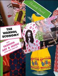
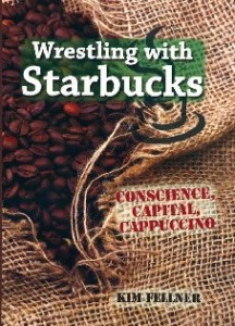 Kim Fellner's book
  A
A