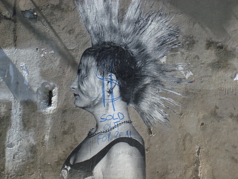
Coudal links to a set of Flickr images apparently showing new work by Banksy, in New Orleans.
Of interest to me are this one and this one. These allude to something you may have noticed if you’ve spent time in New Orleans: Lots of squarish blocks of gray rolled-on paint, all over the place, blotting out what used to be graffiti or street art. The guy behind this is Fred Radtke, a/k/a The Gray Ghost: Basically an anti-graf zealot who rides around town and paints over every tag or other street art manifestation he sees, Radtke is a much-reviled figure among N.O. graffiti types.
This image below is not one of the ones linked above; it was taken some time later:
Originally uploaded by toaminorplace.
The earlier version had the guy painting over a flower; now the whole flower has been rollered out. By Radtke? Hard to say. Seems difficult to believe he would take the care evident here — but maybe he was flattered or amused by this.
Personally, I’ve always found Radkte to be perversely impressive. E and I were last in New Orleans in December (actually she’s been back since then), and the Gray Ghost’s blobby “work” was everywhere. I like his quote in this old article: “I know them all and they know me, absolutely,” he says of N.O. graffiti writers, and he knows they hate him. “But they understand,” he adds, “that I take out everything.” And it’s true: The guy is basically the king of kings in N.O. — the ultimate bomber.
NYT story looks at the role that ad campaigns played in making debt (home equity loans) ets., less scary to consumers; ad execs now say ” society’s attitudes about debt shaped the ads, not the other way around,” but I bet they didn’t say that in pitch meetings ….
The Wall Street Journal recounts The Olive Garden’s “mixed feelings” about “rogue brand ambassador” and Hugh Heffner harem member Kendra Willkinson; traffic-hungry blogs pile on ….
In survey, 73% say Starbucks coffee is too expensive ….
Living Oprah, blog of 35-year-old artist, performer and writer in Chicago: “For one year, I will live as Oprah advises…. Additionally, I’ll be charting the cost of living as Oprah prescribes. Will the costs — financial, time spent, energy expended — be worth the result?” …
Report “focuses on methods of advertising food to kids [via] spreading messages through social networks, and urges lawmakers to restrict junk food advertising to kids online” (via Commercial Alert) …
Anti Advertising agency on plan to limit outdoor advertising (removing 40k billboards) in Buenos Aires….
A political ad making fun of Barack Obama uses the Jackson Browne song “Running On Empty,” and Browne, “incensed,” is suing. …
Shell newspaper ads in the U.K. describing oil-exploration and refining projects as sustainable-energy initiatives spark complaints from World Wildlife Federation, and Britain’s ad-watchdog agency forces the company to withdraw them …
Amusing yet earnest video by Municipal Arts Society about news racks around NYC in clear violation of various laws …
Posted Under:
Anti,
Artists,
Backlashing,
Uncategorized
This post was written by Rob Walker on August 15, 2008
Comments Off on AntiFriday: Weekly compendium of backlashes, dissent & critiques
If you want to get a pic in the Murketing Flickr group highlighted here on Murketing.com, this is a) cheating, and b) encouraged.
Save
As we know, not everybody sees Obama as the antichrist. So here’s a more prObama bit of news following up on the subject of the candidate as muse (per April 13, 2008 Consumed):
The Obey blog announces Manifest Hope:
It’s a new Obama art contest for 2D and 3D art, from painting to photography to sculpture. The winners will be shown at the Manifest Hope Gallery online and in Denver during the Democratic convention alongside works from dozens of established and influential artists.
And, via this meditation in The Stranger on the Obama-as-muse phenomenon, I am now aware of a blog dedicated to the subject: The Obama Art Report. Worth a look.
Not sure if there’s any scripture linking the rapture to art, design, and stylish product, but if so — oh, never mind.
Thanks to all who came out to Politics & Prose last night (and to Becca and Mike), a good time was had by, if not all, than certainly most.
I’m traveling home today and will again be a little too distracted to do much here on Murketing.com, but wanted to pass one thing along as a follow-up to last Sunday’s KAWS column. In that column I mentioned Edward Winkleman’s blog* as a source of reasonable and clear discussion of the too-often mystifying art gallery world. He’s posted a good set of additional thoughts about artists going solo vs. working with a gallery. Check out the whole thing, but here’s a snippet: In addition to the marketplace motivations I mentioned, a gallery show can
perhaps most importantly, provide a context in which not only solo exhibitions can garner press but an artist’s work can be supported against bad press or misunderstandings on the part of the public. The program at most contemporary art galleries is an ongoing dialog about what’s important in today’s art world. Within that context, an artist can perhaps afford to take some risks that wouldn’t make sense without an exhibition space dedicated to their latest ideas, get feedback on them, and return the studio to hammer them out. I’m not sure that’s as possible in museums or other exhibition spaces as it is in many galleries. Yes, I know, the general meme is that galleries are often worse because they’ll only exhibit what they know they can sell. I think that describes a small percentage of the galleries most of us would consider good ones though.
[* PS: thanks to E for tipping me off to Winkleman’s blog in the first place.]

I enjoy looking at ffffound, but sometimes I wish there was a little more information. I love this, but the link just goes here. I poked around gigposters but I guess I’m too click-incompetent and can’t figure out who this artist is.
Do you know?
Thanks to Rich (see comment below) I now know this is the work of StrawberryLuna, a designer and screenprinter in Pittsburgh. This print is called “fair is fair trade,” three colors. 16X22, edition of 90, $25. More prints here, posters here, design here. Nice!
Big thanks to Rich, both for finding, and for not mocking my sad lack of gigposter-navigations skills.
 New Looks
An established art entrepreneur makes his way into a new realm — the art world.
This week in Consumed, Brian Donnelly, a/k/a KAWS, and the relationship between art, markets, and value.
At 33, Brian Donnelly is enjoying a successful art career. Working out of a studio in Brooklyn, he has sold paintings to Pharrell Williams, the rapper and producer; Nigo, the designer-entrepreneur; and Takashi Murakami, the international art star, among others. He has also created a variety of products including toys, apparel and even pillows — and indeed he has his own store, Original Fake, in Tokyo. He has also been widely known in the “street art” world for years; one of his early altered-phone-booth-ad posters recently traded hands on eBay for $22,000. One thing Donnelly had not done until lately, however, is forge a relationship with a dealer or art gallery. This wasn’t because he shunned or had a problem with the traditional gallery system. He says it’s just that “nobody asked.”
[Now he has a bunch of gallery shows and relationship with a gallerist who] figures there’s another market for his work. “I think it needs to get out there in the art world,” she says.
Read the whole column in the August 3, 2008, issue of The New York Times Magazine, or right here.
Additional links*: KAWS site; Donnelly’s blog; Edward Winkleman’s blog; John Jay’s blog; Gering & López Gallery site.
Consumed archive is here, and FAQ is here. Consumed Facebook page is here.
[*QUESTION: I used to do this “additional links” thing all the time, then I stopped. Is it useful? Do you want it? Please let me know.]

As I’ve mentioned before, the one indulgence I allowed myself in the promotion of Buying In was the decision to commission a few promotional posters. This was totally impractical, but for me it was a chance to work with some really great creators whose work I had silently admired from afar. One of those creators is Amy Jo, who I commissioned to make a poster for an event in Boston (see below). I was, obviously, thrilled with the results.
I have a bad memory for this sort of thing, so I don’t recall exactly where I first encountered her work. But what had struck me was her range as a designer, and of course how much I liked just looking at the images she came up with. Aside from posters for bands from the Black Keys to Joan Jett, she does pretty much any kind of design work you can think of. (Many of her screenprinted posters are for sale, as are some of her art prints, like the one above.) I also hoped I could get the Minneapolis-based Amy Jo to participate in Q&A here on Murketing.com. (Earlier: Q&A with F2 Design, which did the other Buying In poster I’ve commissioned so far.)
Happily, she agreed. Below, she talks about the positive effects of gigposters.com, when to turn down work, her Etsy store(s), the upside of having health insurance and paid-vacation time, and where to find musical inspiration when all else fails. Here goes:

Q: I guess that I’m assuming that a majority of your business comes from making rock posters. Has the rise of Gigposters.com and the onslaught of poster-makers of varying backgrounds promoting their work the net and so on been a problem, or has the Web been mostly a good thing?
A: That is exactly right on. The majority of what I do is rock posters, which draws in clients to inquire about other types of design work. More posters: festival posters, film posters, beer posters, and a book poster(!), just to name a few. I also design album/cd artwork, merchandise design, wedding invitations, wine labels, logos, business cards, etc. pretty much anything that needs to be designed, I can probably try do it.
Gigposters.com has been a huge boon to the recent rise of the poster. What’s great about gigposters is the core community… there are a ton of great (some even legendary) poster designers, a wealth of information, and great inspiration to draw from there. Some of my closest pals are people that I have met through gigposters.com, and I am lucky enough to get to travel around and enjoy their company at most of the Flatstock poster conventions. Read more
The WSJ weighs in today on a topic familiar to Murketing regulars, noting the Obama art of Shepard Fairey and others, the Obama stuff on Etsy, the Obama sneaker, and Obama-art backlash art.
Two bits in their piece worth noting:
It is far from clear that the value of the Obama works will hold up. Prices have fluctuated, driven by news and events throughout the campaign season. For example, prices for Obama-related items on eBay dipped in March during the controversy over the candidate’s pastor, the Rev. Jeremiah Wright, according to Ken Harman, a collector and art blogger.
That said, it still looks like a better financial bet than the anti-Obama art:
In Texas, Austin-based designer Baxter Orr, an Independent, created “Dope,” a parody of Mr. Fairey’s posters that makes sport of Mr. Obama’s cocaine use as a young man. The posters are still available for $30 on the artist’s Web site, and sales are slow. Mr. Orr says that buyers only want posters glorifying Mr. Obama. “If I [had] followed the herd and created pro-Obama posters,” says Mr. Orr. “I am certain I would have made more money.”
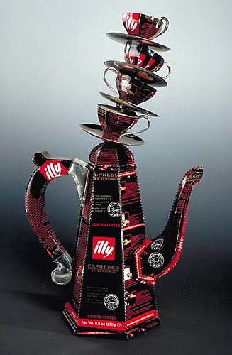
Coffeepot and cups constructed from pre-printed steel from recycled tin containers for IILLY coffee, 10k. gold and aluminum rivets, stainless steel screws. Plastic resin. Stacked espresso cups are permanently attached with a concealed rod going through the cups.
The coffeepot is based on a historical coffeepot from 1728-9. The ratio for the height of the coffeepot to the height of the precariously stacked espresso cups is based on the concept of phi (pronounced ‘fee’), the Golden Ratio, and a pun on the word ‘coffee’. Would you like milk and sugar with your coffee? What is your perfect ratio?

This took me by surprise, but I guess it shouldn’t have: The latest Sublime Stitching artist collaborator is none other than The Black Apple. In other words: Black Apple embroidery patterns.
Sublime Stitching of course is Jenny Hart’s company — Hart being part of the Austin Craft Mafia, and a figure in Buying In. (Post-Buying In follow-up Q&A with Hart is here.)
And The Black Apple is Emily Martin, who dedicated readers will recall from the Handmade 2.0 article as (I think this is still true) the single most popular seller on Etsy.
Both Hart & Martin are very talented and very smart — and, if you don’t mind my saying so, incredibly nice. I did not know they were acquainted, but I think it’s great they’re working together; it makes a lot of sense.
Details here and here.

This coming Thursday night, July 3, is the opening of (extra-special adviser to Murketing) Ellen Susan‘s Soldier Portraits show, at the Blue Sky Gallery in Portland. Plus: Lecture Saturday July 5. Time and location details below.
More about the project at American Photo‘s State of the Art blog; in the June 2008 issue of Photo District News; and in the June/July 2008 issue of The South. And of course at SoldierPortraits.com. Here’s a brief extract from the latter:
The project consists of portrait photographs of soldiers of the United States Army, primarily of the 3rd Infantry Division. The goal of the project is to look at a person in military uniform and to see that person as a unique individual…
The photographs are made using the 150 year old collodion wet plate process — the same process that was used to document much of the period (and many of the soldiers) of the Civil War.
SOLDIER PORTRAITS
July 3 – August 2, 2008
Blue Sky Gallery
122 NW 8th Avenue
Portland, Oregon
Open Tuesday through Sunday, 12 – 5 pm
Opening Reception July 3, 6pm
Lecture July 5, 3pm
(Also showing: Some guy named Rauschenberg. From Texas, I think.)
–> More Soldier Portraits images are also included in group shows at Rayko Photo Center, San Francisco, July 18 – August 24 and at The Photographic Resource Center, Boston, through July 2, 2008, as well as at the Jepson Center for the Arts at the Telfair Museum, Savannah, GA, through July 8, 2008.
A couple of weeks back I noted this Vespa murketing effort in Montreal and other Canadian cities: What looked like street art was actually Vespa branding. In subsequent conversation with the Globe & Mail‘s Jennifer Wells, I learned that this work was executed by an actual street artist, known as Fauxreel, whose work has included a number of billboard alternations. (I wasn’t familiar with him; here’s his site.)
The Anti Advertising Agency points to this evidence that at least some people find the artist’s collaboration with Vespa unappealing: “Sold Out For Real,” someone has scrawled on one of his (non-corporate) pieces.
So how big a deal is this? I’m not sure. Fauxreel is hardly the first graffiti/street artist to do paid work on the street for brands. (Memorable precedent: Tats Cru for Hummer.) Sure this alienates some fans and draws some sellout charges. But I’ve had plenty of conversations with people who figure this sort of thing is just fine: That it sort of amounts to corporations supporting artists, and bankrolling kinda-sorta subversive stuff.
Moreover, I suspect Vespa’s goals here had less to do with impressing street art fans than with simply finding a way (legal or not) to run a campaign that basically can’t be avoided, because it’s not happening in the traditional confines of a magazine ad you can flip past or a TV spot you can mute. It’s not about interrupting a media experience, it’s about interrupting your life. If that costs Fauxreel some credibility, well, I’m sure Vespa will live with that just fine.
Ultimately, backlashing like the above would have to get a lot more widespread before street art murketing goes away.

A few months ago, in what has got to be among the most indefensible financial decisions I’ve ever made in my life, I decided I wanted a really great custom poster to go along with one or more of the events that will promote Buying In. I told myself this might help with “buzz,” but really I know that it’s simply the closest I can ever come to even pretending to be a rock star.
I make it habit to peruse the sites of many letterpress and other poster-makers anyway, so when the time came I had a few folks in mind, and the first one I reached out to was F2 Design, in Lubbock, Texas. Can’t remember how I first found the site, but I loved the work. And I was pleased to find, when I inquired, that co-proprietor Dirk Fowler (his wife Carol Fowler is the other F in F2) was willing to do this slightly weird job. The design he came up with was, in my view, fantastic, and having received actual posters in the mail the other day, I can tell you they’re even more impressive in person.
In fact F2 was such a pleasure to work with, I thought it would be cool to do a Q&A with Mr. Fowler here, and he went along with that, too. In addition to posters for bands like Wilco and Spoon and many others, F2 has also done a variety of other striking design projects, from identity to apparel. But my questions tended to be about posters, and letterpress.
–> Please note: We’ll be giving out about 40 of these F2 Buying In posters (above; they are 18X24 inches), for free, at the event in New York this Friday night.
And yes, this is a weird time of day to post, but I’m out of pocket most of tomorrow. So here goes:
Q. So I believe you work with “an antique letterpress.” Without making you tell your entire life story, I’m curious about what first attracted you to letterpress, and, if the setup you have now, studio-wise, is close to your ideal?
A: I have a Vandercook No. 1 proof press and an unmarked sign press. The latter being the one I do most of my work on because it allows for a much larger print size.


I was first attracted to letterpress after a visit to Hatch Show Print in Nashville in the late 90s. After spending years as an advertising art director, I really wanted to get back into what drew me into graphic design in the first place, making art with my hands. I love the tactile quality and feel of letterpress and wanted to make advertising or design that people might actually want to keep.
I wouldn’t say my setup is ideal. It is a small room (once a sunroom) in the back of my house, really only big enough for one person. I’m a small guy, so it works for me, but ideally, I would like a larger space so I could add more equipment. The danger in this is that I would keep adding more equipment. What I have now allows me to be at home with my family, print until I can’t stand anymore, and go fall into bed. Plus, it keeps my operation small, which I think is a good thing.

On a similar note, I don’t know exactly how long you’ve been interested in letterpress, but I feel as an outsider as though the form has become steadily more popular in recent years — possibly as a result of rising interest in things that have a handmade touch, partly as a result of the Web. So that means more interest — but maybe also more competition? I also feel like there’s a rock poster renaissance afoot, and letterpress is part of that. Is it good or bad for you if there are lots of letterpress folks around? Read more

Leif Parsons, who had a wonderful run as the illustrator of Consumed, has a show coming up (with his friend Duane Burton) — in fact the opening is Thursday night. Details:
Invisible NYC
148 Orchard Street NYC
May 29th through June 28th
[Tuesday through Saturday from 12-8)
Opening Thursday May 29th 7-10
Check it out!
Save


 "
"


 Kim Fellner's book