Flickr Interlude
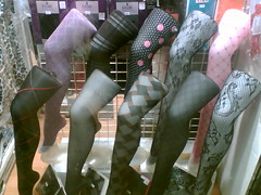
leggings
Originally uploaded by the cockroach of god
[Join and contribute to the Murketing Flickr group]
------------------------
--> The Metapoll. Take it.
 Things That Look Like Other Things.
 Counterfunctionality (A Gallery).
 MLK BLVD: Open-source photography project: Contribute to the Flickr pool; browse the blog.
 "Where Were You?" Annual.
 Titans of Finance: True Tales of Money & Business
leggings
Originally uploaded by the cockroach of god

One of my running themes is that there is nothing new about contemporary consumers being fed up with advertising. We hear all the time about supposed discovery that what sets today’s consumers apart is that they (we) “see through” marketing, and don’t trust it, etc.
So I made sure to bookmark the above image from blog Paleo-Future when it made the rounds while I was away last week. It’s from 1885, and titled “Advertising In The Near Future,” one of the earliest examples I’ve seen yet of popular distaste for ad overload and just how bad it could get. Particularly interesting in the satirical slathering of the Statue of Liberty with commercial slogans is the presence of “suredeath” cigarettes.
Clearly there were people who could “see through” marketing in the late 19th century, and who could count an audience that would get the joke. Just as clearly, seeing through marketing didn’t quite add up to resisting marketing. Kinda like today.
 HomeHero: A fire extinguisher makes a claim that good looks can be a virtue.
Not long ago, Home Depot began selling a $25 fire extinguisher that did not look like a fire extinguisher: white, smooth and resembling a countertop kitchen appliance, it is “attractive enough to keep within reach,” according to a sales circular. Earlier this year, the Industrial Designers Society of America came to a similar conclusion when it gave the HomeHero one of its top awards. As is typical, the organization’s judges praised both functional and aesthetic qualities of the object. The write-up for the International Design Excellence Award asserted that it is less cumbersome and easier to use than a traditional fire extinguisher. “Most importantly,” the statement concluded, its “fashion-conscious” looks mean that “homeowners won’t want to keep the HomeHero hidden out of view, ensuring it will be in reach when seconds matter.”
Industrial designers are forever pointing out they are not mere stylists; doing their job well means making better things, not better-looking things. So it’s attention-grabbing when IDEA judges call style the most important feature of a piece of home-safety equipment….
Continue reading at the NYT Magazine site.

This sounds interesting: Michael De Feo has curated a show called “Behind The Seen”:
Assembling a group of well known street artists from around the world, De Feo invited the participants to showcase work they’re not typically recognized for. Behind the Seen includes personal projects, works in different mediums or styles and pieces not necessarily intended for view on the streets. The mediums include paintings, drawings, photographs and sculptures by over 30 artists from around the world.
The show runs December 13 through January 20th at Ad Hoc Art in Brooklyn. Opening reception December 13, from 7 to 9 pm.
New Murketing column in the December issue of Fast Company:
Recently, Isaac Mizrahi had some choice words for those who look down on him for creating an apparel line for the big-box retail chain Target. Such critics aren’t merely snobs, he declared, they are “brand racists.” Well, that seems a bit much. For one thing, Mizrahi’s once moribund couture business was basically resurrected by his association with Target and the attendant buzz. For another, the implication that status is still organized in a strict top-to-bottom hierarchy seems a little out of touch with the more chaotic marketplace of today, where the right limited-edition sneakers bestow more prestige in the eyes of some consumers than any self-styled “luxury” ever could. That said, it’s precisely this chaos that makes brand bigotry a concept worth pausing over. Marketers pay a lot of attention to brand loyalty and cult-dom and devotion. But what about its opposite number–the brands you simply refuse to consider consuming? ….
Continue reading at Fast Company’s site.

Just so you know: I’m away from home for a bit, and while I thought I’d be able to keep on top of the Murketing thing, it’s proving to be harder than anticipated, for web access reasons. So, there may be some posts this week, and there may not. If not, Murketing returns to normal programming next weekend. Thank you.
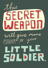
secret-weapon
Originally uploaded by Linzie Hunter
Spam One-Liners: Extracting pleasure from (digital) junk-culture detritus.
Like everybody else with an e-mail account, Linzie Hunter gets a lot of spam. It might be a little more unusual that she sometimes finds the subject headings so amusingly absurd — “No More Lonely Nights for Linzie,” for instance — that she forwards them to friends. (Recipients tend to be nonplused. “Maybe it’s just my sense of humor,” says Hunter, who lives in North London.) More recently, when Hunter, who is an illustrator, was experimenting with hand lettering, she did something extremely unusual. She found a way to convert commercial entreaty and flimflammery into something pleasing. That is, she made spam into art.
Continue reading at the NYT Magazine site.
The Spam One-Liners Flickr set is here.
Late-breaking development: After the column went to press, Linzie Hunter began making prints available by way of Thumbtack Press. It would have been good to have this in the column, but … better late than never.
 Imagining implausible uses for unpopular places. A project in collaboration with Ellen Susan and G.K. Darby.
 Great creative writers invent stories about thrift-store objects. A project in collaboration with Joshua Glenn.
 Letters From New Orleans, by Rob Walker.
  Foreward to Brand Thinking and Other Noble Pursuits
 Introduction to Ad Nauseam: A Survivor's Guide to American Consumer Culture
 Essay for OBEY: Supply & Demand - The Art of Shepard Fairey - 20th Anniversary Edition
 Consumed column about Obama as muse is included in Obama: The Historic Journey.
 A piece I wrote way back when for Slate is included in Sponsorship: The Fine Art Of Corporate Sponsorship/the Corporate Sponsorship Of Fine Art
.
 Gary Hustwit's industrial design documentary Objectified.
 Anne Elizabeth Moore's book, Unmarketable: Brandalism, Copyfighting, Mocketing, and the Erosion of Integrity.
 Kaya Oakes' book, Slanted and Enchanted: The Evolution of Indie Culture
.
 Elizabeth Currid's book, The Warhol Economy: How Fashion, Art, and Music Drive New York City
 Kim Fellner's book Wrestling with Starbucks: Conscience, Capital, Cappuccino
.