I just realized I forgot something I wanted to mention in my post a little while ago about the Point of Purchase show: two other recent examples of semiotic disobedience in the news lately.
Street-art star Banksy got a lot of attention for his latest stunt, which was shopdropping some altered Paris Hilton CDs. “Banksy is notorious for his secretive and subversive stunts,” the BBC explains, adding some details about this particular prank:
Banksy has replaced Hilton’s CD with his own remixes and given them titles such as Why am I Famous?, What Have I Done? and What Am I For? He has also changed pictures of her on the CD sleeve to show the US socialite topless and with a dog’s head.
Banksy’s done some cool stuff, but this seems pretty lame. Seriously: Paris Hilton? Is there supposed to be something surprising — let alone subversive — in the idea of criticizing Paris Hilton for having no talent? Hasn’t that idea already been expressed by, oh, I don’t know, everybody? Maybe this doesn’t even count as semiotic disobedience after all, since the aim seems to have more to do with hyping Banksy than striking a blow against a silly socialite. Or maybe it’s all a meta comment on publicity.
Anyway, the other example: The Ronald McHummer Sign-o-Matic. This, too, is getting a lot of attention online. A response to a McDonald’s promotion that involved giving away Hummer toys, it is “an interactive website that lets you write your own slogan or message about the Hummer giveaway, display it on a McDonald’s marquee, and send a message to the president of the fast-food chain.”
As I type, the site says, “over 99,000 signs served,” presumably referring to the number of messages sent to McDonalds’ execs from the site. If that’s accurate, it’s pretty impressive.
 There’s no Consumed in today’s issue of the Times Magazine, so here is a bit of a follow-up to last week’s “semiotic disobedience” column. The Point of Purchase show at the Dumbo Arts Center through September 24 (mentioned in the Rosemary Williams Q&A below, which you should really read if you haven’t already), includes a few other artists whose work could, I think, be considered in the realm of the semiotic disobedience concept that Sonia Katyal described in that column.
One example is the “Whirl Mart” project, which I’d heard about before and always thought sounded fairly amusing: “It is a ritual during which a group gathers and silently pushes empty carts through the aisles of a superstore.” Silly, childish — but, again, sort of amusing. (Recall the previously mentioned Wal-Mart podcast — maybe somebody should do a group show on Putting the Art in Wal-M(art).)
And then there’s “shopdropping.” I can’t remember where I first read about this, but basically it’s a project of Ryan Watkins-Hughes, who replaces the labels on canned goods with his own photography/artwork, and puts the results on shelves in stores: “Shopdropping strives to take back a share of the visual space we encounter on daily basis,” he explains on this site, where you will also find (click “related projects”) a list of precedents and/or similar actions. Some of these could be counted as semiotic disobedience (especially the work of the Barbie Liberation Organization, dating back to 1989), others not.
Obviously not everything in Point of Purchase can be classified as semiotic disobedience, but there’s a lot of very thoughtful work about consumer culture. I’ve long been interested in Julia Christensen’s Big Box Reuse project. I wasn’t familiar with, but enjoyed learning about, a shopdropping variation by Zoë Sheehan Saldaña: She buys clothes from places like Wal-Mart (there it is again!), hand-makes a duplicate, moves the tags, and returns the duplicate for a refund, meaning her hand-made version is presumably put back on the racks and sold. I was also interested to learn about Stefanie Nagorka, who constructs sculptural forms out of materials in places like Home Depot, then photographs them, and leaves.
And the show had work by several photographers who do nice stuff, notably: Brian Ulrich and Monika Sziladi (whose site seems to be down). Also worth note is the cool “limited edition weekly circular” for the show, by Nicole Tschampel & Bryan Bennett.
In all, a nice job of pulling together a good group of artists by curator Gretchen Wagner. Too bad the Dumbo Arts Center site doesn’t have links to the sites of all these creators — but luckily the aforementioned Brian Ulrich pulled just such a list together, and I’ve raided it liberally in writing this post. Check his site for links to artists I haven’t mentioned here, since I didn’t want to rehash the entire show.
Posted Under:
Flickr Artifacts,
rw by Rob Walker on September 7, 2006
Comments Off on Flickr Interlude
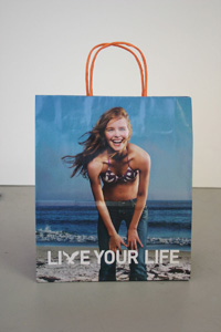
This illustration appears, in rather tiny form (like less than one inch by one inch), on the package for a product called the “Streetwise Key Chain Alarm (with light)”. Basically it’s a key chain attachment that emits a massive sonic blast, unleashed by pressing a button on the device, when you’re about to be attacked by a faceless bad guy. As the tag line on the package says, this is useful “… because our streets our no longer safe.”
That bit of copy speaks for itself. But it’s the illustration that I want to focus on here. I love it! What I love is how totally bored the woman looks as she wards off her shadowy attacker. She seems about as engaged as someone opening a garage door: “Oh, a thug — whatever, I’ll just zap him with the strength of a million decibels.” I also like her sensible outfit and hairdo — and of course, props to the thug for wearing that old-school bad-guy hat.
If I were independently wealthy, I would have an art gallery devoted to nothing but pieces like this. Thumbs up, Streetwise Key Chain Alarm illustrator — thumbs up.
 Earlier this year, as you may know, Brian Eno and David Byrne marked the 25th anniversary of their astonishing 1981 collaboration album, My Life In The Bush of Ghosts, by launching a site that made available all the multitracks for two songs from the album to any and all remixers (who sign up with a specific but apparently pretty enlightened licensing agreement). Our friend Disquiet has kept tabs on the results, pointing out some of the more interesting creations — but recently he offered a new spin on the whole idea: “Our Lives In The Bush of Disquiet.” As he explains:
For Our Lives in the Bush of Disquiet, I contacted a dozen musicians whose work I admire; I wanted to hear what their renditions of the Eno and Byrne tracks might sound like, and none of them had yet joined in the activities at the bush-of-ghosts.com website. With only a few exceptions, these individuals already participate regularly in the loose community of musicians who post their own music for free download on the web, via netlabels, social networking services or their own websites.
The 12 graciously agreed to participate in this project and the resulting compilation ranges from tributes to reconsiderations, from distant reflections to associative interpretations. There are takes on “Help Me Somebody” that milk the funk in the preacher’s voice and there are takes on “A Secret Life” so quiet as to make the original sound like rock’n’roll by comparison.
I was quite interested to hear about this, because I don’t know anybody who is better versed on the curious intersections of music and technology than Disquiet; the site, revolving around “Reflections on ambient /electronic music, and interviews with the people who make it,” is a constant trove of great information and discovery. Basically, if anybody could come up with a compelling curated iteration of a thoroughly wild-and-woolly phenomenon like the Bush of Ghosts remix project, it’s Disquiet.
The 12 remixes, as well as front-and-back cover art by boon (design), are available for listening or downloading here (where there’s also more about each of the contributors and their tracks) and here. My own favorites: “My Bush in the Secret Life of Ghosts,” by Prehab; “If You Make Your Bed in Heaven,” by Roddy Schrock, and “Not Enough Africa,” by Ego Response Technician (who, I should disclose, is also a friend of mine).
Posted Under:
Music,
Pleasing by Rob Walker on September 7, 2006
Comments Off on Mixing the remixes (or something like that)

“Cheeramids #3, by Ernie ButtonAs promised, I stopped by the opening last night of the latest Hey, Hot Shot! exhibition at the Jen Bekman gallery in Manhattan. And as expected, I particularly enjoyed the photographs from Kate Bingaman. But I also want to mention the work of Phoenix-based Ernie Button. Somehow when I’d looked at his pictures online, they didn’t have the same impact that they had in person. The are pictures of “landscapes,” made of cereal. For example, the picture here is of Cheerios.
His statement for the show reads in part: “When I was a child, cereal was a luxury item. Brand name cereals were a rarity, as they were consistently more expensive. Something like King Vitamin (a popular 70s cereal) or Cap’n Crunch made for pure breakfast heaven. Looking at the cereal aisle today, it’s clear that breakfast cereal has changed. The cereal aisle has become a cornucopia of colors with marshmallows that resemble people and objects and characters from movies. It’s apparent that cereal is not just for breakfast anymore; it’s playtime. In keeping with the playtime theme, I began to construct landscapes that would utilize the natural earth tones of certain cereals. I placed enlarged photographs of actual Arizona skies … in the background of the cereal landscapes, giving the final image an odd sense of ‘reality.'”
Poking around online, I found some more of Button’s images here and (of toys, in this case) here. But if you’re looking to buy, I of course suggest you go through Bekman’s gallery. The Hey, Hot Shot! pictures are on view there until September 10.
 A couple of weeks ago I journeyed out to the Dumbo Arts Center to see an exhibition called Point of Purchase. One of the pieces on view there was a big wall of shopping bags, called The Wall of Mall, by an artist named Rosemary Williams. I was interested to learn that there was also a podcast associated with this piece. I signed up for that, and checked out some of Williams’ earlier projects at her site. A lot of her work is right up my alley — projects like Bodega Booty (a “recreation of a New York City bodega” functioning partly as “a love poem” to such stores), and CEO Views, in which we get to look out the windows of some powerful New Yorkers, and hear them talk about their vantage-points, in every sense of the term.
I decided to see if Williams would be willing to answer a few questions, and I’m pleased to say she was. A former New Yorker, these days she’s living (and teaching and making art) in Minnesota, not so far from the Mall of America, which turns out to be quite relevant to her podcast, “Rosemary goes To the Mall.”
Let’s start with the obvious questions. “Rosemary Goes To The Mall” is sort of a spinoff of the Wall of Mall, “a giant sculpture made out of shopping bags from the Mall of America.” What were you hoping viewers of the Wall of Mall would take away from it?
The “Wall of Mall” is meant to be an overwhelming representation of the “brandedness” of our daily lives. I was trying to respond to the Mall of America as iconic architecture, but also as a place which embodies our society’s obsession with stuff, and the ever increasing involvement and identification with manufactured items, the way they imbue status and provide a kind of weird personal satisfaction. I’m not saying that when I was a kid we didn’t want all that stuff and now we do, but there has been a definite creep of national chains overtaking the local store, for better or for worse. On the one hand, this provides a kind of safety, because you know what you are going to get at Starbucks, or the Gap, and it lessens the amount of work one has to do to get a satisfactory coffee, pair of jeans, etc. On the other hand, there is a sameness that is creeping in, which is rarely countered. Please continue…
Posted Under:
Artists,
Consumer Behavior,
Q&A by Rob Walker on September 5, 2006
Comments Off on Q&A: Rosemary Williams, Behind The Wall of Mall
The reason that none of you have been watching Design Star on HGTV is that it is, of course, not a good show. The reason that it’s not a good show was glaringly obviously last night, as the two finalists squared off in a thick fog of mutual respect and best wishes. When they wished each other good luck, they really seemed to mean it: Whoever loses will be ever so happy for the winner.
Who wants to watch that? Where’s the excitement? The episode ended with a group hug. Nobody watches reality TV competitions to see a group hug. Nobody.
I couldn’t care less about fashion designers, but there’s little question that Project Runway is more interesting to watch precisely because so many of the participants are hateful, and seem to hate each other — and each other’s mothers, for that matter. Maybe they don’t, maybe it’s all in the editing, but it all seems pretty mean-spirited, and that’s what counts.
Probably you already knew all that. But I’m wondering if there isn’t an opportunity for a reality show that simply cuts through all the clutter and simply about hatefulness. It could be called America’s Next Top Asshole, and the weekly “challenges” would involve being an awful human: Making a stranger cry, lying to a loved one, taking credit for someone else’s accomplishments, cheating, stealing, insulting, etc. The judges would, of course, be the most hateful people from reality-show history (Puck, Richard Hatch, Ashlee Simpson, etc.). The winner would get a bunch of endorsement contracts, a show on MSNBC, and, of course, braggin’ rights.
Anyway, after last night’s episode of Design Star crawled to its feel-good conclusion, E and I agreed that we would be more likely to hire David, but that Alice would probably have a better show. So for the record, I’m voting for Alice. She’s real sweet.
In Consumed: Disaffected! An online anti-advergame as a form of “semiotic disobedience.”
Persuasive Games, based in Atlanta, is one of many companies that create online games. Sometimes it does this for name-brand clients, including Cold Stone Creamery and Chrysler. Earlier this year, however, Persuasive Games released a game about the copy-shop chain Kinko’s that was rather different. For starters, Kinko’s is not a client. And the game, called Disaffected!, is not a typical example of an “advergame.” In fact, it’s billed as an anti-advergame. As the company explains: “Disaffected! puts the player in the role of employees forced to service customers under the particular incompetences common to a Kinko’s store.” …
Continue reading at the NYT Magazine site, by way of this no-registration-required link.
Additional links: Persuasive Games; Water Cooler Games blog; McDonald’s Video Game.
I think my favorite Second Life writer is Pixeleen Mistral. Read her (I guess it’s her) amusing coverage of politician Mark Warner stumping in the virtual world here. Some excerpts:
Second Life avatar Mark Warner today shocked the metaverse by disclosing his RL identity as Mark Warner — the former Governor of Virginia….
I tried to strike up a conversation with the Mark Warner avatar and got no response. I felt unsettled. A politician that won’t talk is like no politician I have ever seen. Could it be that this avatar was nothing more than an SL “action figure”? ….
More interesting than the interview itself was the scene backstage before the interview, where the Millions of Us handlers put the governor through his paces, practicing waves, helping him keep his feet on the ground and apparently adjusting the size of the avatar as well. He sure looked a lot taller once he was on stage, but maybe it was just the hardware lighting. Perhaps the best RL use of SL for politics going forward will be in producing inexpensive machinima-based political attack ads. This would help create a market for lifelike G.W. Bush and Hillary Clinton avatar costumes, with obvious benefits for SL content creators….
Posted Under:
Virtual Whatever-ness by Rob Walker on September 2, 2006
Comments Off on Politics of Second Life
The Washington Post today has an “appreciation,” written by Paul Farhi, of Arthur Schiff, creator of 1800-plus infomercials or “long form” ads, and, evidently, creator of the phrase “But wait, there’s more!” Schiff died last week.
“But wait, there’s more!” was Schiff’s signature creation, his “Hamlet” and “Moby-Dick.” It eclipsed his other immortal catchphrases: “Isn’t that amazing?” “Now how much would you pay?” and “Act now and you’ll also receive . . . ” He wrote “Wait, there’s more” for a spot for Ginsu knives (a product Schiff himself named, supposedly in his sleep), which has become one of the best-known commercials ever, and surely one of the most parodied.
Ginsu, incidentally, is a nonsense, made-up word. My fondest memory of those ads is the announcer saying, “In Japan, the fooot can split wood” — here they showed a guy in a karate outfit kicking a board in half — “but it can’t split a watermelon!” And they’d show the guy kicking a watermelon. Hilarious.
Farhi describes a variation of this, with a hand chopping a board, but merely squashing a tomato. I remember, that, too, but I’m pretty sure they did this watermelon bit as well — or else I’ve somehow invented it along the way.
Posted Under:
Obituaries by Rob Walker on September 2, 2006
Comments Off on There’s more…
Of course when I saw the above headline in the August 2006 issue of Psychological Science: Research, Theory, & Application In Psychology and Related Sciences, I simply had to know more.
The researchers — Moshe Bar and Maital Neta of the Martinos Center at Massachusetts General Hospital, Harvard Medical School — compiled images of 140 pairs of objects, and another 140 pairs of “meaningless patterns.” They showed these to 14 subjects (all of the human, I suppose), who picked which of each pair of objects they preferred, in sharp v. curved object (or pattern) faceoffs, as well as battles between sharp or curved objects and “control objects” (a great phrase) characterized by “a roughly equal mixture of curved and sharp-angled features.”
The curved objects and patterns dominated!
“It is important to emphasize that there are exceptions,” the researchers note. Example: snakes, which are both curved, and often not liked. But still. Something for you designers to remember. I guess.
Anyway, the researchers have posted their entire catalog of the objects, patterns, and “control objects” here, if you’re curious.
Posted Under:
The Designed Life by Rob Walker on August 31, 2006
Comments Off on “Humans Prefer Curved Visual Objects”
“WhyTheyHate.Us is a participatory web photo project using images submitted to Flickr, a popular photo hosting site. The images are chosen at random from uploaded photos tagged “whytheyhateus”.
The images displayed on the site are not curated, edited, or censored. Anyone can contribute any image to the dialog. Eventually every image will be shown in the random display.”
Interesting, no? This information courtesy of Stay Free! Daily.
Posted Under:
Anti by Rob Walker on August 29, 2006
Comments Off on WhyTheyHate.US
 Several months ago I was very taken by some images I saw of vinyl figures made by Sket One, and spent a little time researching (well, Googling) him. The figures were part of a show called “Subcultures: The Art of the Action Figure,” at Channel 1, in New Haven, where Sket One lives; you can check out coverage of that show, with lots of pictures (including one that I use on the jump page) at Vinyl Pulse.
Eventually I decided to approach him as the second in my series of Q&As with people who are artists and entrepreneurs, finding ways to make a living from creative enterprises. He kindly agreed, and that exchange follows.
Sket One has been writing graffiti since 1986 (here are some of his pieces in that medium,via graffiti.org.) He graduated from art school in 1992, and also works on canvass, on products such as skateboards and shirts, and in the form vinyl figures. And, he works as an art director, at a sports marketing agency called Silverman Group. You can read his official bio and see examples of all his work (since here I’m mostly focused on one set of vinyl figures) at his web site, and on his Myspace page.
Since the thing that really got my attention was the Product Customs, I’ll start there. What inspired those? Would you characterize them as making a comment about brands and products and so on, or was it a more purely graphic-driven inspiration? And, of course, I’m curious how you decided on which products. (Windex! I wouldn’t have thought of that…)
The product customs were done for many reasons. I love pop art objects from my past. I also work for a marketing agency so I am drilled the whole “BRANDING” scheme every dear born day. The message I tried to convey is, first off, cool stuff is designed every day by designers who take their time investigate and study design, design some more, and the end result is something as simple as mustard and ketchup get picked up thrown in a basket and used (only later to be thrown out). So think about it: That packaged was designed by someone? Maybe a team? Well I noticed it, do you? Please continue…
In Consumed: Jamón Ibérico: Paying for the privilege to be the first to own the caviar of pork products.
Some months ago, Harry Saltzman and his wife, Barrett Cobb, were planning one of their regular trips to Europe. Saltzman, a retired music professor who lives in Manhattan, is a foodie, and he was looking forward to the Spanish segment of the itinerary. A week before they left, he received an e-mail message from La Tienda, an online store he had patronized. The subject heading was “Do you want to visit your ham?”
Continue reading at the NYT Mag site via this no-registration-required link.
Additional links: La Tienda; Good Food with Evan Kleiman.


 "
"


 Kim Fellner's book