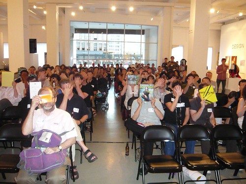
Big thanks to everyone who came out to Friday night’s New York Buying In event at the Art Directors Club. I was happy with the turnout, happy to see old friends, happy to make new ones.
I particularly want to thank PSFK for making it happen, and I hope Piers and Hedy won’t mind if I name-check them here. We had a lot of moving parts to this thing, and they executed perfectly. Awesome job, and my gratitude is deep and heartfelt. Being the center of attention gives me the straight-up willies, but this came off so nicely even I had a good time. Thank you.
I also want to thank Barking Irons, Andrew Andrew, Fast Company, Danielle Sacks, and F2 Design.
Inevitably, too many conversations were cut short, or simply never happened; my apologies to those I didn’t get to spend as much time chatting with as I would have liked.
Finally: I would like to thank the fine gentleman who loaned (well gave) me a pen.

Originally uploaded by EssG.
Time Magazine reports on a guy who is trying to whittle down his possessions to a mere 100 things.
[Dave] Bruno keeps a running tally on his blog, guynameddave.com of what he has decided to hold on to and what he is preparing to sell or donate. For instance, as of early June, he was down to five dress shirts and one necktie but uncertain about parting with one of his three pairs of jeans. “Are two pairs of jeans enough?!,” he asked in a recent posting.
Time suggests this is a “grassroots movement,” although even Bruno seems surprised by that assertion. (“Now it’s a ‘grassroots movement,’ according to Time. Wow!”) Even so, his 100 Thing Challenge is an interesting variation on the whole voluntary simplicity idea, and also on the probably more useful notion of simply thinking harder about material culture — about what really matters, and what really doesn’t.
[Thanks for the tip, Orli!]
I’m on record as standing against the absurd hype about Barack Obama’s logo: “drastically overrated” I boldly declared (cough) in a parenthetical aside buried deep in this inexcusably long post.
Today, NYT says:
[Obama] did not initially like the campaign’s blue and white logo — intended to appear like a horizon, symbolizing hope and opportunity — saying he found it too polished and corporate.
He didn’t like “Change We Can Believe In” either. But he’s got his priorities straight, so he let it go.
Possibly he’s shrewd enough about logo design to know that the real key isn’t aesthetic beauty, it’s overwhelming repetition. (Sorry, logo designers!)
[Big thanks: discoczech!]
A friend writes:
I saw something REALLY disturbing on TV and immediately thought of you*. Have you seen these TBS ads for the Bill Engval show? He literally walks onto the screen, pauses the show with a remote, tells you to watch his new series, and then restarts it. It’s insanely awful. Made me get up and write to TBS about how bad it is. Found a youtube clip of it. Obviously I’m not the only one bothered by this…
http://www.youtube.com/watch?v=2vUtfG9Bkec
Whether you watch the clip or not, a quick scan of the 200+ comments confirms that, yes, TBS viewers are mightily annoyed.
I’ve said before — and particularly a lot lately in interviews about Buying In — the real significance of TiVo and click culture (see the book for more on that) is not that it’s all given great power to the consumer (you know, “the consumer in control”) to zap past ads.
The real significance is that, faced with the possibility of people zapping past ads, etc., the commercial persuasion business has completely rewritten the rules about where and how advertising and marketing can appear. (Thus, “murketing.”) This thing is just a blunt example of one small way they’re doing that.
And it’s worth noting that, even now, less than a quarter of U.S. homes even have a DVR. But every home that gets TBS, DVR-ed or no, experiences this unpleasant stunt.
Maybe this particular style of ruining your viewing experience will fade if the backlash is severe enough, but it’ll just get replaced by more experiments in pitches that are tough to TiVo past. As with the just-noted Vespa street art campaign, I think we can expect more of this sort of thing in the future.
[Thanks, Justin.]
[* Yes, as a matter of fact, friends often think of me when they see “disturbing” things on television.]
A couple of weeks back I noted this Vespa murketing effort in Montreal and other Canadian cities: What looked like street art was actually Vespa branding. In subsequent conversation with the Globe & Mail‘s Jennifer Wells, I learned that this work was executed by an actual street artist, known as Fauxreel, whose work has included a number of billboard alternations. (I wasn’t familiar with him; here’s his site.)
The Anti Advertising Agency points to this evidence that at least some people find the artist’s collaboration with Vespa unappealing: “Sold Out For Real,” someone has scrawled on one of his (non-corporate) pieces.

So how big a deal is this? I’m not sure. Fauxreel is hardly the first graffiti/street artist to do paid work on the street for brands. (Memorable precedent: Tats Cru for Hummer.) Sure this alienates some fans and draws some sellout charges. But I’ve had plenty of conversations with people who figure this sort of thing is just fine: That it sort of amounts to corporations supporting artists, and bankrolling kinda-sorta subversive stuff.
Moreover, I suspect Vespa’s goals here had less to do with impressing street art fans than with simply finding a way (legal or not) to run a campaign that basically can’t be avoided, because it’s not happening in the traditional confines of a magazine ad you can flip past or a TV spot you can mute. It’s not about interrupting a media experience, it’s about interrupting your life. If that costs Fauxreel some credibility, well, I’m sure Vespa will live with that just fine.
Ultimately, backlashing like the above would have to get a lot more widespread before street art murketing goes away.

Originally uploaded by b0.

 The Indie Look
T-shirts celebrating little-guy capitalism — or at least the idea of it.
This week in Consumed, a look at a company that sells T-shirts that at first glance look as though they advertise long-lost, or possibly imaginary, places and businesses. Actually, they’re all real.
Destee Nation is not selling nostalgia or hipster kitsch but romance — the romance of the American small business, the neighborhood diner, the old bar, the mom-and-pop shop that has managed to linger into the era of big-box chains. It celebrates little-guy capitalism with an agenda: “Let’s keep it,” the founder says, noting that every time Destee Nation sells a T-shirt, the business it advertises gets a cut.
Founded in 2004, the company now has 21 employees and sales approaching 10,000 T-shirts a month, and this month will begin distributing through a number of Nordstrom locations. “Basically,” the founder says, “we’re using fashion as a way to save local landmarks.”
Read the column in the June 15, 2008, issue of The New York Times Magazine, or here.
Special thanks to Dan W.
Consumed archive is here, and FAQ is here. Consumed Facebook page is here.
Probably as a result of previously alluded to scheduling congestion, I didn’t spot as many interesting Things in the last two weeks for this installment of the fortnightly Thingdown. Just two. These.

Brass Knuckle Corkscrew, via Book of Joe.

Whippy, via Ffffound.

Friday night July 13 is the New York event for Buying In. It’s at the Art Directors Club, 106 W 29th St. (Doors 6:30, activity starts at 7.) Free and open to the public.
I’ll be in conversation with Danielle Sacks of Fast Company, and then taking audience questions. Books will be sold and signed, a limited number of beautiful letterpress posters will be given away for free, Barking Irons will be screenprinting (and selling) T’s on the spot, Fast Company will be giving out free magazines. Plus catering, booze, and mingling, all put together by PSFK.
Now I mentioned all this a while ago, and maybe you clicked through and RSVPed, or maybe you clicked through and learned that it was “sold out.” Several people have asked: How can a free event be “sold out”? The anwer is that the number of RSVPs exceeded the amount of space available — but of course we have no way of knowing how many of the RSVP-ers will actually show up. Or for that matter how many people who did not RSVP will show up anyway.
So that’s what’s going on; just trying to be as open about it as possible. If you did RSVP, I recommend that you show up — and in fact I recommend that you do so closer to 6:30 to 7. I think it’ll be a fun evening. Hope to see you there.
 This site’s been quiet the last couple of days because I’m away from home and running around a lot doing various things to support Buying In. Next week things will be more active here again. On a related note, AntiFriday is postponed this week — I’ve got a few items but no time to put together a post. So next week will be Double AntiFriday.
Meanwhile: In Buying In news: I was on the Diane Rehm show Wednesday, you can listen here if you like; 1800 CEO Read recommends Buying In; Jennifer Wells’ writeup in the Globe and Mail; Chris Cadelago interview in the San Francisco Chronicle.

A few months ago, in what has got to be among the most indefensible financial decisions I’ve ever made in my life, I decided I wanted a really great custom poster to go along with one or more of the events that will promote Buying In. I told myself this might help with “buzz,” but really I know that it’s simply the closest I can ever come to even pretending to be a rock star.
I make it habit to peruse the sites of many letterpress and other poster-makers anyway, so when the time came I had a few folks in mind, and the first one I reached out to was F2 Design, in Lubbock, Texas. Can’t remember how I first found the site, but I loved the work. And I was pleased to find, when I inquired, that co-proprietor Dirk Fowler (his wife Carol Fowler is the other F in F2) was willing to do this slightly weird job. The design he came up with was, in my view, fantastic, and having received actual posters in the mail the other day, I can tell you they’re even more impressive in person.
In fact F2 was such a pleasure to work with, I thought it would be cool to do a Q&A with Mr. Fowler here, and he went along with that, too. In addition to posters for bands like Wilco and Spoon and many others, F2 has also done a variety of other striking design projects, from identity to apparel. But my questions tended to be about posters, and letterpress.
–> Please note: We’ll be giving out about 40 of these F2 Buying In posters (above; they are 18X24 inches), for free, at the event in New York this Friday night.
And yes, this is a weird time of day to post, but I’m out of pocket most of tomorrow. So here goes:
Q. So I believe you work with “an antique letterpress.” Without making you tell your entire life story, I’m curious about what first attracted you to letterpress, and, if the setup you have now, studio-wise, is close to your ideal?
A: I have a Vandercook No. 1 proof press and an unmarked sign press. The latter being the one I do most of my work on because it allows for a much larger print size.


I was first attracted to letterpress after a visit to Hatch Show Print in Nashville in the late 90s. After spending years as an advertising art director, I really wanted to get back into what drew me into graphic design in the first place, making art with my hands. I love the tactile quality and feel of letterpress and wanted to make advertising or design that people might actually want to keep.
I wouldn’t say my setup is ideal. It is a small room (once a sunroom) in the back of my house, really only big enough for one person. I’m a small guy, so it works for me, but ideally, I would like a larger space so I could add more equipment. The danger in this is that I would keep adding more equipment. What I have now allows me to be at home with my family, print until I can’t stand anymore, and go fall into bed. Plus, it keeps my operation small, which I think is a good thing.

On a similar note, I don’t know exactly how long you’ve been interested in letterpress, but I feel as an outsider as though the form has become steadily more popular in recent years — possibly as a result of rising interest in things that have a handmade touch, partly as a result of the Web. So that means more interest — but maybe also more competition? I also feel like there’s a rock poster renaissance afoot, and letterpress is part of that. Is it good or bad for you if there are lots of letterpress folks around? Please continue…
Apropos of nothing at all, I typed “Obama” into the search box on Etsy, the online handmade emporium.
Results? 538 items.
“McCain” search yield: 45 items.
 SILENCE GENERATION
Technology adapts to eliminate the clatter of city life, one person at a time
For today’s special issue of The New York Times Magazine, The Next City, I devoted the Consumed column to a look at noise-canceling headphones, in particular the Bose QuietComfort line. The connection to the “city” idea is that such headphones are relevant to the thing that makes cities both appealing and oppressive: All the other people.
Originally developed for use in airplanes, Bose’s headphones moved from pilots to consumers, and then to city streets.
Deep into the age of cellphones and iPods, the portable soundtrack is a given in city life, although some of the conceptual pieces in “Design and the Elastic Mind” suggested that we’re still adjusting to this new reality. … One concept, by the Social Mobiles project, which originated in the London office of the design firm IDEO, proposes phones that modify their owners’ behavior — for instance by shocking them when they talk too loud.
Given the unease and adjustment that such projects imply, it’s no surprise that noise-canceling headphones have come to be tools for blotting out not just the dull roar of an airplane but also the clatter of city life…
Read the whole column in today’s issue of The New York Times Magazine, or here.



 "
"


 The Indie Look


 Kim Fellner's book
  A
A