The blog of Burlesque Of North America pointed out the following a little while back. Here is a poster (amoxicillin) designed by Minneapolis artist Amy Jo (who you may recall is one of the folks I hired to create a promo poster for Buying In), back in 2005:

And here is a T-shirt from LRG, in 2009 :

I’m not in the business, of course, but it’s hard for me to believe that the designer of the latter just coincidentally came up with that psychedelic swirl/flower pattern, among other similarities. (And yes there are differences — the LRG shirt in my opinion is pretty sophomoric compared to the more-striking Amy Jo effort.) And I was actually surprised to see that one of the comments on the Burlesque of North America blog linked to this Frank 151 item alleging LRG had lifted another design, from Sailor Jerry, and claiming that “they have done this several other times.”
To be clear, I’m not making any allegations myself, as I have no idea what LRG’s side of the story might be. As you probably know, a variety of similar instances involving big companies and indie creators are explored on the (cytotec) site You Thought We Wouldn’t Notice. Often the posts there come from creators who feel ripped off.
A prominent theory of Web-thought is that such exposure ought to spark some kind of response and ideally resolution of the specific instances — and, you would think, a downtick in the number of such instances. And yet it seems routine. And it looks like LRG didn’t even respond to the allegations on either the Burlesque of North America blog, or on Frank151. Aren’t there swarms of social-media consultants out there claiming that companies have to seek out and address complaints and allegations — whether they come from the creator, or from a third-party observer — or suffer marketplace consequences? Is that theory true or not?
Or does a creator who feels aggrieved have to do what Jenny Hart did and file a lawsuit*? I don’t want to get sued myself, so let me just be clear, again, that I really do not know enough about copyright law to say how the various allegations noted above would fare in the legal system. And maybe there (priligy) are explanations — maybe LRG, for example, has some plausible reason for the apparent similarities between their designs and Amy Jo’s, and Sailor Jerry’s. If so, you’d think that they’d want to say so in public. But maybe in real life, despite what the social-media folks say, it’s easier for them to just ignore it?
[*10/24 update: I originally wrote that Hart “sued,” but that’s technically wrong as the suit was filed, but not served. My apologies. I’ll follow up later on this to set the record straight in a clearer way.]
The New York Review has a quite interesting writeup about controversy over whether certain works attributed to Warhol are or are not authentic. One set of images in particular is at the center of a lawsuit because a board of the Warhol Foundation, which passes judgment on such matters, has ruled negatively. The piece says:
When a work is deemed not to be by Warhol, it is mutilated by stamping it in ink on the reverse with the word “DENIED”—thereby rendering the picture unsaleable even if the board later changes its mind. Although a lawyer for the board has said that no one forces applicants to submit works for authentication, no auction house or dealer will handle a work whose authenticity the board has questioned. A painting stamped DENIED is worthless.
My initial reaction to this was: Really? I’ll take them all! Give you a hundred bucks, even.
But I suppose “worthless” is relative. Probably the owner paid a lot and couldn’t get that amount again.
So my second reaction was that if I had the wherewithal, I’d mount a show called “WARHOL DENIED,” made up of works the board has “mutilated” with that “Denied” stamp.
For starters, I’d actually like to see them. With the series at the center of the lawsuit, the issue appears to boil down to whether or not Warhol’s hand was in any way involved in the work. But of course Warhol devoted a lot of clever thinking to the ambiguity of what the artist’s hand really meant. The NYR piece spells all this out so I won’t rehash it. I’m more just curious to see what else the board has thumbs-downed.
Moreover, I think the show could actually be profitable — by converting the “DENIED” into a status marker of sorts: Yes, this an Official Denied Warhol.
I happen to think Warhol himself would endorse that idea.

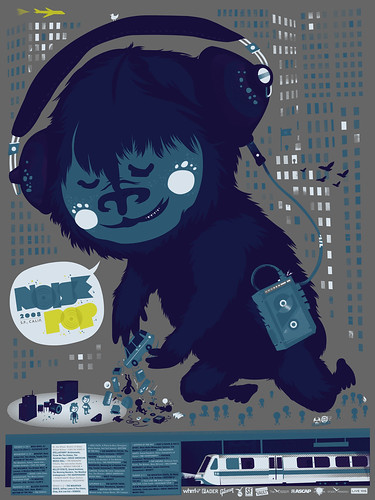
The current Giant Robot brings my attention to the work of Masakatsu Sashie, and I like it a lot.
Do I like it enough to reverse my decision to let my GR sub lapse? Well, no. But still. Really good stuff. I’d love to see it in real life. Meanwhile, check the artist’s site.
Posted Under:
Artists,
Just Looking
This post was written by Rob Walker on May 11, 2009
Comments Off on Just Looking

Quick reminder: There is no Consumed column this weekend. And now some updates.
Above: New(ish) from The Black Apple. (You may remember her from the Handmade 2.0 story.)
Rich Brilliant Willing, whose hypothetical design project Green Cell was the subject of this April 20, 2008 Consumed, get some attention for a more recent project — Russian nesting doll tables — here.
I did a January 27, 2008 column about Kiva. This past I got an email from somebody at BetterLabs about an app the created: If you want to make a loan to a Kiva entrepreneur, but have particular criteria (a particular country, or maybe some particular sort of business) and want to be alerted when there’s a loan-seeker who meets those criteria, then you can try Kiva Alerts.
And in new links on the roll: Adding Yu-Ming Wu’s new blog to the Brand Underground section; Yu-Ming is a very smart guy and someone I like a lot, and appears in Buying In. Also adding The Sound of Young America blog to the Hard to Categorize category.

A few years back I met Shepard Fairey when I wrote an article about him and his design firm, Studio Number One, for Inc. We stayed in touch a little bit, and I was later invited to contribute a piece to the book Supply & Demand. Normally I decline such offers, but for various reasons I made an exception in this instance. Lately I have decided that that it might be interesting to publish that essay here. Partly because Fairey is obviously much in the news, partly in order to mark the occasion of his first major museum show at the Institute of Contemporary Art in Boston, and partly because people keep sending me email asking me what I think (or telling me what they think) about his work.
Keep in mind that this was written in 2004 and first published in 2005, so adjust the date references accordingly. (Among other things, there is obviously no reference at all to the Obama imagery.) Here it is:
SURFACE EFFECTS
 The story goes like this. Some 15 years ago, when Shepard Fairey was a student at the Rhode Island School of Design, a friend wanted to know how to make stencils. Fairey offered to show him, using picture of the wrestler Andre the Giant, chosen basically at random from the newspaper. The friend objected that this was a stupid image. Fairey said no, it’s a cool image — because Andre the Giant has a posse. Later they made some stickers, slapped them up here and there around Providence. That might have been the end of it, except that Fairey overheard strangers at the grocery store, discussing what the stickers might “mean.” So he put up more stickers, and a prank turned into a campaign. In a way, it’s a story that has everything. The never-ending of river of pop culture flotsam. The mastery and teaching of a skill. The seductiveness of persuasion. The power of repetition. And the curious human yearning for symbolic meaning.
That crude early image has long since shifted to a more stylized visage – the icon face — and is now most familiarly paired with the words “Obey Giant,” or simply “Obey.” It has been reworked dozens and dozens of ways, and as an open-source project that pre-dates the Internet, it has been spread by countless volunteer confederates all over the world. The icon face has been in movies, in art museums, it has been tattooed onto people’s bodies, and, yes, it has even appeared in commercial messages, and on clothing. People are still arguing about what it might “mean.” Read more
When: Friday, December 12, 5 – 11 PM
Where: pinkcomma, 81B Wareham Street

Back in August, I did a Consumed about KAWS, noting that having established himself as a successful artist, he was starting to get, somewhat belatedly, actual gallery shows. One of those shows opened on November 6, and runs through December 23, at Gering & López Gallery in NYC. More info here.
Posted Under:
Artists,
Update
This post was written by Rob Walker on November 10, 2008
Comments Off on To Do in NYC: KAWS
Maybe this is old news, but I didn’t know until Charles told me:
Fred Radkte, the “Gray Ghost,” the guy in New Orleans who rollers over and obliterates any and all graffiti/street art, and has even been tweaked by Banksy, got arrested.
Apparently he painted over a mural that had every right to be there. Doug MacCash in Times Picayune:
On Wednesday, Radtke, New Orleans’ most celebrated and scorned anti-graffiti activist, was in the process of rolling gray enamel over a newly finished painting when he was brought up short by a pair of National Guard Military Police officers. Though Radtke has long enjoyed the cooperation of the New Orleans Police Department, this time he had defaced art that was painted with the permission of the wall’s owner, Southern Coating and Waterproofing.
Apparently there was no comment from Radtke. But now he has something more in common with his nemeses: Like them, he’s obsessed with leaving his mark all over town, and like them, he’s been hounded by The Man! “If convicted, he could be fined up to $500 and/or spend up to 90 days in jail, plus pay restitution.”
Meanwhile the mural he went up over has been redone. Pix here.
Posted Under:
Anti,
Artists
This post was written by Rob Walker on October 30, 2008
Comments Off on New Orleans top bomber: Busted!
 PAINTING BY NUMBERS:
Pricing is an art — or at least these artists have turned it into one.
This week in Consumed, an experiment in the meaning of prices and objects by Justin Gignac and Christine Santora:
The couple — art directors in the advertising business in New York — wanted to work together on a creative project. Part of their motivation was to make a little extra money, and talking about what they might do with it, Santora says, led them to the strategy of “why don’t we just be totally transparent?” If they wanted to make enough to buy a plate of buffalo wings at Le Figaro Cafe (now defunct) on Bleecker Street, they would render a plate a buffalo wings and charge $12.70. If they wanted a Wii, they would paint one and charge $270.92.
Read the column in the October 19, 2008, issue of The New York Times Magazine, or here.
The Wants For Sale site is here; Needs For Sale is here. Earlier Murketing post about Gignac is here.
Consumed archive is here, and FAQ is here. The Times’ Consumed RSS feed is here. Consumed Facebook page is here.
To make a point about Consumed that you think readers of The Times Magazine would be interested in: “Letters should be addressed to Letters to the Editor, Magazine, The New York Times, 620 Eighth Avenue, 6th Floor, New York, N.Y. 10018. The e-mail address is magazine@nytimes.com. All letters should include the writer’s name, address and daytime telephone number. We are unable to acknowledge or return unpublished letters. Letters may be edited for length and clarity.”
On a brief visit to Portland back in April, I had a chance to stop by a pretty cool show at the Museum of Contemporary Craft, titled “Framing: The Art of Jewelry.” Among the pieces that I found most interesting were some by Harriete Estel Berman, a jewelry maker based in California. So I was really pleasantly surprised when Berman coincidentally contacted me a few months later.
After learning a little more about the breadth of her work, which is consistently fascinating both in terms of her actual mastery of craft and materials, and in terms of its thematic exploration of consumer culture.
I immediately figured she’d be a great Q&A subject here, and after some delays that were entirely my fault, I got some questions together for her. Her answers did not disappoint. And here (after another delay that was again my fault) they are. Read on for Berman’s thoughts on advertising language, on where she gets the raw material that she converts into art, about consumer culture and identity, trying to imagine sexy furniture at Ethan Allen, and her take on the impact of Etsy/the DIY scene/the Internet on creators such as herself, so far.
[Plus: It happens that she also has work at a show that opened more recently at the Museum of Contemporary Craft, called Manuf®actured: The Conspicuous Transformation of Everyday Objects, which is up through January 4, 2009 and sounds pretty interesting.]
Q: We’ve been in touch for a while, and I’ve wanted to do this Q&A for a while, but part of what’s slowed me down is that you’ve done so much interesting work and I don’t know where to start. So I’m actually going to start at the end. What are you working on right now — and how does it fit into the general themes you’ve been exploring since (I think I have this right but correct me if not) about 1980.
A: Usually, I am working on several different pieces at the same time, all at different stages of progress. Generally, this is a necessity, as ideas often gestate for months to years or time is needed to collect the right tin cans for a specific idea.

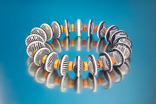
Currently, I am in the middle of a series of work called, Bermaid, the California Collection. (Image above.) These three-dimensional fruit crate labels and bracelets are constructed from recycled tin cans providing layers of images and symbolism. The images and repurposing of post consumer material to construct the fruit crate labels and bracelets reflect upon California as both the archetypal consumer culture and a leader in the recycling movement and green design. Read more
 This looks cool: The Brooklyn Historical Society has an exhibit called Counter/Culture, photos of mom & pop shops around the borough, some of which have since closed, others are still going.
At the Society’s site there’s a series of audio files in which the photographers talk about the project and some of the stores.
The exhibit opened yesterday, and runs through December 28. It’s at 128 Pierrepont, corner of Clinton, in Brooklyn (obviously). Hours here.
Via Gothamist, which has more nice pictures from the show, here.
That’s right, AntiFriday is on Saturday today. Here goes.
* Heart asked the GOP to stop using “Barracuda” as Sarah Palin’s de facto theme song — and the GOP promptly played it again after her convention speech. “I feel completely f—ed over,” Nancy Wilson says. She and sister Ann add: “Sarah Palin’s views and values in NO WAY represent us as American women. We ask that our song ‘Barracuda’ no longer be used to promote her image. The song ‘Barracuda’ was written in the late 70s as a scathing rant against the soulless, corporate nature of the music business, particularly for women.” Slate says the GOP may not need the band’s permission.
* Unplug Your Friends features a cute video intended to counter “screen addiction.” Specifically you can counter screen addition by joining/forming a Meet Up group — or (in a classic murketing tactic) emailing your friends to get them involved in Meet Up. And I must disclose that this came to my attention because someone at Meet Up sent it to me. [Link goes straight to video]
* The Washington Post assesses retail signage that looks a lot like Barbara Kruger’s work. Guy responsible says it’s an “obvious homage.” Kruger doesn’t seem to care one way or the other. Writer Blake Gopnik concludes: “Sometimes — maybe even most of the time — the look of an image is itself the thing we care most about it. Its look is its crucial content. Its style is its meaning; it’s what gets distilled out of it, as the message we take home. When a real estate agent borrows Kruger’s look and leaves most of her ideas behind, he may be treating art the way most of us do.” [I’m a devoted WaPo Style page reader, but thanks also to Braulio for mentioning this.]
* And finally: E directs my attention to this video in which you “meet the graphic designer behind Hollywood’s most famous floating head movie posters.” Amusing. [Again, link goes straight to video.]
Posted Under:
Anti,
Artists,
Backlashing,
Murketing
This post was written by Rob Walker on September 6, 2008
Comments Off on AntiFriday: Your weekly compendium of backlashes, dissent & critiques
Here, then, the third Q&A connected to artists I commissioned to create posters related to Buying In. This time it’s The Little Friends of Printmaking, who I believe I first heard of from Faythe Levine; then I checked out their site, and saw their work in person when I happened to be at Renegade Chicago a year or so ago. I was thrilled when they zithromax were willing to make a poster in connection with the Washington D.C. Buying In event (see below; there’s also a version of this poster that’s sort of like a “tour blank,” but more on that some other time).
As with F2 Design and Amy Jo, the other esteemed creators I was fortunate to enlist in my largely ego-driven cause, I asked The Little Friends of Printmaking if they’d be willing to do a Q&A here, and they said yes. Read on for their thoughts on working as a team; on getting applications from hopeful Brand Managers; on the inspiring effects of crippling student debt and no particular professional prospects; on the effect of so many poster-makers; on how their life is actually not that much like a sitcom; and on which of their cats is less helpful, among other topics.
Very briefly: The Little Friends of Printmaking are Melissa and JW Buchanan; they are based in Milwaukee; they make posters and art prints and illustration work and apparently even at least one toy. (Blog; Flickr stream.) And as you’ll see, they’re very funny.

Q: So you are a married couple who work together as Little Friends of Printmaking. At what point did you decide to take a team approach? And do you think it made it harder or easier to establish yourselves as Little Friends of Printmaking than as two separate artists? Do people ever think that you’re more of a company than two collaborating artists?
Melissa: We started working together when we were in school. We were both studying art at the University of Wisconsin in Madison, and we had met early on. I don’t know when exactly we started to work as a team, or if there was a specific project that made us want to pool our resources; I think it was a gradual extension of us working side by side. When you’re a printmaker the work goes much faster if you’re working with a buddy. That kind of relationship, where you help someone else print their work, that wasn’t unusual. What we did, collaborating from beginning to end, was unusual. Our professors didn’t really encourage us or even approve of our partnership, probably because it was harder to grade us as individuals. We made their lives 0.15% more complicated, which of course was unacceptable.
JW: It’s a big step to throw everything together into a partnership the way we did. Maybe we didn’t have the sense of propriety that other people had for their own work, or maybe we just liked each other’s work a whole lot. Who knows. As a team, we have had an easier time establishing ourselves in some respects. When you work under a name that isn’t your given name, or from under the umbrella of a collective, you kind of get to invent and define who you are as an artist without sounding too much like an idiot or an asshole.
It’s been much easier for us to promote our Little Friends projects because our names aren’t front and center. I don’t think we would have made it very far if we had to rely on reserves of self-confidence that we don’t have. We can hide behind the name, use it as a bully pulpit, whatever. It works for us. There’s still a lot of glamour attached to the idea of the artist as a genius with a singular vision—we don’t get any of that. We’re glamour-deficient. Read more
… mere moments after that post below, I see (via PSFK) that Urban Outfitters has “has offered a set of windows facing the Philadelphia Institute of Contemporary Art as a canvas for artists to present public installations.”
Something’s Hidden In Here has taken the retailer up on this offer, with a project called Your Message Here.
Basically they have installed a sign in said window, and are inviting you — yes you — to make suggestions for what it should say. Apparently they’ll change it daily. Maybe a line from that Guardian piece (“Adverts are the enemy of art”) would be interesting? I don’t know. Maybe this project is an example of art and commerce coexisting happily. What do you think?
If you care to suggest something to be put on the sign, go here, and type away. As I bang this out you have 160 competitors and counting.


 "
"


 Kim Fellner's book