The January 2010 issue of The Believer has an interesting book review — interesting in that the reviewer, Justin Taylor, was prevented from knowing anything about the book: who wrote it, who published it, to what genre it belonged, etc. “Its covers, front matter, and endpages had all been stripped, and the spine blacked out with a Sharpie.”
Toward the end of the review, Taylor addresses the “sensory-deprivation school of reading” he’d just experienced:
Jacket copy does more than simply entice you to buy. It supplies a framework for one’s experience. It is less a movie trailer than a placard on a museum wall, telling you not just how to look at the painting, but what to see there when you do.
I think that’s a very good point. Taylor adds some positive words about being a reader “freed from the tyranny of the preprogrammed response.” That’s an interesting notion, too.
That said, physical books will continue to have covers, front matter, blurbs, and other elements of the “framework” Talyor describes. In my (limited) experience, publishers do think of these things as something like a movie trailer or advertisement. That is, they think about the cover design and title and so on in terms of potential readers: How to attract them, get their attention, hook them, reel them in. Will a shorter subtitle grab more people? What snappy language on the flap is most likely to lead to a sale? Is the cover bold enough to stand out from the pile at Barnes & Noble? Etc.
I wonder how these things might be different if they were created with actual readers in mind: Not the person wandering through the bookstore, but the person who has bought the book and is reading it. Would this affect the look of the book, the nature of the jacket copy, maybe even its title? Would the “framework” have more to do with reinforcing (or even influencing) the reading experience, and less to do with the point -of-sale experience? (To use/abuse Taylor’s terms, if these things were thought of more as a placard in a museum and less as a blaring moving trailer.)
Maybe there would be less difference than I assume. But it might be an interesting experiment or design assignment, to think about how a book would look, and how its jacket copy etc., would read, if it were crafted not for the potential buyer, but for the actual reader.

I only recently got hip to the Museum of Things, in Berlin. I’d heard of it, but a chance encounter with Garth Johnson, an incredibly nice (and smart) guy, included him really setting me straight on the Museum of Things, and the fact that I really need to go.
But while I wait for the checks to materialize that will make it possible for me to travel to Berlin, I’ve at least been able to check out the site. And then I saw this Core77 item with the above image.
from the “Bad Taste Exhibition” at the Museum of Things in Berlin. 100 years ago, Gustav E. Pazaurek started a so called “Cabinet of Bad Taste” featuring the worst of the worst items ever made. The Museum of Things recently decided to give new life to Pazaurek’s historical and extremely complex efforts in documenting material mistakes, design mistakes, decorative mistakes and pure kitsch. Aart van Bezooyen brings us this great (and terrible!) gallery of over a century of bad taste!
But wait — look at those things. Bad taste? Those look like Significant Objects to me! Couldn’t any of them, or other similar objects in the MoT’s collection, be turned into valuable signifiers of very discriminating taste? I think so. Even this one. (Um, NSFW? Sorry.)
Okay, then, an update on the recent-sh post, titled The Marketplace of (Other Peoples’?) Ideas. Basically this was me thinking out loud about indie creators who feel their work is getting ripped off by big companies, and what if anything can be done about it. Notably:
A prominent theory of Web-thought is that such exposure [of alleged ripoffs, online] ought to spark some kind of response and ideally resolution of the specific instances — and, you would think, a downtick in the number of such instances. And yet it seems routine.
I had a number of private conversations with various folks about this post after it went up. The upshot is as follows. Read more
I don’t know how closely you’re following the inquiry over in Great Britain about that country’s decision to involve itself in the Iraq war. And I don’t have much to say about that.
But hey, how about the logo! What do you think of the type treatment? Is this going to make the Iraq Inquiry the breakout inquiry of 2010?


No column in the NYT Mag today, but of course you should go buy the Sunday paper anyway. As always you can check out murketing.tumblr.com or facebook.com/consumed if you’re bored, I tend to update those even when I’m too busy to say anything here, as I have been lately. I hope to get some half-written stuff finished and onto this site in the week ahead, but then I hoped that last week, too.
Meanwhile I’ve noticed a few “Stand By” graphic treatments lately. My opening slide when I was doing Powerpointy self-promotion in connection with Buying In was in fact the classic stand-by color bars. Often the A/V guy would find it confusing. I’ve wondered if anybody else even remembers the image, so I guess I’m glad to see evidence that people do. Anyway if you happen to know of more examples I’d love to see them!

Sewing Room TV Cover by modernjax

By Frank Chimero
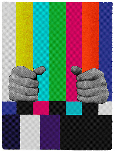
Also by Frank Chimero, whose work is excellent.
 I mentioned a while back that I was cataloging all my collected images of counterfunctional watches in one place. That’s just about done. See: Counterfunctionality: A Gallery. I’ll add new ones as they come along, but I’m pretty sure this is everything I’d stockpiled. It’s pretty impressive if you ask me. (But if you ask me, what would you expect me to say?)
I’m still not sure if I should expand the Gallery to include non-watch examples of counterfunctionality, or just stick to the one product category. This was all inspired, you may recall, by this Consumed.
 And meanwhile, Things That Look Like Other Things will continue to be updated daily, for a good while at least. I still haven’t worked off my inventory on that one, and new examples seem to pop up every day.
This too is a spinoff of an earlier Consumed column.
That is all. Have a nice weekend.

 The Dieline points to the above images and this explanatory post on Pentagram’s site. Apparently it’s a reaction to the most recent anti-tobacco legislation. Pentagram’s DJ Stout “suggests that to comply with the crackdown, tobacco companies should embrace the restrictions and make cigarettes look truly dangerous.”
I guess these are meant to examples of that idea — but I think these packages look totally awesome.
(And by the way, re the text, I don’t know if that’s a real cigarette-package warning or not, but I’m pretty sure all regular smokers “eventually die.” Non-smokers too.)
Longtime readers know that I’ve long had an interest in watches that really aren’t very useful as tools to tell you what time it is. What’s the point of such things? Well I used them in a Consumed column as an example of the identity power of counterfucntionality — drawing on the research of Wharton’s Jonah Berger. That column is here.
Deep Glamour has just run a series of posts about watches. This post examines watches as markers of “an eye for style and design.” This one focuses on status.
With all that in mind, I hereby announce yet another in my astounding series of quixotic side projects: Counterfunctionality, A Gallery. I’m adding one counterfucntional watch or watch-like object per day, from my very extensive collection of links. Enjoy.
Posted Under:
The Designed Life,
Update
This post was written by Rob Walker on June 9, 2009
Comments Off on Watches, identity, and counterfunctionality: My latest, and last, word on the subject
NOTE (MARCH 25, 2012): I’m not really updating this post anymore. (So I’ve closed the comments.) Please visit RobWalker.net for more about whatever I’m up to now.

EBay

Facebook

Flickr

Hotmail

Twitter

YouTube

Friendfeed
Just a few that occurred to me. More ideas? Let me know.
Or has someone already gathered these up somewhere? It wouldn’t surprise me*, but if it’s out there I couldn’t find it.
UPDATE: I opened the comments, they were closed by mistake. Plus: Adding some more examples after the jump, and will keep adding as they come in or otherwise come to my attention. *2nd UPDATE: On 10.1.09, some has brought to my attention this other collection from 2006. Read more
After yesterday’s barrage of posts, I’ll leave you alone today, or rather direct you elsewhere.
1. Steven Heller has an interesting post about design “empathy,” an idea with its own logo. He also has some questions if you know much about that subject: “What I want to know is, when did empathy become first, a strategy, and second, a brand? Can you shed some empathetic (or sympathetic) light on the subject?”
2.Paola Antonelli is now writing a column for Seed.
3. Update on the 2/12/19 Consumed about the Fail Whale: ” To attract more followers to Baltimore tourism’s Twitter account, the guy who runs it, Tom Rowe, pledged that a friend of his would get a tattoo of Twitter’s iconic fail whale, and broadcast the tattooing on live webcam, if they could get past the 3,000 followers mark.” Adfreak has the picture.

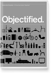
So here’s the poster for Objectified, the documentary I mentioned the other day. The Underwire, which says Objectified is “one of the buzziest movies showing at this year’s South By Southwest film festival,” makes this interesting assertion:
The poster already has the design geeks drooling, and apparently the physical print (metallic silver, 27 inches by 39 inches) is even more impressive in person.
Hm. What does it mean to covet this particular poster? I wonder what director Gary Hustwit thinks of that?
Anyway, keen-eyed observers have noted that my name is in the “cast” list. What that means is Hustwit interviewed me. He was a nice guy and very smart, and I’m sure the documentary will be interesting. But I’ll be seeing it for the first time this coming Saturday evening, and I really don’t know what to expect. (On a personal level, probably some form of humiliation. That’s always what I expect.)
That said, if you’re going to SXSW, you might want want to check out the movie, too, and/or the Sunday panel “We Have Been Objectified: Identity, Consumerism, and the Future of Designed Objects.” Which I’m on. Maybe we’ll talk about poster lust.
And whether you go to those or not, please stop by the South By Bookstore from 5 to 5:30 pm on Sunday the 15th; I’ll be there signing books. Or perhaps just staring idly into space.
The South by Bookstore is located on the Trade Show Floor. Enter the Austin Convention Center (on 4th Street across from the Hilton), take the escalators up to the fourth floor, take a right when you get off the escalator and walk down the hall. The main entrance to the trade show is on your left. Walk to the back, right side of the room. The bookstore is along the back wall. There will be signs identifying it.
Save
Posted Under:
The Designed Life
This post was written by Rob Walker on March 9, 2009
Comments Off on “Objectified” object
I was going to throw this into the linkpile, but given Brian’s masterly comment on government logos the other actually mentioned NASA’s logo as his favorite ever: In T Magazine this weekend, Alice Rawsthorn assessed the two logos that agency has used, “the meatball,” and “the worm.” It’s pretty interesting. Opinions seem mixed on which is better. I kind of like the worm, now that I’m forced to think about it.

Okay well I just said I wasn’t going to offer an aesthetic critique of the new recovery logo. But, since McChris, in the comments, mentioned the National Recovery Act emblem from the Great Depression/New Deal era and even offered an image link … Well, I can’t help but say that I think there’s a boldness in the old emblem that’s definitely not present in the new one. The new one seems a bit wimpy to me, a bit, I don’t know, Facebooky or something — or like it represents an iPhone app. It also strikes me as a little too busy for its own good.
BUT, maybe my view will change in time. Again I think it does its job only via repetition and context. So … we’ll see.
Anyway what seeing this old emblem really makes me wonder is: Why in the world didn’t the Obama team hire Shepard Fairey to do the new recovery logo? Whether you’re pro or con Fairey, you’ve got to admit: The guy really knows how to do propagandistic icons.
[3/5 UPDATE: I really have nothing to say today, so instead read Brian’s comment on government iconography below, as it is superior to the post itself. Oh, and here, via Design Observer‘s “observed” links, is info on who designed the new recovery logo. I’m going to guess that when the design blogs get to assessing (I still haven’t seen any writeups), they will generally like it. But maybe not. Very curious to know… ]
 WSJ:
WSJ:
At the Department of Transportation Tuesday, Mr. Obama unveiled a new logo for projects funded by his $787 billion stimulus plan and announced the first infrastructure project to receive funds.
The logo — with a three-leafed sprig for green jobs, a set of gears for infrastructure, and “recovery.gov” beside a field of stars — will be used to brand projects as well as raise the visibility of the White House’s economic initiatives and try to dramatize their impact.
This is interesting and I think it’s potentially smart. I’ll leave it to others to critique the actual design — and I expect there will be plenty of critiques. But as is so often the case with logos (including the vaunted Obama campaign logo), what will really matter won’t be simply aesthetics, but repetition and context. If people really start to see this a lot, connected to actual work being done, it will have the desired effect: “Wow, that stimulus money is making things happen.”
Somebody was interviewing me today about the book and the current economy and all that, and the conversation turned to Tropicana bowing to consumer pressure (apparently) to junk its recent redesign. What does that episode say about the present state of the “secret dialogue between what we buy and who we are”?
Well, for one thing it’s an example of one manifestation of that dialogue becoming somewhat more open — in the sense that one of the things the Web does is make visible consumer sentiments that would have been harder to quantify in the past.
More interesting, though, I would suggest, is that the episode underscores the surprising degree to which consumers want to participate in this dialogue. By that I mean: If nobody cares about brands anymore (as various experts have claimed for years, and are claiming once again with the recession as the new rationale), then why in the world would anybody go to the trouble of emailing a company, or starting a Facebook group, about package design? After all, the juice didn’t change. So, you know, who cares?
Lots of people, that’s who. Marginal Utility picks up on a comment from some Tropicana exec that the decision was made because the brand’s “most loyal consumers” were supposedly unhappy: “That they bother to complain is precisely what makes them loyal,” Rob Horning writes. “Others would probably just buy something else without a second thought. Myself, I would prefer to be one of those others.”
To me, that’s definitely a more reasoned response: I mentioned that we at Murketing HQ disliked the new design, and responded by trying some alternatives. While we talk about this kind of consumer/design trivia all the time around here, it never occurs to us to get involved in some kind of Web-enabled protest movement, or at least not about the way a package looks.
After all, it’s not like the aesthetics of Tropicana is some kind of important issue worth rallying around — certainly nothing worth treating like a consumer-rights battle that pitted the grassroots against corporate power.
And yet, there’s at least some evidence that certain observers see this incident in precisely those terms. For example, Marginal Utility also noted the Kottke entry on the Tropicana episode, which declares: “We won!”


 "
"


 The
The 





 Kim Fellner's book
  A
A